Intermediate

2022 Week 41 | Power BI: Likert Scale and Net Promoter Score (NPS)

Introduction This month we are getting the #WorkoutWednesday community involved in the challenges with Community Month. Each week we’re going to have an outstanding member of our community present a challenge. This week we have Gerard Duggan from sunny down under (Australia). Gerard rocks the Power BI community showing us how to present outstanding analysis …

2022 Week 41 | Power BI: Likert Scale and Net Promoter Score (NPS) Read More

Error Bars showing standard deviation from the average

2022 Week 39 | Power BI: Use error bars to show statistical ranges

Introduction We first looked at error bars in week 28. But error bars have several formatting features and can be used in several types of visuals. This week, we are going to use error bars to show a dynamically populated range around an average.  Requirements Calculate the average height and standard deviation for the heights. …

2022 Week 39 | Power BI: Use error bars to show statistical ranges Read More

2022 Week 36 | Power BI: Split Violin Plot and HTML

Introduction Another PlotlyJS visual this week – creating a split violin plot. We’ll be comparing male and female dating preferences collected from speed dating events between 2002-2004. EXTRA CREDIT – For those with a little more time on their hands, an extended workout challenge is included; conduct your own data analysis and create a data …

2022 Week 36 | Power BI: Split Violin Plot and HTML Read More

2022 Week 35 | Power BI: Make a Comet Chart

Introduction This week we are exploring another lesser used chart type: the comet chart. Comet charts show the evolution of one or two measures over time. They allow you to see change between two time periods across a category while emphasizing the direction of the change. You might use a comet chart instead of a dumbbell …

2022 Week 35 | Power BI: Make a Comet Chart Read More

2022 Week 34 | Power BI: Calculation Groups

Introduction Calculation Groups in Power BI essentially allow you to apply logic or formatting to a variety of measures at the same time.  For example, let’s say you were looking to create a Month-To-Date, Quarter-To-Date, and Year-To-Date view across Revenue, Orders, and Units.  This would require you to create a calculation for each of the …

2022 Week 34 | Power BI: Calculation Groups Read More

2022 Week 33 | Power BI: Compare two series of values

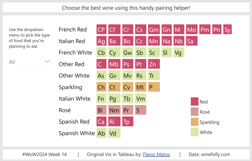
Introduction Welcome back to Workout Wednesday! This week we’re visualizing two series of values in a take on last week’s Tableau challenge! This week’s challenge uses youth cellphone data and gives you the opportunity to either build a dumbbell chart using Charticulator or to build a lipstick column chart using a custom visual. Complete one or both …

2022 Week 33 | Power BI: Compare two series of values Read More

2022 Week 32 | Leverage Field Parameters in Measures

Introduction My name is Spencer Hamilton, Analytics Consultant with phData, and I’ll be guest hosting this week’s challenge! For the challenge, we’re going to look at one of Power BI’s newer features, Field Parameters, and create some calculations that dynamically change based on the selected parameter value. In this specific example we’re looking at Sample …

2022 Week 32 | Leverage Field Parameters in Measures Read More

#WOW2022 Week 31: Let’s build a KPI dashboard

Introduction Who doesn’t love a good KPI dashbaord? This one is fairly simple and straightforward. Let’s look at four simple metrics and see how each subcategory ranks within a selected metric. With this challenge – MIND THE NUMBER FORMATTING 🙂 Click to open in Tableau Public Requirements Dashboard Size: 700 x 350 2 sheets Display …

#WOW2022 Week 31: Let’s build a KPI dashboard Read More

Scroll to Top