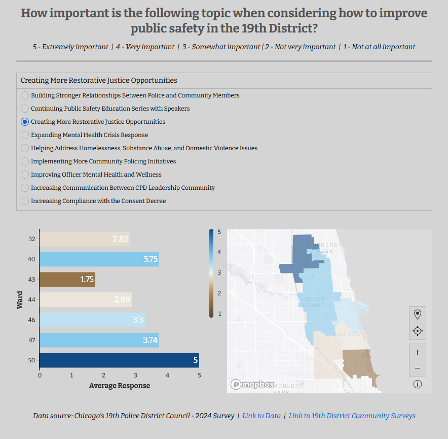
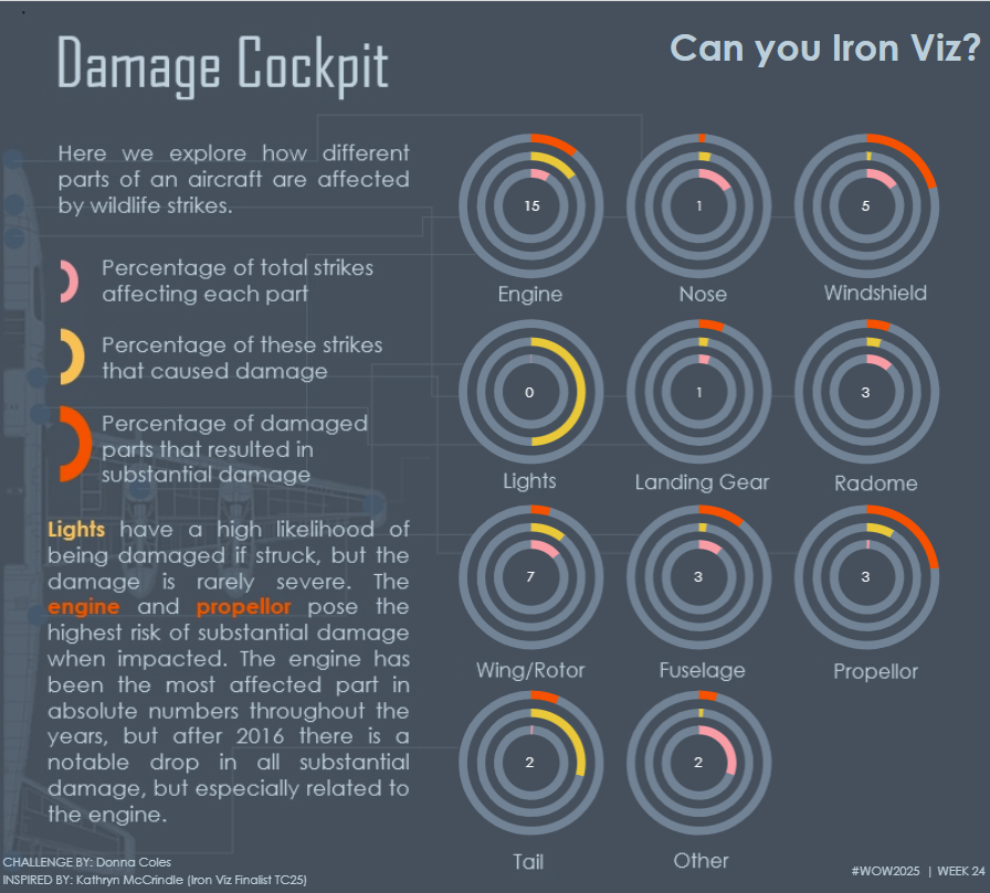
map layers

2022 – WEEK 49: Can you make a pie chart?

Introduction This challenge you are to recreate a pie chart with some interesting formatting. Click to open in Tableau Public Requirements Use Segment and Sales to divide the pie slices. Have a thin solid exterior with Segment labels on the outside. Have white space between the edge and the interior of the pie. Have a …

2022 – WEEK 49: Can you make a pie chart? Read More

2022 – Week 39: Where were COVID-19 Cases most active on December 30th, 2021?

Introduction This week we’ll look back at COVID-19 cases in the continental United States on December 30th, 2021. In this challenge you will use data from covidactnow.org to show where cases were most prevalent in terms of cases per 100,000. The data for this challenge are already pre-loaded in a workbook. They include the COVID-19 …

2022 – Week 39: Where were COVID-19 Cases most active on December 30th, 2021? Read More

2021 Week 24 | Tableau: Can you visualise the Cholera Outbreak?

Introduction How is it that time of the week already? This week I have a challenge for you which hones in on some of the Map Layers and Spatial Calculations. It is using a dataset recreated by a colleague of mine Dan Farmer as he posted a similar visualisation internally. Thanks for the inspiration Dan. …

2021 Week 24 | Tableau: Can you visualise the Cholera Outbreak? Read More

2021 Week 19 | Tableau: Regional Sales Readout

Introduction Recently I’ve been spending more time working with Map Layers, so this week is dedicated to reimagining maps using this feature. You’re tasked with recreating a Regional Readout Report where Sales teams can see the performance of various cities within their Region.  They’ll be able to get more information by hovering over a city. …

2021 Week 19 | Tableau: Regional Sales Readout Read More

Scroll to Top