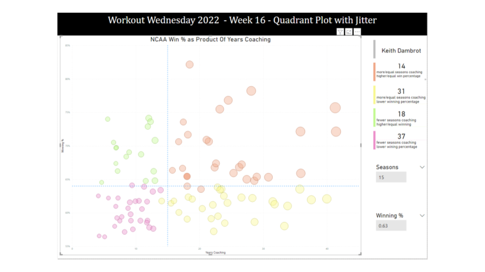
Parameters

2020 Week 2: Can you build a beautiful and dynamic bar chart?

Introduction Happy New Year!  I’m excited to be back for yet another year of Workout Wednesday.  This year we’ve expanded the team and made a commitment to the community to provide solution videos.  We’ve also got some great collaborations lined up, and a few exciting enhancements to come (custom color palette anyone?)! To get the …

2020 Week 2: Can you build a beautiful and dynamic bar chart? Read More

2019 Week 50: Can you build a retention heat map with a marginal histogram?

Let’s take a break from Superstore this week! I’ve fabricated some new data that will help us create a more realistic view of customer retention, you can connect to the data via the Google Sheet connector at this link. This data set has one row per order week and customer ID, representing said customer placed …

2019 Week 50: Can you build a retention heat map with a marginal histogram? Read More

Week 48: Can you build a Bar Chart that automatically combines small contributions?

How much information have you retained from Tableau Conference 2019?  Are you still watching session videos (like I am?).  This challenge is an homage to the amazing conference from this year. The challenge comes from something I encountered in a recent work situation.  The end-user wanted to be able to automatically group together small contributing …

Week 48: Can you build a Bar Chart that automatically combines small contributions? Read More

#WOW2017 | 02 | How to show nothing when “All” is selected

Introduction EDITOR’S NOTE: This challenge was originally published on Emma Whyte’s Tableau blog which no longer exists. The challenge is republished here with the author’s permissions For week 2, I challenge you to recreate the dashboard below. The visualisations themselves are fairly simple. It’s the kick-ass text titles and logo switching that are the real challenge. …

#WOW2017 | 02 | How to show nothing when “All” is selected Read More

Scroll to Top