
Introduction
Welcome to Week Twenty-Five! This week, you’re going to compare US Census data from 2000 and 2010. In this challenge, we’ll highlight a couple of new formatting additions to Sigma, as well as create a dynamic parameter.
Good Luck!
-Ashley
Need access to Sigma?
Note: You will only have view access to WOW Workbooks, Folders, and Workspaces, not edit access. Please create your WOW Workbooks under “My Documents.” We suggest creating a folder to organize all your workbooks.
Requirements
- On a hidden Data Tab:
- Add the US Census Data: Sigma Sample Database / FUN / CENSUS / CENSUS
- Note the pre-defined Metrics available. We will use Population Change and Population Change %
- Group this data table by State
- Find the Population Change by State, using the pre-defined Metric.
- Add the US Census Data: Sigma Sample Database / FUN / CENSUS / CENSUS
- On a visible page:
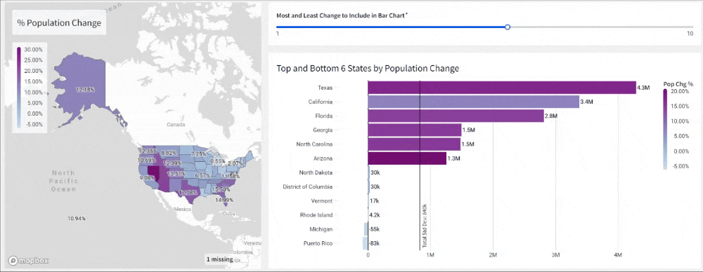
- Create a Map – Region visualization to visualize the Population Change Percent by State
- Region = State
- Color = Population Change %
- Label = Population Change %
- ToolTip = Population Change
- Show a Title with a descriptive name
- Change the Color Palette
- Create a Slider Input Page Control to input the [Param-Change] and select a value.
- Allow Values 1-10
- Make it Required
- Show Background
- Create a horizontal, stacked bar chart to visualize the States with the Most AND Least Population Change
- Y-Axis = State
- X-Axis
- (Visible Field) Population Change
- (Hidden Field) Create a Boolean Column that determines if the state is in the range of the most or least change, based on the [Param-Change] input.
- Hint: Use 2 RankDense functions combined with an OR statement.
- Filter the visualization on this column = True
- Formatting:
- Sort by Population Change
- Color: Population Change %
- Change the Color Palette to match the Map
- Format the X-Axis and Data Labels in SI Units
- Format Population Change in the ToolTip as a Whole Number (full value)
- Add a Reference Mark:
- Standard Deviation of Population Change
- Add a label with value and text in the Bottom Right
- Give the chart a Descriptive Title that includes dynamic text showing the [Param-Change] input value.
- Show the Legend & Header
- Shorten the Field name, to not take up so much space
- Finishing Touches
- Give the Dashboard a Descriptive Title
- Arrange your elements into a cohesive dashboard
- Create a Map – Region visualization to visualize the Population Change Percent by State
Dataset
Simple Sample Database / Retail / Tasty_Bytes_Food_Trucks / FCT_ORDERS
Share
After you finish your workout, share on LinkedIn, Sigma’s Community page, (or Twitter) using the hashtags #WOW2024 and #SigmaComputing, and tag Ashley Bennett, Eric Heidbreder, and Katrina Menne!
Create an interactive, sharable version of your solution here.
Also, make sure to fill out the Submission Tracker so that we can count you as a participant this week to track our participation throughout the year.