Year: 2022

2022 – WEEK 44: What is the lifetime value of customers?

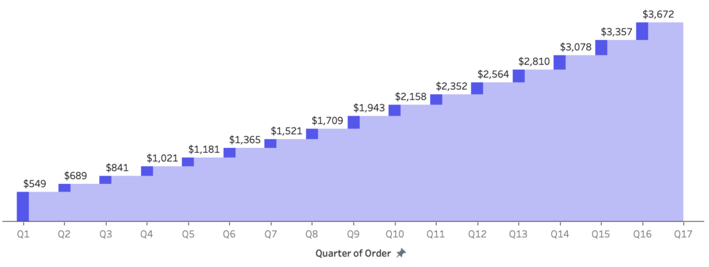
Introduction This is probably my favorite challenge of the year. So i’m saving it for near the end. You’ll need level-of-detail and table calculations to solve this one. For this challenge you need to calculate customer lifeftime value (in sales). While their are many ways to do this. We are going to keep this as …

2022 – WEEK 44: What is the lifetime value of customers? Read More

#WOW2022 W43: Advanced Formatting by Jeremy Anderson

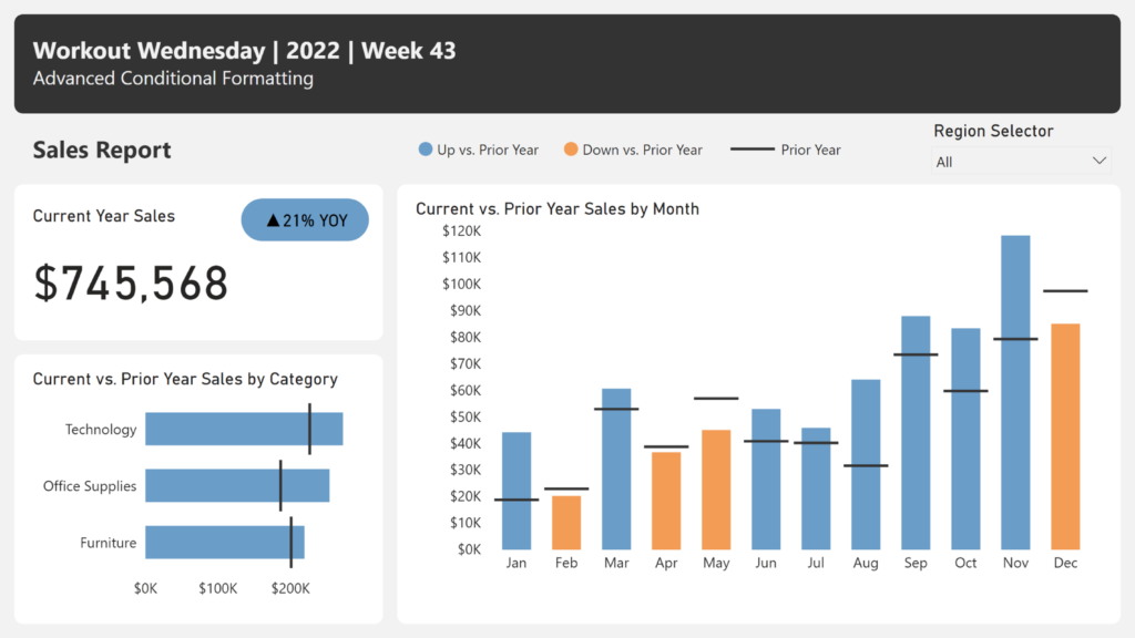
Introduction Conditional formatting is a robust feature in Power BI that you can leverage to help users gain insights. Typically, we see conditional formatting applied to the table and matrix visuals. For example, you might apply a background color, font color, or icons to the values based on a set of rules.  Conditional formatting of …

#WOW2022 W43: Advanced Formatting by Jeremy Anderson Read More

#WOW2022 | Week 43 | Selected Subcategory Influence

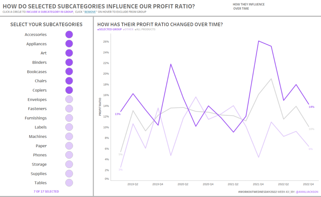
Watch Introduction Hi Workout Wednesday friends!  I’m back, just in time for the Tableau 2022.3 release, which means we’ll be exploring Dynamic Zone Visibility.  This new feature allows you to use calculations and logic to dynamically show and hide dashboard elements (pretty powerful).  So in this challenge, you’ll get some hands on exposure to this …

#WOW2022 | Week 43 | Selected Subcategory Influence Read More

#WOW2022 | Week 42 | Can you use Tableau to estimate Aaron Judge’s home run trajectories?

Introduction Hello there, Workout Wednesday #DataFam! This week’s challenge is all about two of my passions growing up: baseball and physics. This past baseball season, New York Yankees outfielder Aaron Judge broke the 61 year old American League record for home runs in a single season set by Roger Maris in 1961 – Judge concluded …

#WOW2022 | Week 42 | Can you use Tableau to estimate Aaron Judge’s home run trajectories? Read More

2022 Week 42 | Power BI: Deneb Custom Visuals

Introduction I was recently asked by Rob Saunders if I would like to assist with a #WorkoutWednesday PowerBI challenge. To be seen in the same crowd with Kerry, Shannon, Meagan, Spencer, and Rob is such an honour. Cue the onset of imposter syndrome. After that feeling passed, Rob and I decided to continue with the …

2022 Week 42 | Power BI: Deneb Custom Visuals Read More

#WOW2022 Week 41: Can you do YoY comparisons?

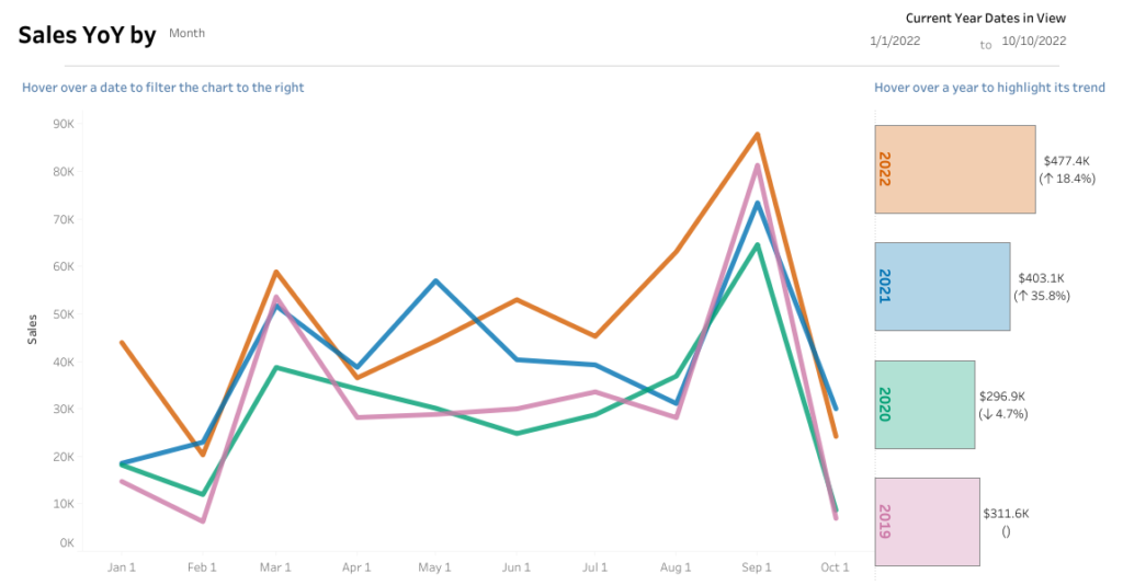
Introduction Welcome to week 2 of #WOW2022 community month! I’m excited to have Liam Huffman joining me for this week’s challenge. Liam is a fellow colleague at Evolytics and is a great member of the #datafam! With that – here’s Liam Hey everyone! I’m excited to be here sharing my challenge dashboard. This one focuses …

#WOW2022 Week 41: Can you do YoY comparisons? Read More

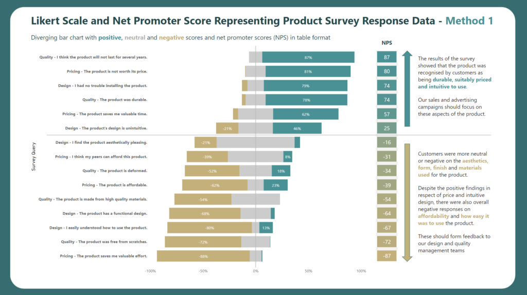
2022 Week 41 | Power BI: Likert Scale and Net Promoter Score (NPS)

Introduction This month we are getting the #WorkoutWednesday community involved in the challenges with Community Month. Each week we’re going to have an outstanding member of our community present a challenge. This week we have Gerard Duggan from sunny down under (Australia). Gerard rocks the Power BI community showing us how to present outstanding analysis …

2022 Week 41 | Power BI: Likert Scale and Net Promoter Score (NPS) Read More

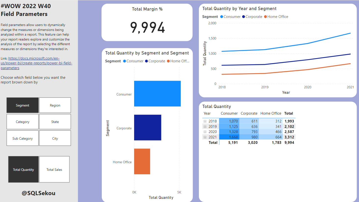
#WOW2022 W40: Power BI: Field Parameters with Conditional Formatting

Introduction This month we are getting the #WorkoutWednesday community involved in the challenges with Community Month. Each week we’re going to have an outstanding member of our community present a challenge. This week we have one of the best out there, Sekou Tyler, gracing us with his presence. Sekou is an accomplished BI professional and …

#WOW2022 W40: Power BI: Field Parameters with Conditional Formatting Read More

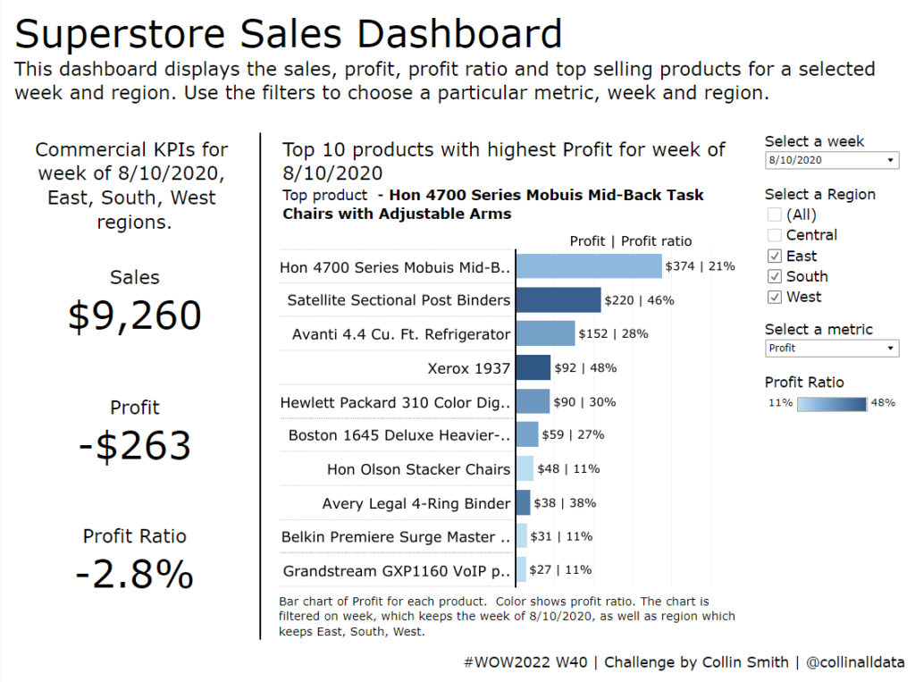
#WOW2022 | Week 40 | Applying Accessibility Principles to Data Visualization

Introduction October is Community Month here at Workout Wednesday. This means that each challenge will be brought to you by a guest coach from our wonderful data community Kicking things off this week, we have a challenge by Collin Smith (@collinalldata).  “Have you ever tried to incorporate accessibility into a Tableau dashboard? Incorporating accessibility into our …

#WOW2022 | Week 40 | Applying Accessibility Principles to Data Visualization Read More

2022 – Week 39: Where were COVID-19 Cases most active on December 30th, 2021?

Introduction This week we’ll look back at COVID-19 cases in the continental United States on December 30th, 2021. In this challenge you will use data from covidactnow.org to show where cases were most prevalent in terms of cases per 100,000. The data for this challenge are already pre-loaded in a workbook. They include the COVID-19 …

2022 – Week 39: Where were COVID-19 Cases most active on December 30th, 2021? Read More

Scroll to Top