I can’t believe I am entering my 4th year as a Workout Wednesday coach. It has been such an incredible journey so far. I bet you think how do we come up with the challenges all the time? Tableau has such a broad range of calculations and different ways of doing things so that parts easy (sometimes).
Every year I say I’m going to get better at Table Calcs, so this first challenge is just that, working on those skills.
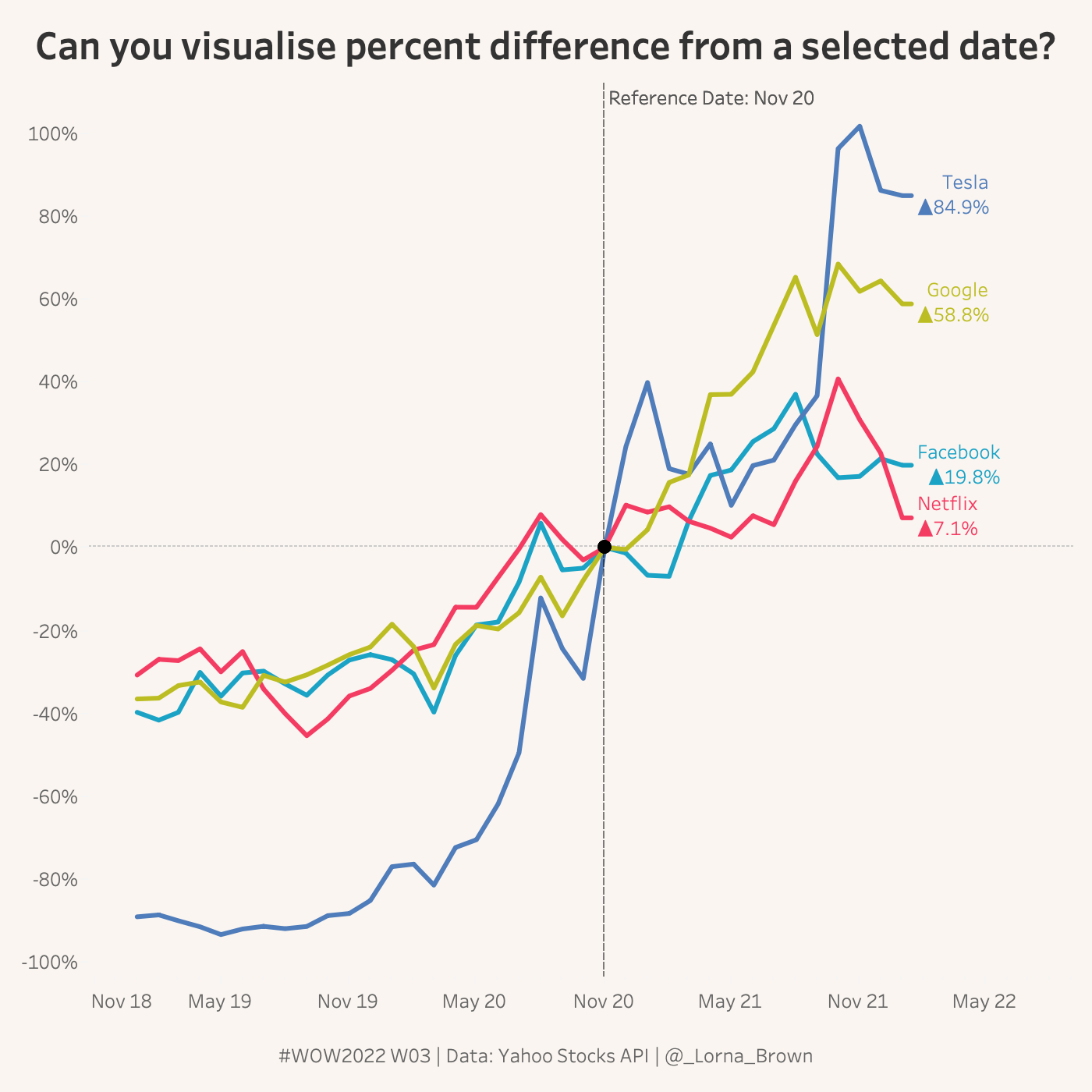
Create a line chart showing the Percent Change from a Selected Date
Use Action to change Selected Date
Chart should go above and below 0%
Dataset
This week I pulled data from the Yahoo Stocks API. You can find it here on Data.World
Attribute
When you publish your solution on Tableau Public make sure to take the time and include a link to the original inspiration. Also include the hashtag #WOW2022 in your description to make it searchable!