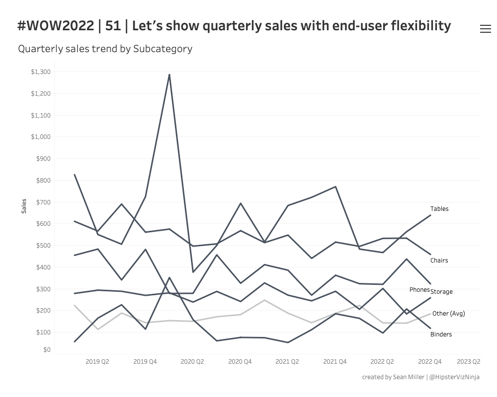
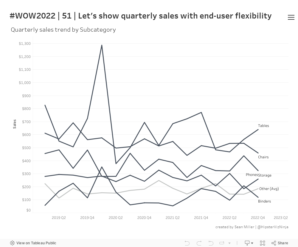
I recently had this type of request at work – stop me if you’ve heard this before. We need to show the trend of [single or multiple measures] and we want to see it by these specific dimensions. Oh! And we also need to be able to filter by the same dimensions as well…
“Sure! No problem” you say because why would you turn down a challenge? But then you start building it and you realize that these dimensions have a hard cardinality so the trends turn into a plate of spaghetti. This is obviously not ideal so you have to get creative – and this is what I end up building to satisfy the request.
This solution allows them to do everything wanted, presented in a practical solution and forces THEM to decide to look at a spaghetti chart if that’s what they choose.
Allow the user to show the top n and then group all others
Top Ns should be aggregated by sum and the other bucket should be the average.
Allow the user to decide to see the Other bar or show all dimension members
Dataset
This week uses the Superstore data set. You can find it here on Data.World
Attribute
When you publish your solution on Tableau Public make sure to take the time and include a link to the original inspiration. Also include the hashtag #WOW2022 in your description to make it searchable!