Introduction
There has been an overwhelming response from the last couple of weeks series so I thought, let’s continue. How many times have you gone into a meeting with a finished dashboard and someone’s asked “Can you just…”. Well here is my “Can you just…”!!
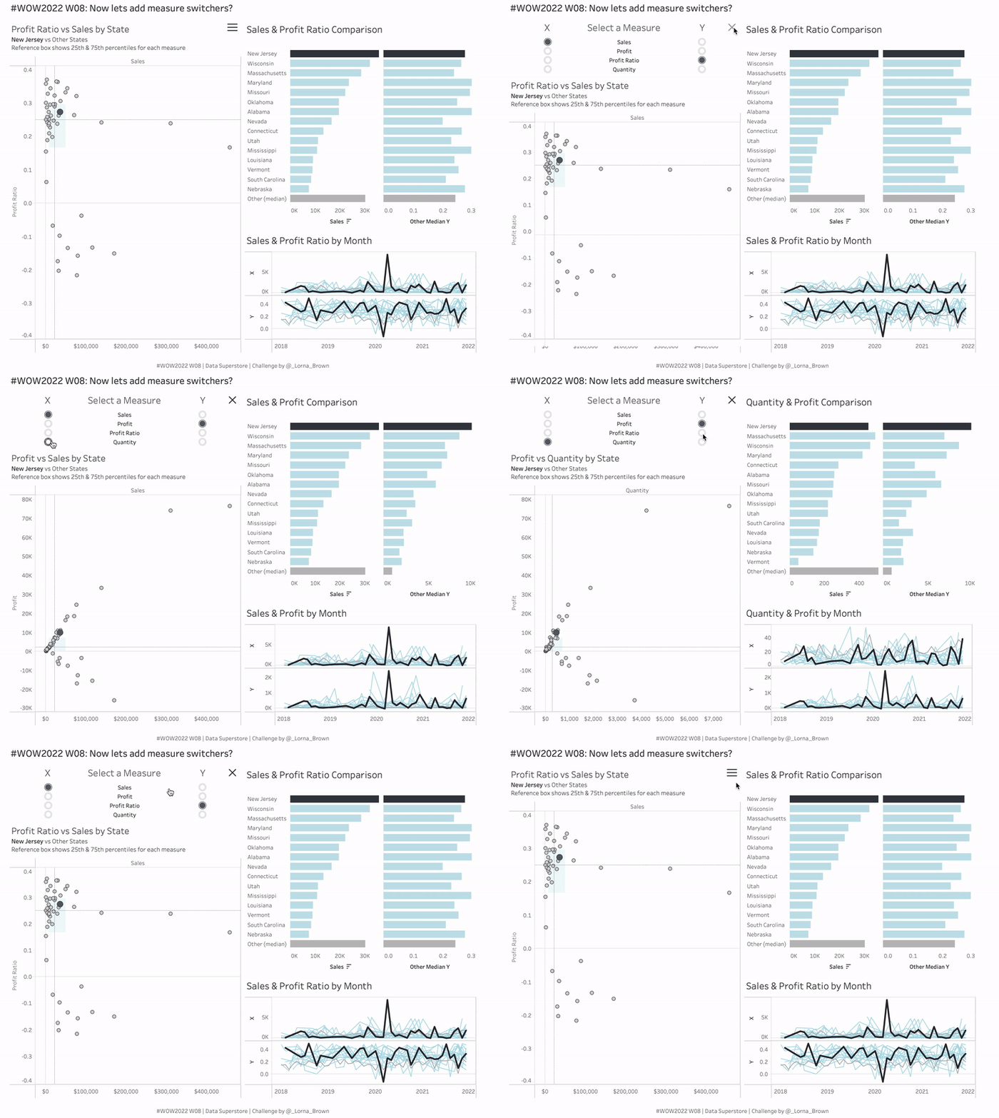
I want you to be able to switch what measures we are using throughout the viz. I want to choose from Sales, Profit, Profit Ratio and Quantity. Not only that, I want a special user interface for selecting the measures which means no drop down menus (I don’t want much!)
If you are coming to this challenge fresh you have three options, you can either:
- Start with Erica’s challenge from Week 5 and Sean’s challenge from Week 6
- Download Kyle’s workbook from last week
- or simply take the measure switcher and create a simple scatter plot (see example 2).
Requirements
- Maintain Dashboard Size
- Add in Measure Switcher using the dataset below. HINT: 1 = Sales, 2 = Profit etc…
- Use the measure from the switcher for every chart in the dashboard
- Add sheet to dashboard in a container which can be Shown or Hidden.
- Use Parameter Actions to switch the X & Y.
Example 2:
- Dashboard Size: 600 x 850
- Create a simple scatter plot with the X & Y selections
- All other requirements same as above

Dataset
This week uses Superstore from 2021.4. You can find it here on Data.World
You also need to copy and paste the below into Tableau as a secondary data source:
Number,
1,
2,
3,
4
Attribute
When you publish your solution on Tableau Public make sure to take the time and include a link to the original inspiration. Also include the hashtag #WOW2022 in your description to make it searchable!

Share
After you finish your workout, share on Twitter using the hashtag #WOW2022 and tag @LukeStanke, @_Lorna_Brown, @HipsterVizNinja, @_hughej, and @YetterDataViz

This is SO useful – do we get the same thing in the Power BI Challenge for this week? It hasn’t posted yet, I’m eagerly waiting!