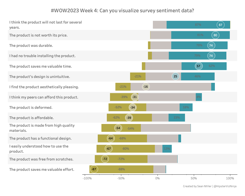
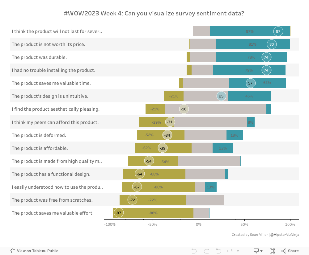
Have you ever had to visualize survey data? It can be tricky to work with so let’s stretch our muscles with this week’s challenge!
In this challenges we’ll be dealing with unstructured data, positive & negative sentiment and “floating” bar charts. It’s got a little bit of everything. Enjoy!
Show the distribution of negative, neutral and positive survey responses
HINT: Read each survey question and determine the sentiment of the question to get your values to match up
Calculated the overall NPS score as a circle
NPS is the ([Positive values]+[Negative values])*100
Show ONLY the negative and positive values on each bar
No Tooltips
Match formatting
Nuriel Stone palette
Have FUN!
Dataset
This week uses a fake survey. You can find it here on Github
Attribute
When you publish your solution on Tableau Public make sure to take the time and include a link to the original inspiration. Also include the hashtag #WOW2023 in your description to make it searchable!