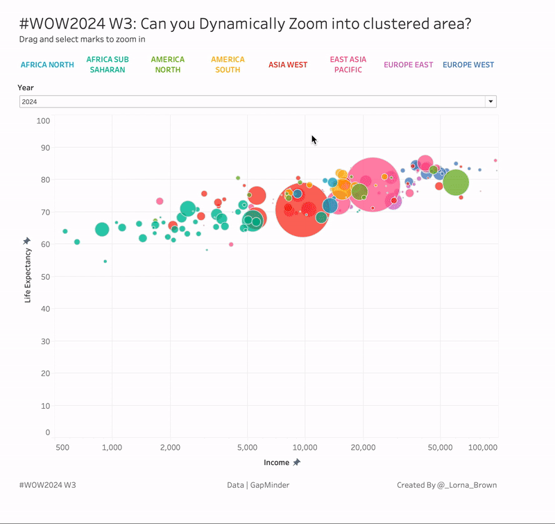
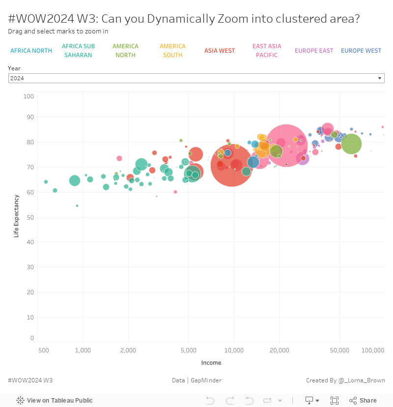
This week I wanted to test out one of Tableau’s new features, Dynamic Axis Ranges. In this exercise you want to be able to zoom into some of those clustered countries which you can then hover over to get more information about. There are, of course, some other features within this visualisation. You might also recognise the data and the visualisation as it is based off of Hans Rosling and a Workout Wednesday from 2021, which you can access here
Relate all four data sets together using Country and Year
hint you’ll need to pivot
Create a scatter plot showing Life Expectancy and Income per GPD, sized by population
Create a region filter
Add a Viz in Tooltip to show the change over time by country only!
Create the dynamic axis range
reset back to 0-100 for Life Expectancy, and 500 to 100000 for Income.
Dataset
This week uses data from GapMinder. But for ease you can find all four needed on Data.World
Attribute
When you publish your solution on Tableau Public make sure to take the time and include a link to the original inspiration. Also include the hashtag #WOW2024 in your description to make it searchable!