Erica Hughes

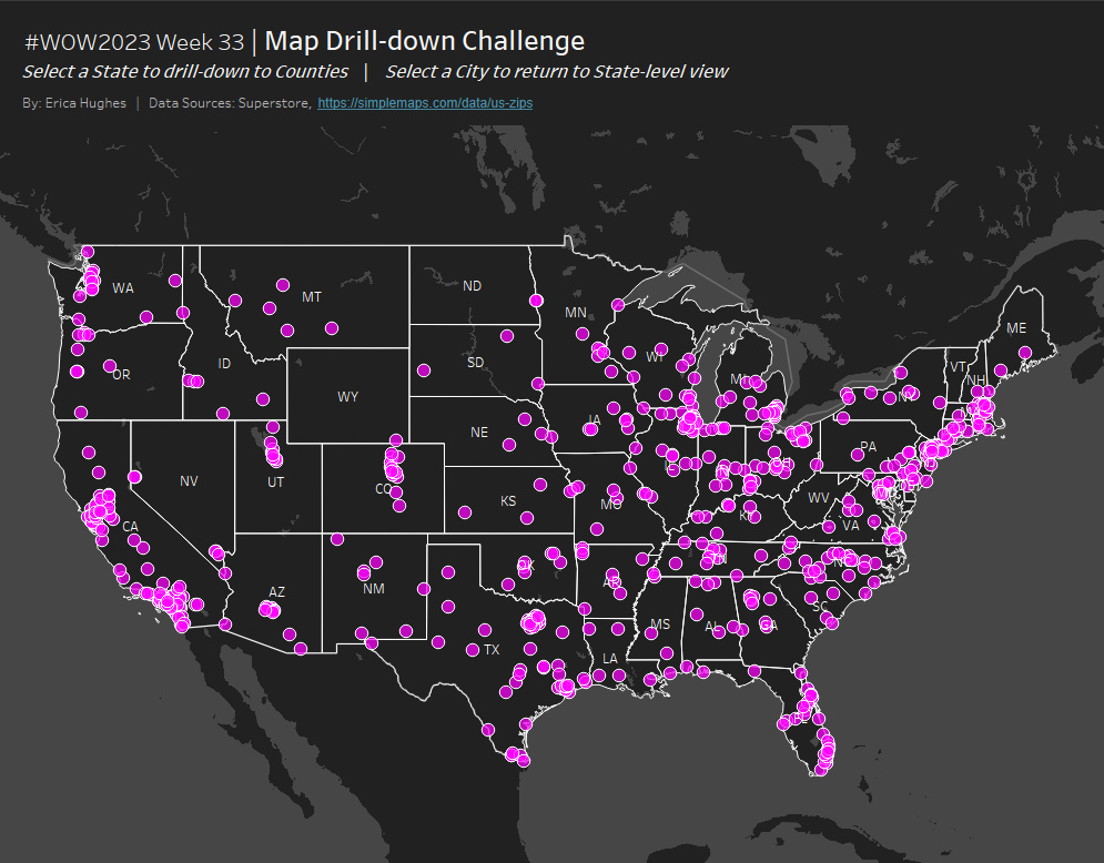
#WOW2023 | Week 33 | Map Drill-down Challenge

Introduction This week I have a full-on Tableau Spatial challenge for you. Just one worksheet. Minimal formatting. It’s all about the behind-the-scenes magic. Enjoy! Click to open in Tableau Public Requirements Dashboard Size: 1000 x 800px 1 sheet Create a map of the 48 ‘contigous’ (aka: mainland) US States Plot points for every City in …

#WOW2023 | Week 33 | Map Drill-down Challenge Read More

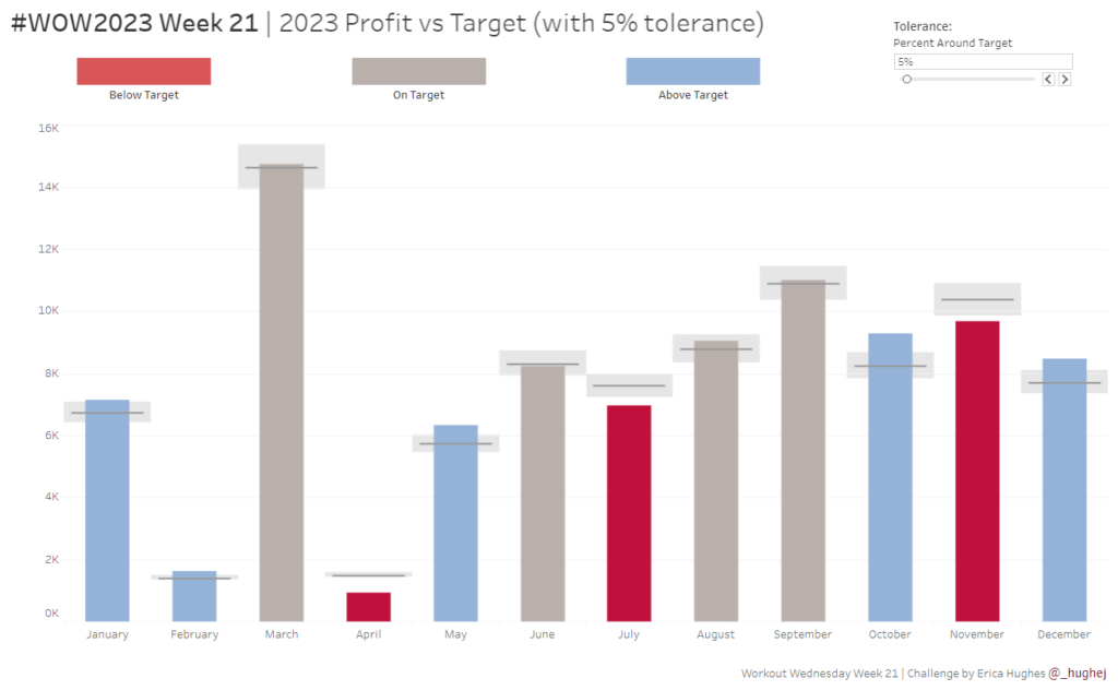
#WOW2023 | Week 21 | Profit vs Target (with Tolerance)

Introduction This week’s challenge is a slight twist on the classic Measure (bar) vs Target (gantt) chart. The key difference here is that we want to allow the user to select a ‘tolerance’ around the specific Target value. We only want to highlight months where profit was Above or Below the permited tolerance. Click to …

#WOW2023 | Week 21 | Profit vs Target (with Tolerance) Read More

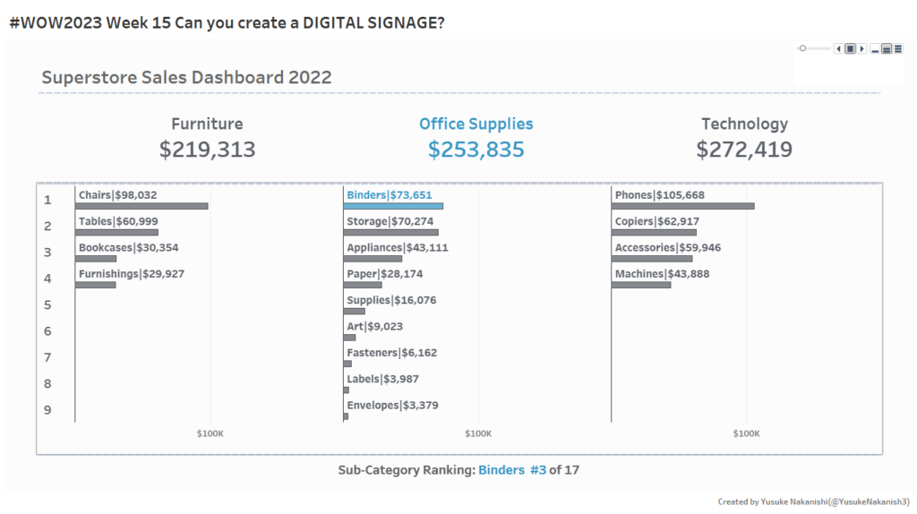
#WOW2023 | Week 15 | Can you create Digital Signage with Tableau?

Introduction It’s Community Month once again here at #WOW2023 which means we have a guest coach. I wanted to use this opportunity to connect with our global community. Without a doubt, the most active group of challenge participants I see on Twitter, beyond those in anglophone countries, are the #DataSaber community based in Japan. I …

#WOW2023 | Week 15 | Can you create Digital Signage with Tableau? Read More

#WOW2023 | Week 3 | Calculating Year-On-Year Percentage Change

Introduction This week’s challenge is one I’ve been waiting to share with you. It has a bit of everything, so I hope you enjoy it! The goal is to visualize the Sales in a given year for different countries in Europe, with an indicator in the tooltip to identify whether this value has increased or …

#WOW2023 | Week 3 | Calculating Year-On-Year Percentage Change Read More

#WOW2022 | Week 50 | Interactive Proportional Brushing

Introduction This is my last challenge of the year and what better way to round things off than with everyone’s favourite chart – the bar chart – but let’s make it “sexy”. Bar charts may be simple but when you combine them with some interactive highlighting and sorting you can create something quite dynamic which …

#WOW2022 | Week 50 | Interactive Proportional Brushing Read More

#WOW2022 | Week 45 | Average Patient Waittimes

Introduction This week’s challenge was derived from a project that I helped some colleagues with. My colleagues were working on a client project for a travel company. They wanted to be able to compare a selected “Event Date” with an average travel day. The aim was to see if and how travel patterns might be …

#WOW2022 | Week 45 | Average Patient Waittimes Read More

#WOW2022 | Week 40 | Applying Accessibility Principles to Data Visualization

Introduction October is Community Month here at Workout Wednesday. This means that each challenge will be brought to you by a guest coach from our wonderful data community Kicking things off this week, we have a challenge by Collin Smith (@collinalldata).  “Have you ever tried to incorporate accessibility into a Tableau dashboard? Incorporating accessibility into our …

#WOW2022 | Week 40 | Applying Accessibility Principles to Data Visualization Read More

#WOW2022 | Week 35 | Conditional Table Formatting with Dynamic Headers

Introduction This week’s challenge is brought to you by a guest coach, my colleague Valerija Kirjackaja, who came across this problem at work and created a beautiful solution for it. How often do you get asked to re-create Excel tables in Tableau? On a scale from 1 to ‘I am never doing this again’ – …

#WOW2022 | Week 35 | Conditional Table Formatting with Dynamic Headers Read More

Scroll to Top