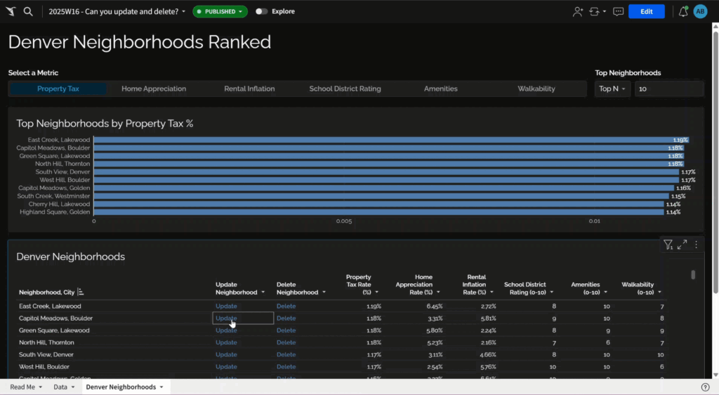
2024 Week 20 | Sigma: Can you create quadrants?

Introduction Week 20 already! Crazy how fast the year is going by…and how fast you’re skilling up in Sigma! I love scatter plots. They’re a great way to display a lot of information in an easily consumable package. Layering quadrant colors on top, make it even easier to visually group dots and find outliers.  -Katrina …

2024 Week 20 | Sigma: Can you create quadrants? Read More

#WOW2024 | Week 20 | Can you combine categorical and sequential colors in the same chart?

Introduction A couple weeks ago while standing in line for Ken and Kevin Flerlage’s session at Tableau Conference, I had a conversation with the woman next to me that led to something like “what is something you’re trying to solve right now?” Her response was that her boss wanted to have something of a stoplight …

#WOW2024 | Week 20 | Can you combine categorical and sequential colors in the same chart? Read More

2024 Week 20 | Power BI: Build your first report with Dynamics 365 Business Central Data

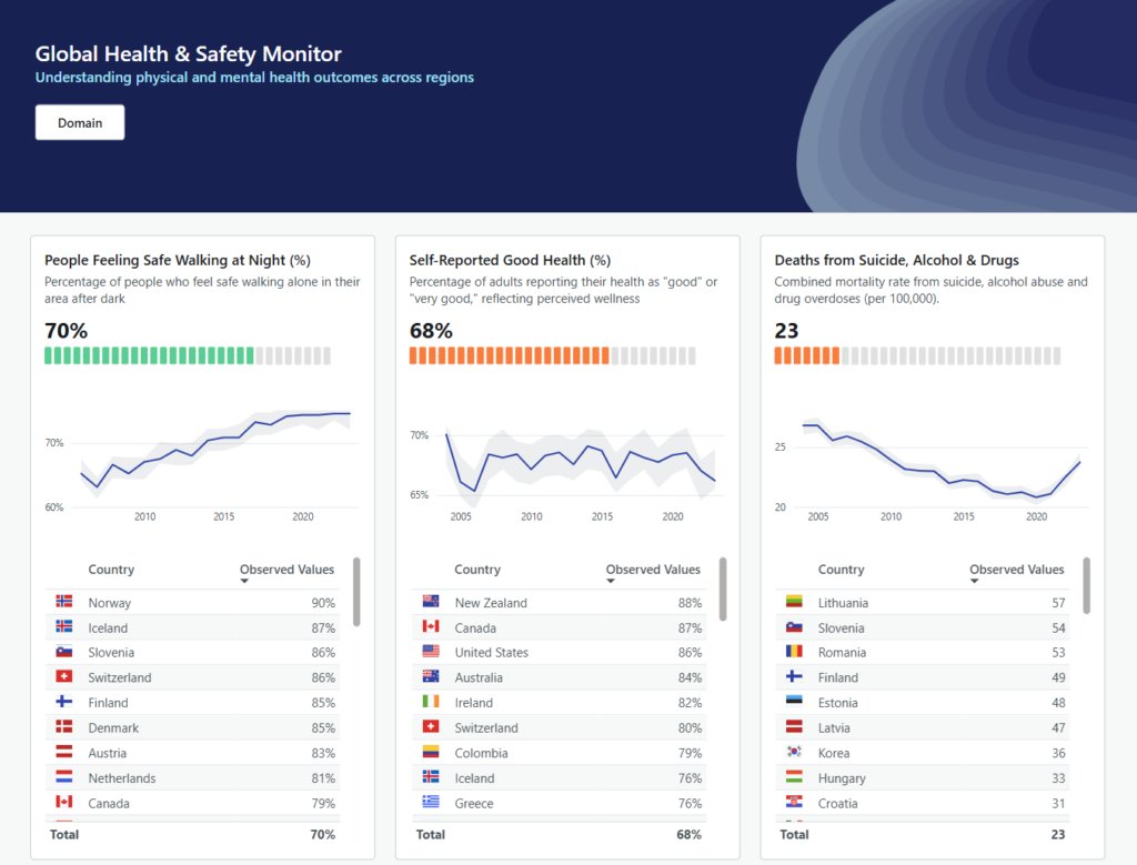
Introduction Welcome back to Workout Wednesday! This week’s challenge is for participants new to Power BI and/or new to data visualization. We’re building a report containing 2 charts, a table, and a slicer. My challenge to you is to design the report in a way that a) makes sense to business users and b) is …

2024 Week 20 | Power BI: Build your first report with Dynamics 365 Business Central Data Read More

Radial Plots

2024 Week 19 | Power BI: Radial Plots using Line and Scatter Charts with trig functions

Introduction In this week’s challenge, we are experimenting with Radial Plots using Line and Scatter Core Visuals. Radial Lollipop charts are an alternative to radar charts. Power BI does not have Polar Plots, only cartesian plots, so we will need to use trigonomic functions within DAX to calculate the cartesian X and Y position of points. Requirements …

2024 Week 19 | Power BI: Radial Plots using Line and Scatter Charts with trig functions Read More

2024 Week 19 | Sigma: Can you clean a string?

Introduction After last week’s awesome product launch, I was thinking about some of the Sigma features that we have not yet highlighted in Workout Wednesday. One of those is Custom Functions, and while the ability to create Custom Functions is currently reserved for admins, it’s a great feature for users to be aware about when …

2024 Week 19 | Sigma: Can you clean a string? Read More

#WOW2024 | Week 19 | Can you expand this segmented bar chart?

Introduction So this week follows on from my previous challenge in week 13 here. Feel free to either recreate completely from scratch or use my/your own original solution to build on (my solution for week 13 is here and my solution guide is here). Having built a segmented bar chart, we are now going to …

#WOW2024 | Week 19 | Can you expand this segmented bar chart? Read More

#WOW2024 | 18 | Sleep Survey Marimekko

Introduction Welcome to week 18 and this week’s challenge. This is a special challenge as it is the challenge that coincides with Tableau conference and #Data24!  This week your challenge is to analyze sleep survey data and build a marimekko chart in Tableau! Click to open in Tableau Public Requirements size: 1000×800  the x axis …

#WOW2024 | 18 | Sleep Survey Marimekko Read More

2024 Week 18 | Power BI: Visualize Mammal Lifespan with a Scatterplot and Background Image

Introduction Continuing on last week’s infographic theme, we are recreating an infographic from Visual Capitalist this week, this time showing average lifespan for different mammals.  We will be using a scatterplot visual of your choice this week. I made two demo versions, one using the Deneb custom visual and one using the Enhanced Scatterplot custom …

2024 Week 18 | Power BI: Visualize Mammal Lifespan with a Scatterplot and Background Image Read More

Scroll to Top