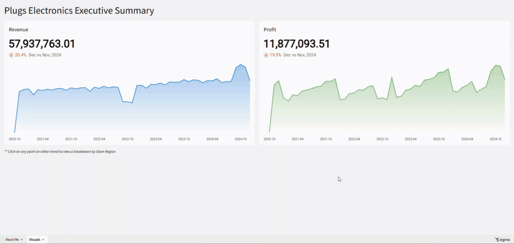
2024 Week 9 | Sigma: Can you create Bar charts in this Pivot Table?

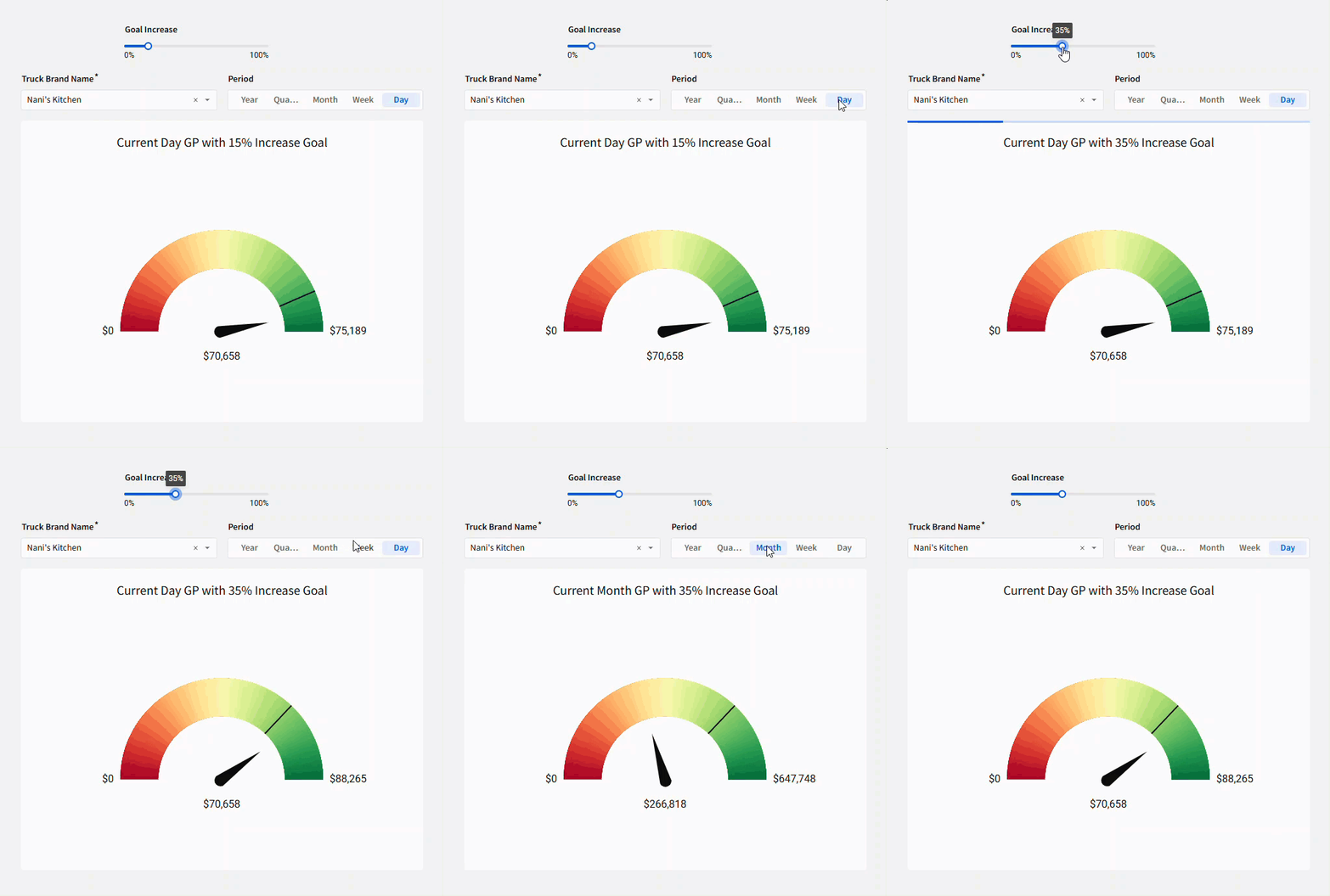
Introduction This week have a guest author! Tausif Kazi is an expert in data visualization who is experienced in several platforms such as Sigma, Power BI, Tableau, and Snowflake.   Connect with Tausif:Linkedin: https://www.linkedin.com/in/tausifkazi/Twitter: https://twitter.com/VizByTK This challenge will cover how to create a Bar chart in Pivot Tables. This will help your users quickly understand the …

2024 Week 9 | Sigma: Can you create Bar charts in this Pivot Table? Read More

2024 Week 09 – Formulate Select and Navigate Dashboard

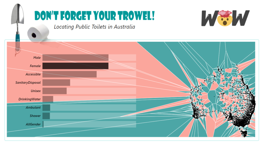
Introduction Almost the end of February! Time flies fast! – And another WoW Challenge is here!!  This week is based on the same dataset and maps we had as a challenge during Week 4! The changes are adding one KPI, and one top 5 chart to the existing dashboard. Then add an Interaction (not binding) …

2024 Week 09 – Formulate Select and Navigate Dashboard Read More

2024 Week 9 | Power BI: Use Bar Overlap and Border Formatting

Introduction Welcome to this week’s Workout Wednesday. This week, we are taking advantage of some new features in the February 2024 release of Power BI Desktop. We can now have bars overlap in a clustered column chart and hide the inner borders in a stacked column chart. This week, we’ll use those formatting options to …

2024 Week 9 | Power BI: Use Bar Overlap and Border Formatting Read More

2024 Week 8 | Power BI: Build a Pipeline Funnel with Core Visuals

Introduction This week’s challenge we will be utilising visual calculations (this will require turning Visual Calculations on in Preview settings of February 2024 Desktop) and some additional new data label formatting options to create a pipeline funnel with out of the box visuals in Power BI. Visual calculations can be handy for visual specifiic calculations …

2024 Week 8 | Power BI: Build a Pipeline Funnel with Core Visuals Read More

2024 Week 8 | Sigma: Can you customize this tooltip?

Introduction A good data visualization strikes a balance between enough and too much information. For this week’s challenge, we will explore a couple of ways to customize tooltips. Customizing these can help provide users with meaningful information without overwhelming or crowding the visuals. I’m sure you’ll knock this one out of the park! Need access …

2024 Week 8 | Sigma: Can you customize this tooltip? Read More

#WOW2024 | Week 8 | Can you create an area chart tile map?

Introduction While reviewing recent work I’ve done in preparation for this week’s challenge, I came across a tile map with individual area charts by state that we use to monitor subscriptions, and thought it would be a fun one. As I dug into it, I realized it was inspired by Luke’s challenge in 2020 Week …

#WOW2024 | Week 8 | Can you create an area chart tile map? Read More

A Line Graph that changes between different date granularities

2024 Week 7 | Sigma: Can you recreate this Line Graph?

Introduction Welcome to Week Seven! This week, you’re going to create a line graph that can change its date granularity.  With a dynamic x-axis, this graph allows users to view trends at the level that makes sense for their current needs, without duplicating work. Also in this challenge, you’re going to learn how to show …

2024 Week 7 | Sigma: Can you recreate this Line Graph? Read More

Scroll to Top