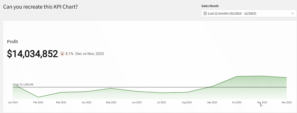
2024 Week 5 | Sigma: Can you use dynamic text to report on KPIs?
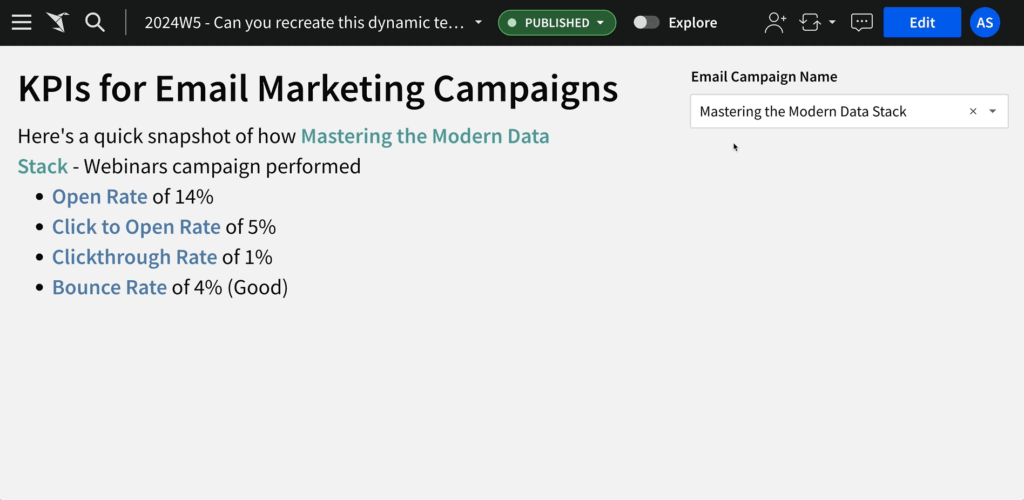
Introduction Welcome to Week Five 🖐🏼 This week’s challenge is all about crafting an impactful headline. Whether it’s for the top of a dashboard or a key component of a presentation, the goal is to effectively highlight KPI performance of email campaigns through Hubspot. We’ll be utilizing Sigma’s dynamic text feature, drawing data directly from …
2024 Week 5 | Sigma: Can you use dynamic text to report on KPIs? Read More »