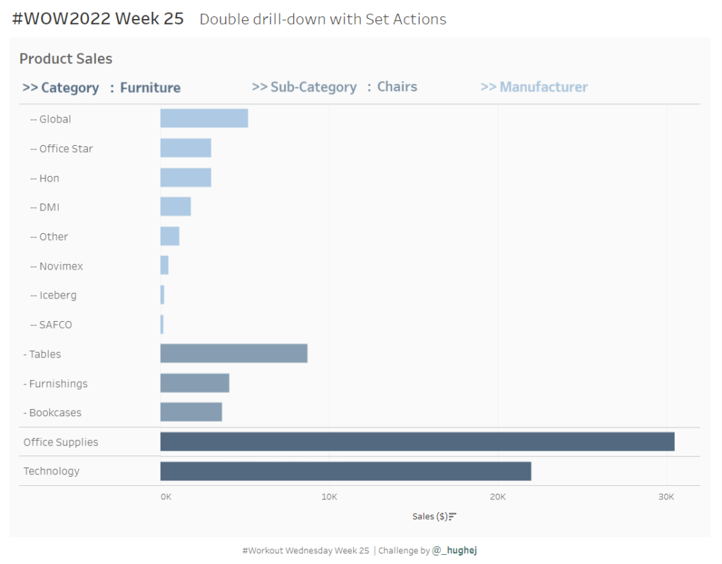
2021 W38 | Tableau: How Can You Quickly Tell the Net Change Between Two Dates? (Community Challenge)

Introduction This week’s challenge is by Will Perkins About Will: Will has been actively involved with the external Tableau Community over the past 3 years. He has spoken at Tableau Fringe Fests, multiple TUGs, and mentored various individuals in one-off questions or more long term instances. At work, he has helped build an internal global …

2021 W38 | Tableau: How Can You Quickly Tell the Net Change Between Two Dates? (Community Challenge) Read More »

2021 Week 37 | Power BI: What-If Parameters

Introduction This week’s Workout Wednesday we will be using “What-If” Parameters to show Top N values based on user selection. What-If Parameters can allow your audience to have more self-service interaction with the dashboard. For this challenge, we will be visualizing the Top N Movies based on Worldwide sales, as well as leveraging conditional formatting to …

2021 Week 37 | Power BI: What-If Parameters Read More »

2021 Week 35 – How Much Change Has Occurred?

Introduction September 2021 is community month. Every year since 2018 we’ve invited individuals to share challenges with the community. This year we’ll have some amazing challenges from the Tableau and Power BI communities. But before we get there I’ll be sharing the following challenge: We’ll make a modified dot plot comparing sales for the current …

2021 Week 35 – How Much Change Has Occurred? Read More »

Workout Wednesday Power BI Week 34 2021

2021 Week 34 | Power BI: Building a Network Diagram

Introduction This week’s Workout Wednesday we will be creating a network diagram in Power BI.  Network diagrams are useful to explore relational datasets and are often used to visualize such things as project interdependencies, and social networks.  For this challenge we will be visualizing the interconnections of actors/characters of the Love Actually movie by number …

2021 Week 34 | Power BI: Building a Network Diagram Read More »

Power BI Magic Tables

2021 Week 33 | Power BI: Create Magic Tables

Introduction Tables, tables, tables…Love them, or hate them, we, Power BI developers, can’t live without them. Our users too. However, who says that we must provide our users with “normal”, old-fashioned tables? This week, with little creativity and magic, we will push table visual experience to a whole new level! The report below shows data about …

2021 Week 33 | Power BI: Create Magic Tables Read More »

2021 Week 33 | Tableau: Can you create a moving average chart with a focus on selected subcategories?

Introduction After the results of the community survey, the top ranked feature was Table Calculations, so guess what? Let’s do some Table Calculations! Click to open in Tableau Public Requirements Dashboard 600 x 600 ONE SHEET Table Calcs ONLY! Create a parameter controlled moving average by month for sales. Create a way to multi-select subcategories …

2021 Week 33 | Tableau: Can you create a moving average chart with a focus on selected subcategories? Read More »