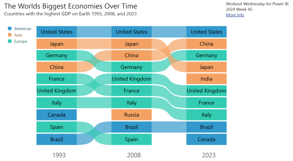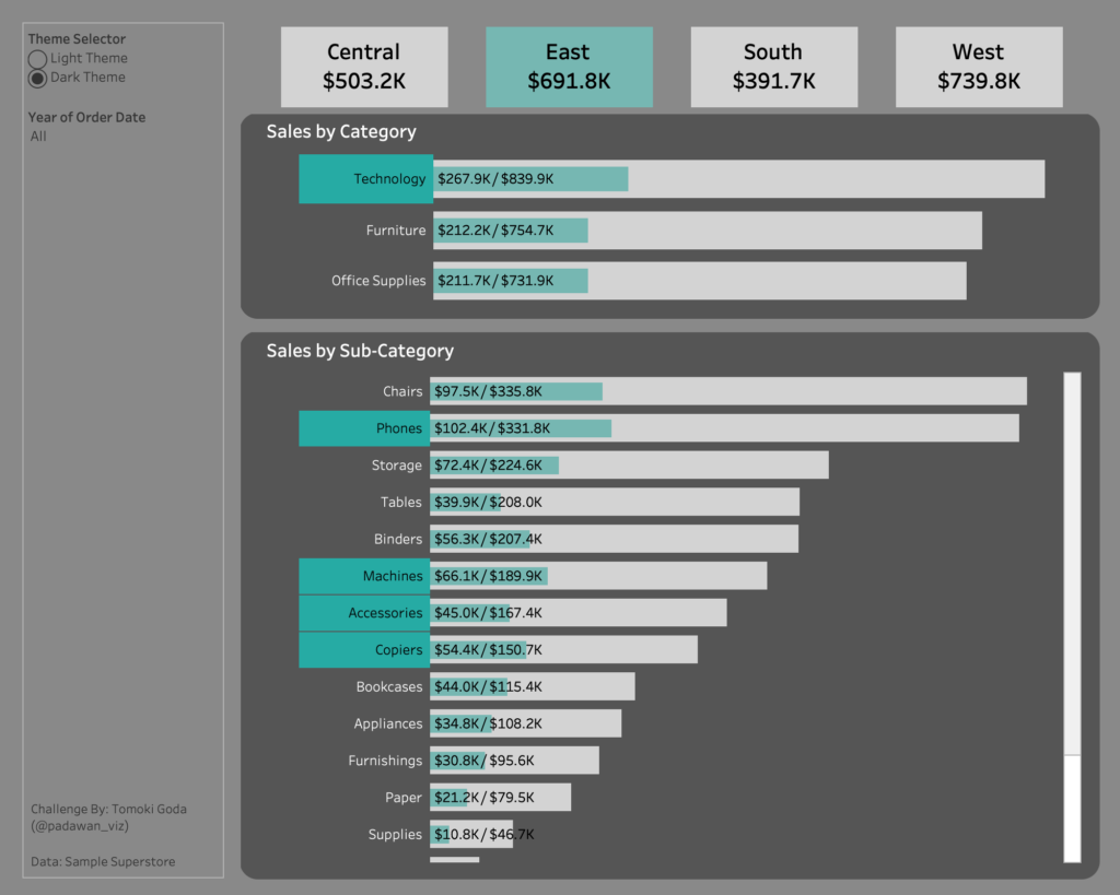
#WOW2024 | Week 45 | Can You Switch A Dashboard Theme?
Introduction This month we hold Global Community Weeks! We’ll feature guest coaches from around the world in the coming weeks. I’m excited and honored to introduce Tomoki Goda (@padawan_viz) from Japan! Tomoki is relatively new to Tableau but is strongly passionate about Tableau community activities. He is one of the co-hosts of a popular Japan …
#WOW2024 | Week 45 | Can You Switch A Dashboard Theme? Read More »