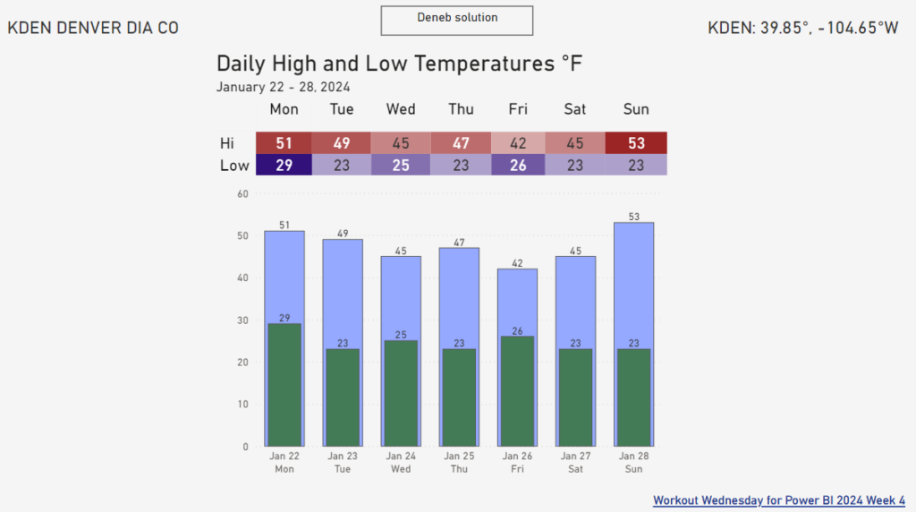
Beginner

The new button slicer used to filter a scatterplot

2023 Week 47 | Power BI: Use the New Button Slicer

Introduction The November 2023 release of Power BI Desktop includes the new button slicer visual. This visual can currently be used as a replacement for the original slicer visual when using tiles. There are more enhancements to come, but we already have a lot more control over the formatting of the slicer. We can add …

2023 Week 47 | Power BI: Use the New Button Slicer Read More »

2023 Week 42 | Take Control of Your Experience with Actions Menus

Introduction This week we are exploring a feature – Action Menu – which allows your users as they gain insights into your business from your dashboard, to perform actions on underlying Salesforce records. Allowing them to invoke a Salesforce action on the record directly from CRM Analytics. Requirements Create a new dataset or use an …

2023 Week 42 | Take Control of Your Experience with Actions Menus Read More »

2023 Week 38 | Enhanced Single-Click Interactions

Introduction Hello and welcome to week 38 of our CRM Analytics WoW challenges! This week we are exploring Single-Click Interactions through Dashboard Widgets! This feature allows you to create a curated journey for your users turning a static dashboard into a dynamic navigation experience that progressively reveals more details. The teams at Salesforce CRM Analytics …

2023 Week 38 | Enhanced Single-Click Interactions Read More »

2023 Week 34 | Power BI: Use core visuals with dynamic titles

Introduction Welcome back to Workout Wednesday! This week we’re building some basic visuals and use dynamic titles to visualize gas prices in the Rocky Mountain Region of the US (where I live!) over the past 3 years from the U.S. Energy Information Administration. Be sure you’re using the June 2023 version of Power BI desktop or later …

2023 Week 34 | Power BI: Use core visuals with dynamic titles Read More »

Style Guide App

2023 Week 34 | User Experience, Design & Templates

Introduction This week we are exploring user experience and design for CRM Analytics dashboards. Design foundations are the key visual elements to create a consistent interface. This includes guidance on color, type scale and fundamental navigation patterns. Using the Design Style Guide template app gives you a starting point for consistent and best practice design …

2023 Week 34 | User Experience, Design & Templates Read More »