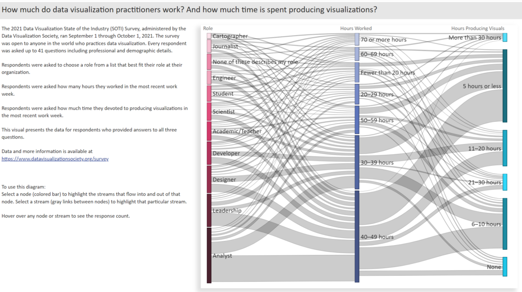
2022 Week 08 | Power BI: Can you make a Gantt Chart?
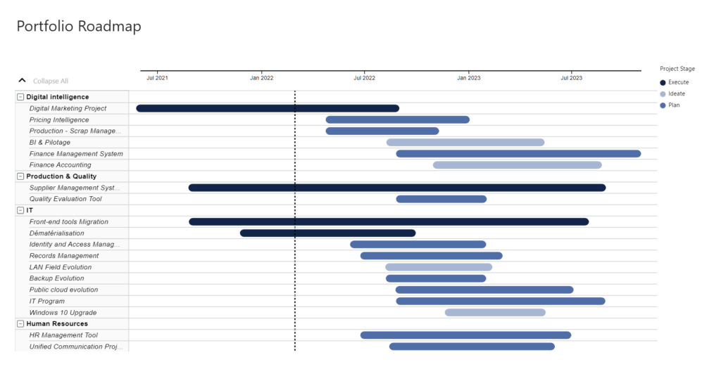
Introduction This week we are creating Gantt Charts in Power BI. It is not required to do all 4 variations, choose one of the options that interests you the most. Each option increases in time and/or experience level. Requirements QUICK MODE Import data Import the Microsoft Gantt Chart from AppSource Place Project Category in the …
2022 Week 08 | Power BI: Can you make a Gantt Chart? Read More »