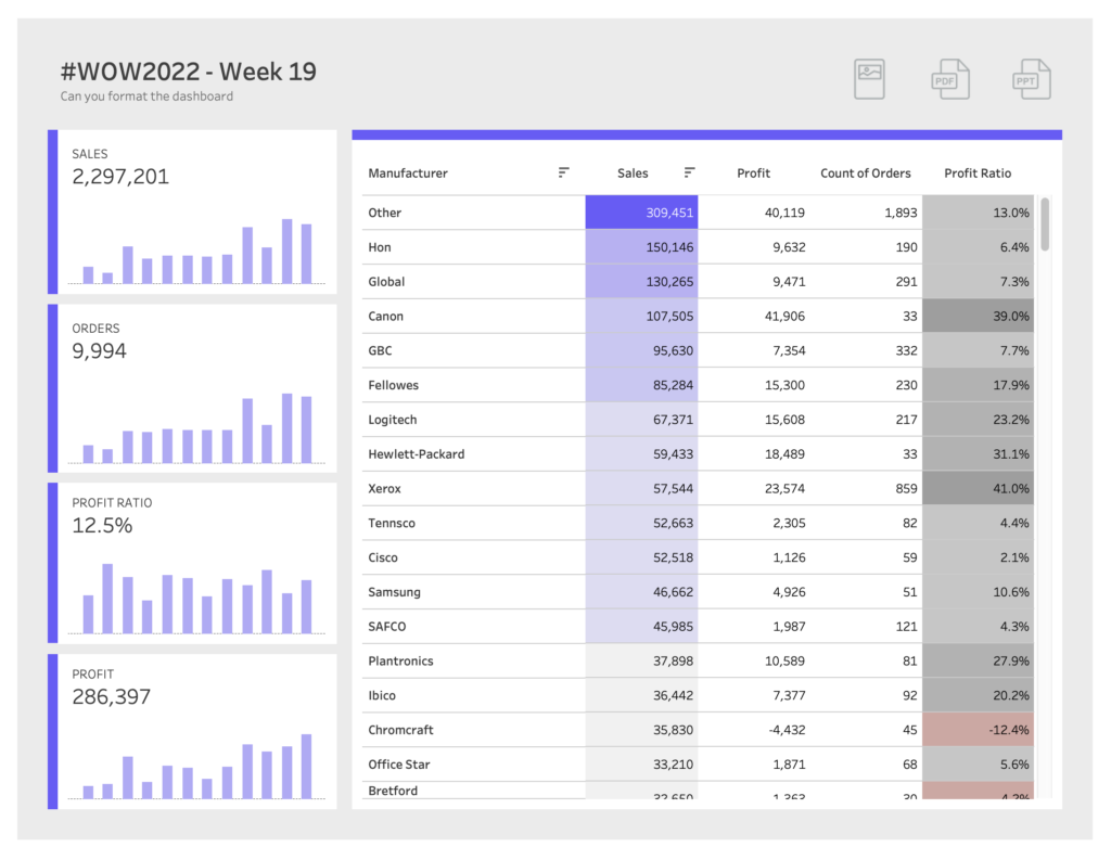
#WOW2022 Week 31: Let’s build a KPI dashboard
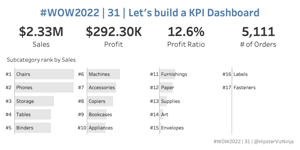
Introduction Who doesn’t love a good KPI dashbaord? This one is fairly simple and straightforward. Let’s look at four simple metrics and see how each subcategory ranks within a selected metric. With this challenge – MIND THE NUMBER FORMATTING 🙂 Click to open in Tableau Public Requirements Dashboard Size: 700 x 350 2 sheets Display …