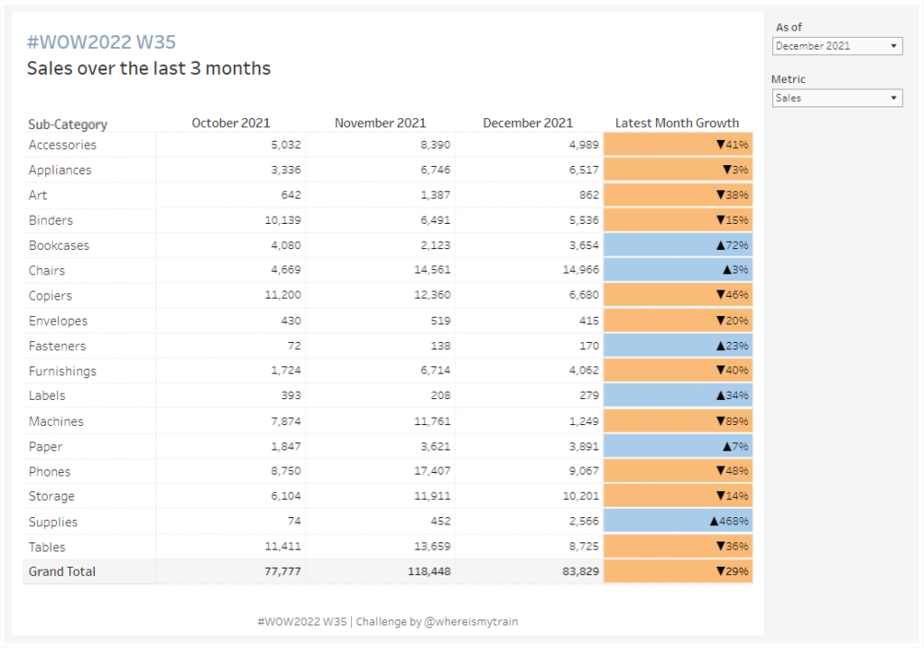
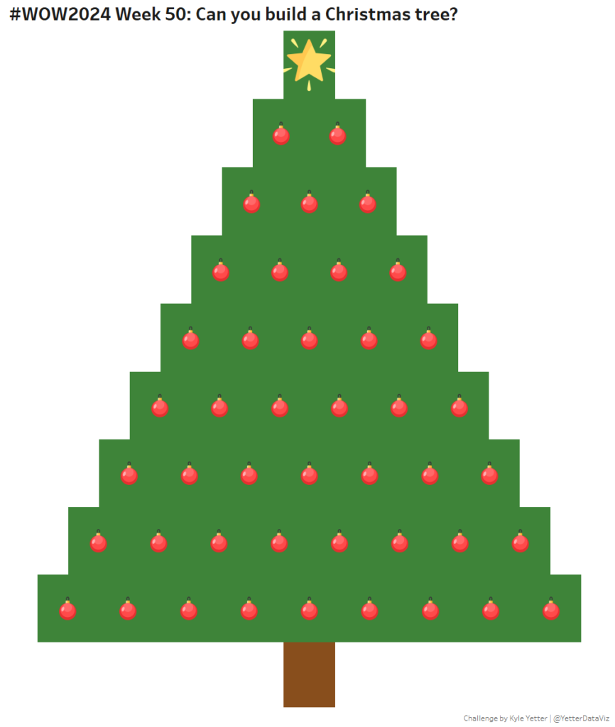
formatting

Overlapping Histogram

2024 Week 13 | Power BI: Overlapping Histogram

Introduction In this week’s challenge we are creating an Overlay Histogram. An overlay histogram utilises overlapping columns or bars to compare two populations. In this case, we are utilising the speed dating data from a previous challenge to compare male and female differences in dating preferences. Requirements Obtain the data from the Workout Wednesday 2022 …

2024 Week 13 | Power BI: Overlapping Histogram Read More

2024 Week 8 | Power BI: Build a Pipeline Funnel with Core Visuals

Introduction This week’s challenge we will be utilising visual calculations (this will require turning Visual Calculations on in Preview settings of February 2024 Desktop) and some additional new data label formatting options to create a pipeline funnel with out of the box visuals in Power BI. Visual calculations can be handy for visual specifiic calculations …

2024 Week 8 | Power BI: Build a Pipeline Funnel with Core Visuals Read More

#WOW2022 W43: Advanced Formatting by Jeremy Anderson

Introduction Conditional formatting is a robust feature in Power BI that you can leverage to help users gain insights. Typically, we see conditional formatting applied to the table and matrix visuals. For example, you might apply a background color, font color, or icons to the values based on a set of rules.  Conditional formatting of …

#WOW2022 W43: Advanced Formatting by Jeremy Anderson Read More

2022 Week 36 | Power BI: Split Violin Plot and HTML

Introduction Another PlotlyJS visual this week – creating a split violin plot. We’ll be comparing male and female dating preferences collected from speed dating events between 2002-2004. EXTRA CREDIT – For those with a little more time on their hands, an extended workout challenge is included; conduct your own data analysis and create a data …

2022 Week 36 | Power BI: Split Violin Plot and HTML Read More

#WOW2022 | Week 35 | Conditional Table Formatting with Dynamic Headers

Introduction This week’s challenge is brought to you by a guest coach, my colleague Valerija Kirjackaja, who came across this problem at work and created a beautiful solution for it. How often do you get asked to re-create Excel tables in Tableau? On a scale from 1 to ‘I am never doing this again’ – …

#WOW2022 | Week 35 | Conditional Table Formatting with Dynamic Headers Read More

#WOW2022 Week 31: Let’s build a KPI dashboard

Introduction Who doesn’t love a good KPI dashbaord? This one is fairly simple and straightforward. Let’s look at four simple metrics and see how each subcategory ranks within a selected metric. With this challenge – MIND THE NUMBER FORMATTING 🙂 Click to open in Tableau Public Requirements Dashboard Size: 700 x 350 2 sheets Display …

#WOW2022 Week 31: Let’s build a KPI dashboard Read More

2022 Week 31 | Power BI: Connected Scatter with PlotlyJS

Introduction This week for Workout Wednesday we are getting familiar with the PlotlyJS visual by creating traces and annotations for a connected scatterplot.   Connected scatterplots are a cross between a scatterplot and a lineplot whereby two numeric variables are connected by a third ordered variable (often time).   The below graph created with the …

2022 Week 31 | Power BI: Connected Scatter with PlotlyJS Read More

Scroll to Top