Intermediate

Area charts with layered series

2023 Week 02 | Power BI: Create layered line/area charts with labels and annotations

Introduction For our second week of Workout Wednesday 2023 Power BI Edition, we are taking inspiration from a recent Washington Post interactive story titled “See just how bad a year it was for your retirement account — and why”. The article looks at the closing price of the S&P 500, comparing the value at the …

2023 Week 02 | Power BI: Create layered line/area charts with labels and annotations Read More

2023 Week 01 | Power BI: Use DAX to control visual display

Introduction Welcome to Workout Wednesday 2023, Power BI edition! If this is your first time joining us, we’re happy you’re here. The goal of this initiative is to help you build your Power BI skills. We provide the data and the instructions, and you build the visuals! We hope you have fun and learn a new …

2023 Week 01 | Power BI: Use DAX to control visual display Read More

2022 Week 48 | Power BI: Conditional SVG Measures

Introduction While we looked at SVG measures in a matrix in week 20, we are taking a different approach this week. SVG measures can be used in other visuals, and they can be designed to include links.   In the below Power BI report, I’ve got 4 visuals populated by SVG measures. Initially, all 4 visuals show …

2022 Week 48 | Power BI: Conditional SVG Measures Read More

2022 Week 47 | Power BI: WoW on Twitter

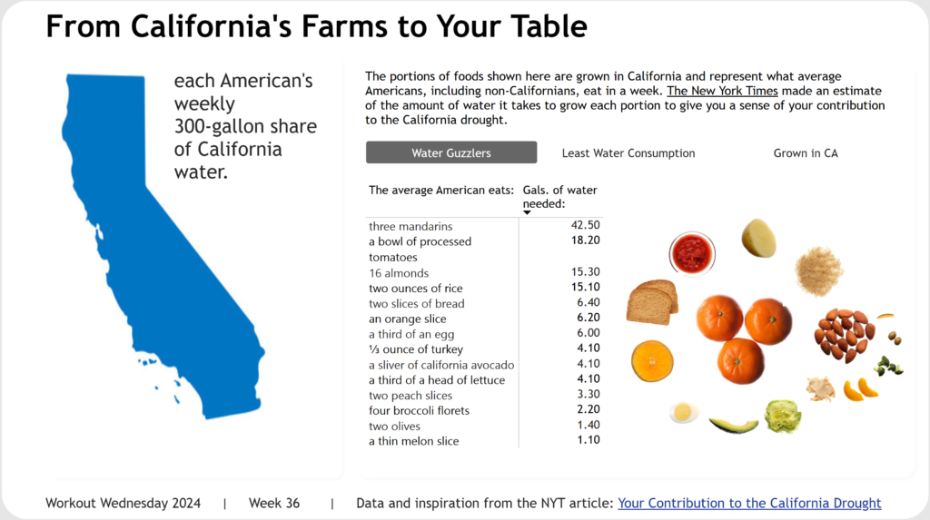
Introduction Welcome back to Workout Wednesday! This week we’re going to visualize Twitter data using Twitter’s API to retrieve tweets that have been made about Workout Wednesday! You have complete creative license to visualize the data in any way that you see fit. If you have a Power BI premium license, I encourage you to …

2022 Week 47 | Power BI: WoW on Twitter Read More

2022 Week 46 | Power BI: My Second Deneb

Introduction During week 42’s community month challenge brought to us by Thys van der Westhuizen – Thys built on my week 37 challenge – My First Deneb. For that week’s challenge I built out three basic bar charts using Deneb visuals, and subsequently, Thys continued to build a few more amazing visuals in his challenge. …

2022 Week 46 | Power BI: My Second Deneb Read More

#WOW2022 W43: Advanced Formatting by Jeremy Anderson

Introduction Conditional formatting is a robust feature in Power BI that you can leverage to help users gain insights. Typically, we see conditional formatting applied to the table and matrix visuals. For example, you might apply a background color, font color, or icons to the values based on a set of rules.  Conditional formatting of …

#WOW2022 W43: Advanced Formatting by Jeremy Anderson Read More

2022 Week 42 | Power BI: Deneb Custom Visuals

Introduction I was recently asked by Rob Saunders if I would like to assist with a #WorkoutWednesday PowerBI challenge. To be seen in the same crowd with Kerry, Shannon, Meagan, Spencer, and Rob is such an honour. Cue the onset of imposter syndrome. After that feeling passed, Rob and I decided to continue with the …

2022 Week 42 | Power BI: Deneb Custom Visuals Read More

2022 Week 41 | Power BI: Likert Scale and Net Promoter Score (NPS)

Introduction This month we are getting the #WorkoutWednesday community involved in the challenges with Community Month. Each week we’re going to have an outstanding member of our community present a challenge. This week we have Gerard Duggan from sunny down under (Australia). Gerard rocks the Power BI community showing us how to present outstanding analysis …

2022 Week 41 | Power BI: Likert Scale and Net Promoter Score (NPS) Read More

Error Bars showing standard deviation from the average

2022 Week 39 | Power BI: Use error bars to show statistical ranges

Introduction We first looked at error bars in week 28. But error bars have several formatting features and can be used in several types of visuals. This week, we are going to use error bars to show a dynamically populated range around an average.  Requirements Calculate the average height and standard deviation for the heights. …

2022 Week 39 | Power BI: Use error bars to show statistical ranges Read More

Scroll to Top