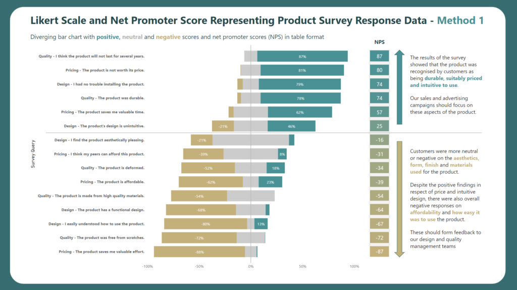
Intermediate

2022 W16 | Power BI : Quadrant Plot with Jitter

Introduction Your challenge this week is to create a Quadrant Plot. It should include different colors in each quadrant and the points should be jittered to try and reduce data overlap. Please note, that it is not expected to create the quadrants, quadrant lines, and color change by selecting any individual data point (if someone figures out how …

2022 W16 | Power BI : Quadrant Plot with Jitter Read More

2022 Week 14 | Power BI: Create an achromatic report

Introduction April is colour month for Power BI Workout Wednesday 2022. First up we are going to try our hand at creating reports WITHOUT hue. Using a file from a previous challenge, can you create an achromatic report that uses contrast and lightness effectively? There will be some creative freedom involved in this challenge, no …

2022 Week 14 | Power BI: Create an achromatic report Read More

2022 Week 12 | Power BI: Build a Slicer Panel

Introduction Welcome back to Workout Wednesday – we’re glad you’re here! This week, we’re continuing on with our project management theme. We’re tracking project progress using data generated from Microsoft Planner. Using Power BI with Planner (as opposed to using the inbuilt charts) enables us to both customize visuals and to view more than one plan at …

2022 Week 12 | Power BI: Build a Slicer Panel Read More

2022 Week 10 | Power BI: Risk Matrix

Introduction Your challenge this week is to create a Risk Matrix with some supporting visuals.  We decided to keep the project management theme going this week.  If you did not do last week’s challenge, I highly recommend you checkout Kerry’s Gantt Chart challenge, here.   For this challenge, I looked at a lot of possible ways to create a …

2022 Week 10 | Power BI: Risk Matrix Read More

Power BI Parallel Sets

2022 Week 07 | Power BI: Parallel Sets

Introduction Welcome to week 7 of Workout Wednesday for Power BI 2022. We are again using the Data Visualization Society‘s annual State of the Industry survey results.  This week we are looking at how we can visualize parallel sets. Although this may not be a visual that we use often, it can be very useful for multivariate analysis. …

2022 Week 07 | Power BI: Parallel Sets Read More

Line chart with vertical reference line

2022 Week 03 | Power BI: Can you visualize percent difference from a selected date?

Introduction This week we are taking a page from the Tableau team and looking at how a metric has changed from the value at a specified reference date.  Requirements Create a line chart showing percent change of the close price from a selected date.  Use a slicer or other visual to allow users to change …

2022 Week 03 | Power BI: Can you visualize percent difference from a selected date? Read More

2021 Week 48 | Power BI: Create a Waffle Chart

Introduction This week we are continuing our design theme and using the waffle chart custom visual.  Waffle charts show progress toward a whole or a target percentage, and can be used as an alternative to bar and/or pie charts. The Waffle Chart custom visual in Power BI allows us to customize the icon (here we …

2021 Week 48 | Power BI: Create a Waffle Chart Read More

2021 Week 45 | Power BI: Create a Custom Navigation Experience

Introduction We hope that you had a lot of fun last week re-designing Spencer’s report! This week we’re also focusing on design and creating a custom navigation experience using bookmarks and buttons.  I am looking for a new place to live and stumbled upon the 2017 State of American Well-Being report. This PDF report details community well-being …

2021 Week 45 | Power BI: Create a Custom Navigation Experience Read More

Power BI report showing Dutch Bros coffee locations within a radius of a selected city

2021 Week 43 | Power BI: Maps with a Distance Radius

Introduction It’s the final week of mapping month! This week we are plotting points on a map within a selected radius. It’s common to want to see locations, such as stores or restaurants that are nearby to a selected location. This week we are exploring one way to do that in Power BI. This involves …

2021 Week 43 | Power BI: Maps with a Distance Radius Read More

Scroll to Top