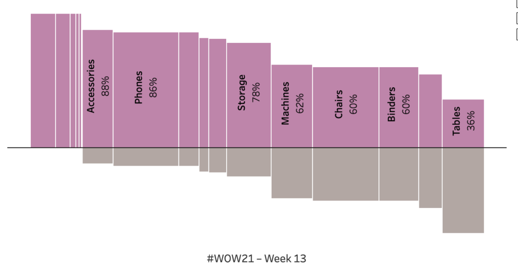
2021 Week 13 | Tableau: What percentage of sub-orders are profitable?
Introduction The goal is a modified mekko chart. My guess is you will need LODs to solve but it is 100% possible with table calculations. Click to open in Tableau Public Requirements Dashboard Size: 800px by 400 px Set the bar height to be percent profitable. The level of analysis should be at the sub-category …
2021 Week 13 | Tableau: What percentage of sub-orders are profitable? Read More