Year: 2024

2024 Week 44 | Power BI: Community Appreciation – SQLJason

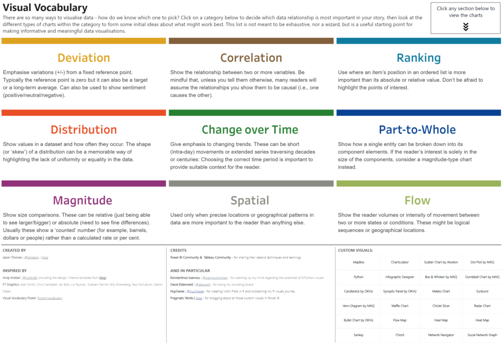
Introduction Welcome back to Workout Wednesday! I’m nearing the end of my 4th year contributing to this incredible initiative, and quite honestly, I am running out of ideas! This week I went to the Fabric Data Stories Gallery to look at reports that have inspired me, and I was reminded of this incredible report that Jason Thomas …

2024 Week 44 | Power BI: Community Appreciation – SQLJason Read More

2024 Week 44 | Sigma: How likely is a holiday birthday?

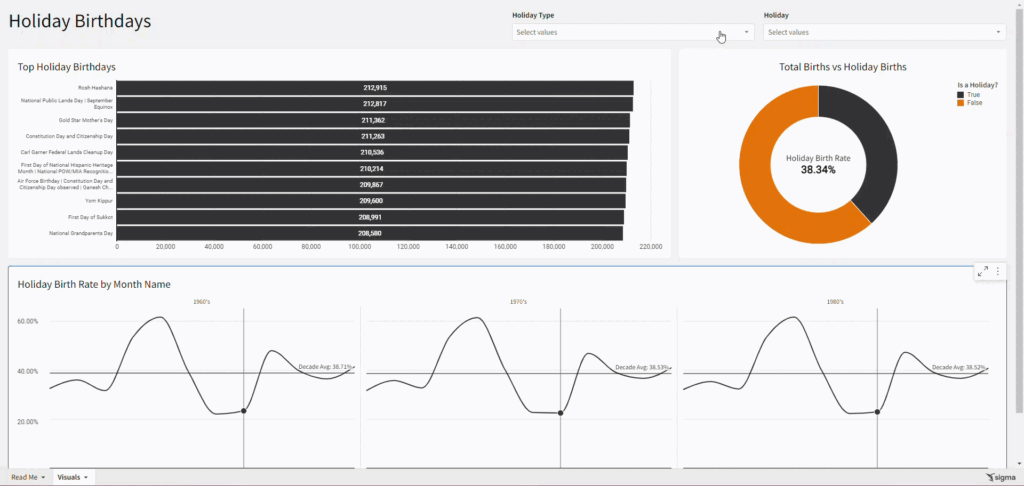
Introduction Welcome to Week Forty-Four! This week, I wanted to have a little fun because not only is Thursday Halloween, but it’s also my birthday.  As someone who loves data and shares her birthday with a holiday, I am interested to see just how common holiday birthdays are. In this challenge, you will use a couple …

2024 Week 44 | Sigma: How likely is a holiday birthday? Read More

#WOW2024 Week 44 | Can you join two spatial files to find intersection?

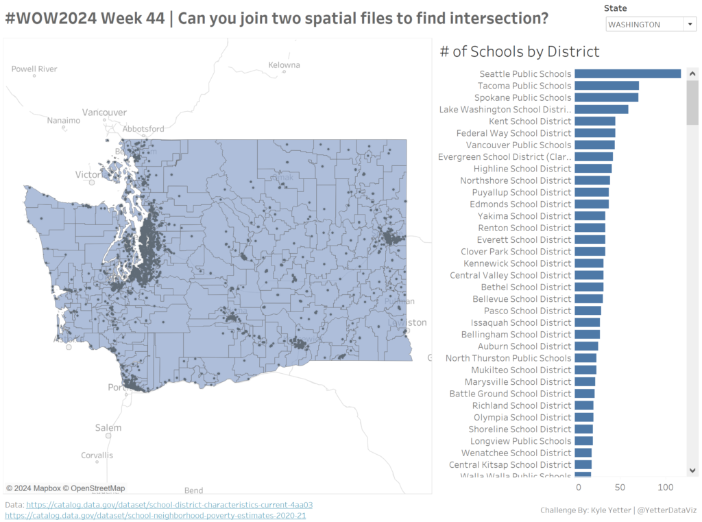
Introduction This week we’re working with some spatial data. I have a project at work where we’re finding the number of records (points) that are within a geospatial area (polygon), so we’ll try that this week. We’ll use public school district boundaries (polygons) and school locations (points) to find the number of schools in each …

#WOW2024 Week 44 | Can you join two spatial files to find intersection? Read More

Chart Makeover

2024 Week 43 | Power BI: Line Chart Makeover

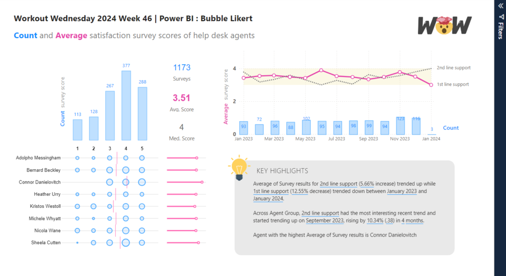
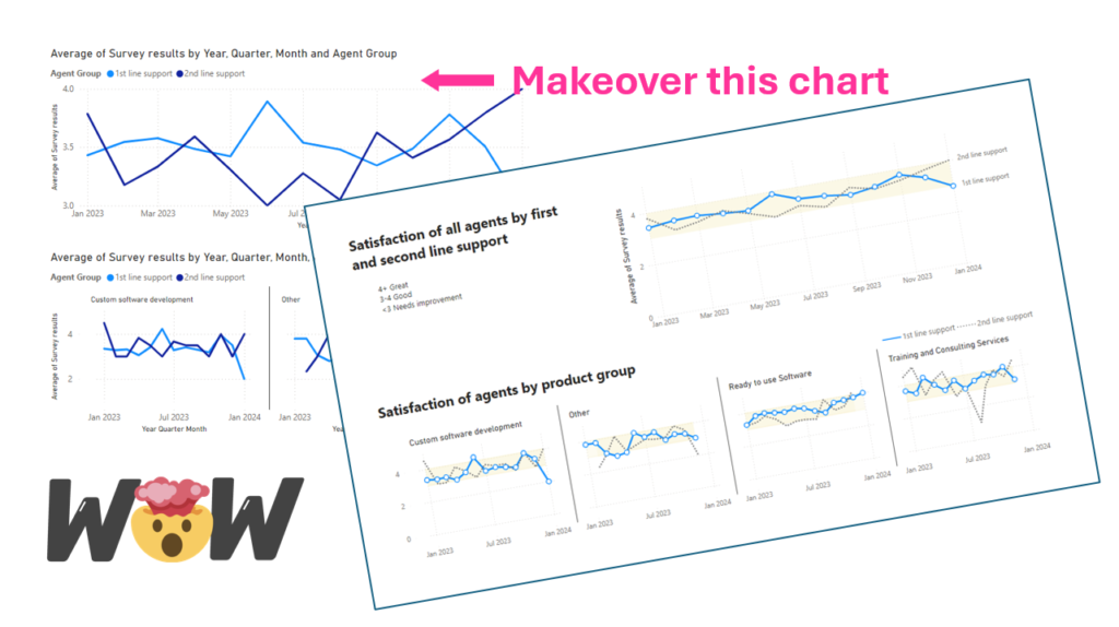
Introduction This week’s challenge is to test your data storytelling skills and enhance a line chart of service desk survey responses to focus attention on important aspects. No solution file provided this week. Requirements Obtain the data Model Data Create a chart showing survey response trends Dataset This week’s dataset is downloadable from Github https://github.com/kolky001/Workout-Wednesday-2023/blob/main/Help%20Desk.xlsx  …

2024 Week 43 | Power BI: Line Chart Makeover Read More

2024 Week 43 | Sigma: Can you create a segmented date control?

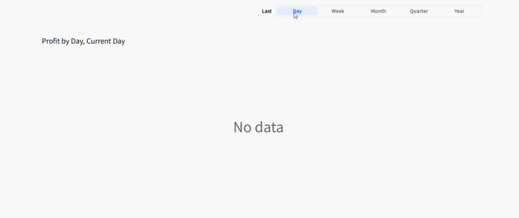
Introduction This week, I wanted to highlight Sigma’s actions once again, as we got a new update a last week: The ability to change date controls via actions! Pairing this new feature with the ‘Conditions’ beta feature in actions, we can create more user-friendly date filtering with much less hassle. Stay up to date on changes to …

2024 Week 43 | Sigma: Can you create a segmented date control? Read More

#WOW2024 W43: Can you show total sales and filtered sales in the same view?

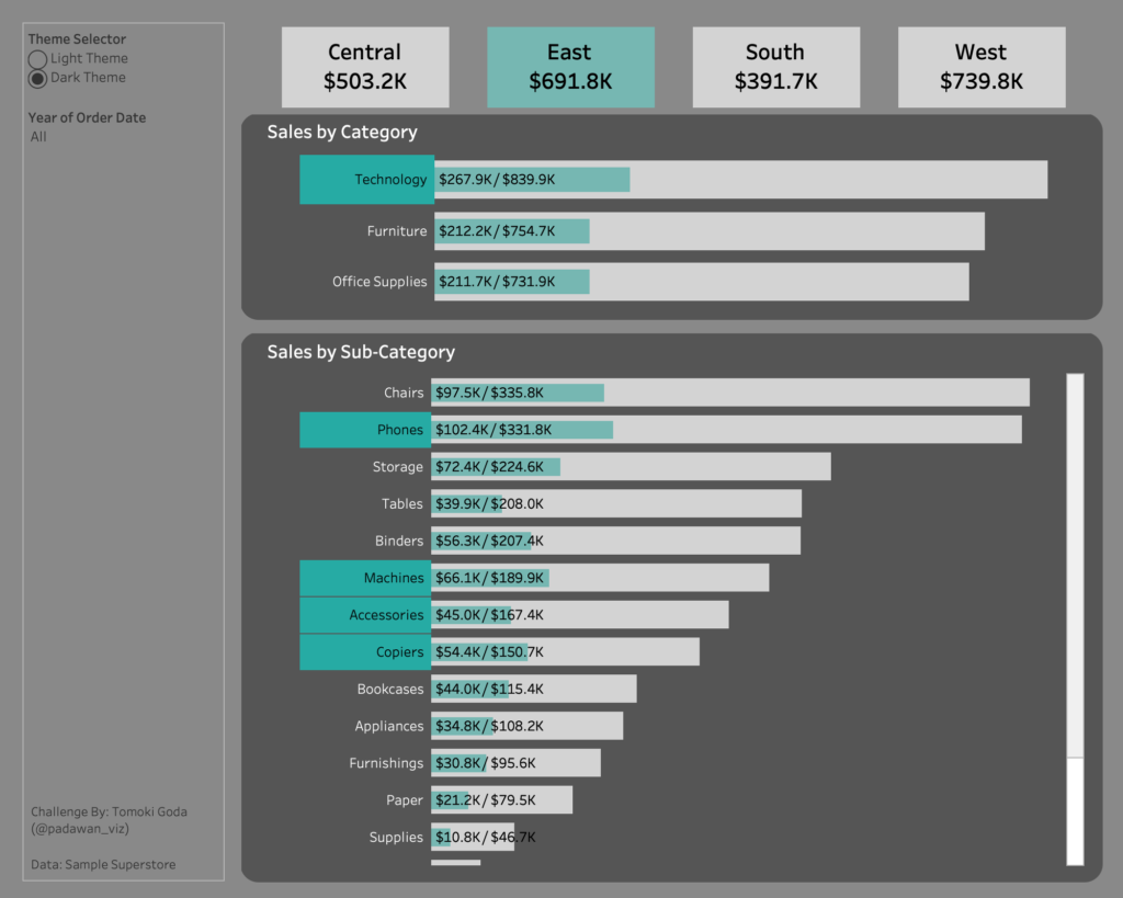
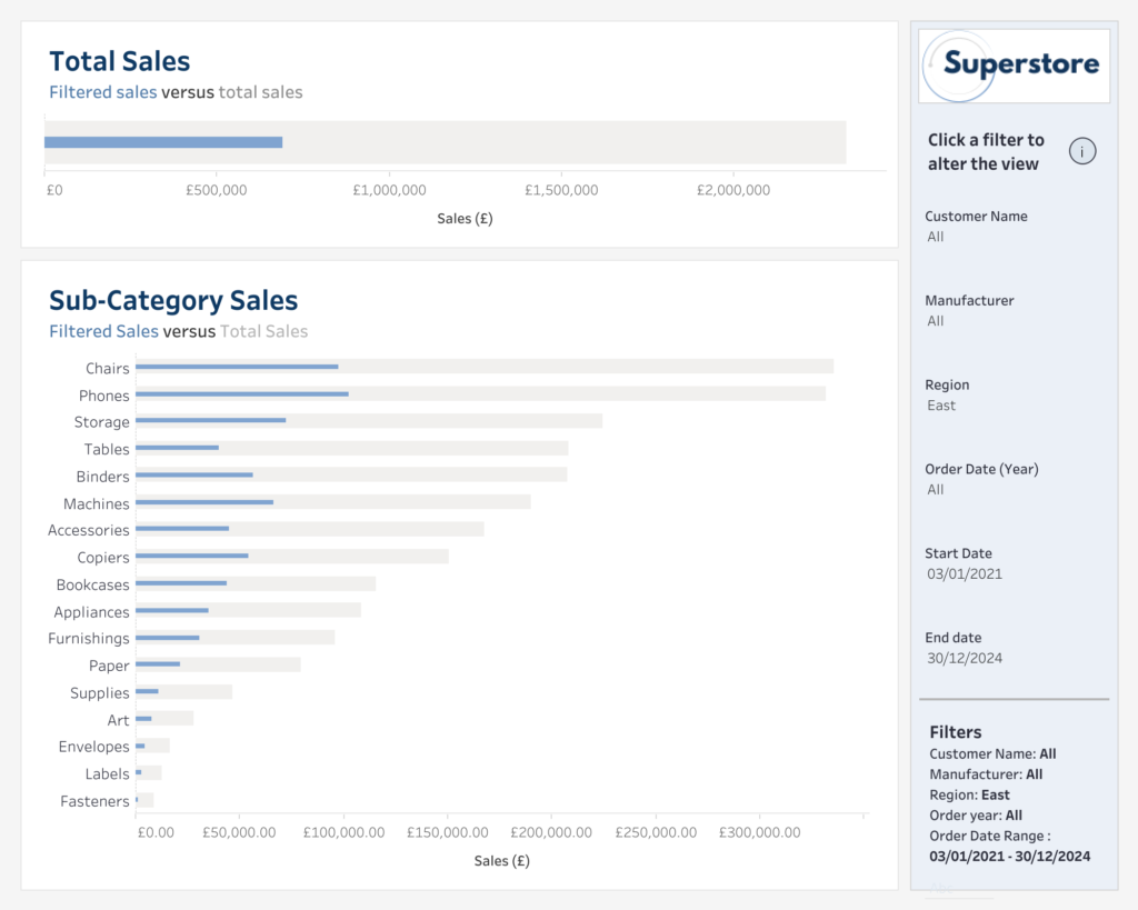
Introduction Hello #WOW enthusiasts, I’m Hannah, a data analyst consultant at The Information Lab. This week’s challenge is inspired by a client project I did recently, where I was trying to recreate a specific visual from a different software. I thought I could save you the headache if this kind of problem ever crossed your …

#WOW2024 W43: Can you show total sales and filtered sales in the same view? Read More

scatterplot

2024 Week 42 | Power BI: Scatter Plot Dynamic Colour Density

Introduction Scatterplots are one of the most useful visual chart types for data exploration. You can use them to identify relationships among two or more variables, find clusters of data, encode data in several ways for communicating insights etc. This is especially useful when working with large datasets. In this WoW challenge, our goal is to use marker …

2024 Week 42 | Power BI: Scatter Plot Dynamic Colour Density Read More

#WOW2024 | 42 | Let’s play with Table(au) Extensions!

Introduction  Hot out of the oven  Tableau 2024.3 is here! And with it comes SO MANY amazing new features including the topic for this challenge. Table Extensions!  That’s correct, you read that right. Tables are now “native” to Tableau. I used air quotes because it does require viz extensions to be enabled on your cloud/server …

#WOW2024 | 42 | Let’s play with Table(au) Extensions! Read More

2024 Week 41 | Power BI: Visualize a Drag Race with Animation

Introduction There are a few ways to visualize movement in Power BI. This week, we are visualizing race cars moving on a track. The example report below uses Deneb, but you could also complete this challenge by combining a custom visual and the Play Axis visual.  In the report below, once you click the Go …

2024 Week 41 | Power BI: Visualize a Drag Race with Animation Read More

Scroll to Top