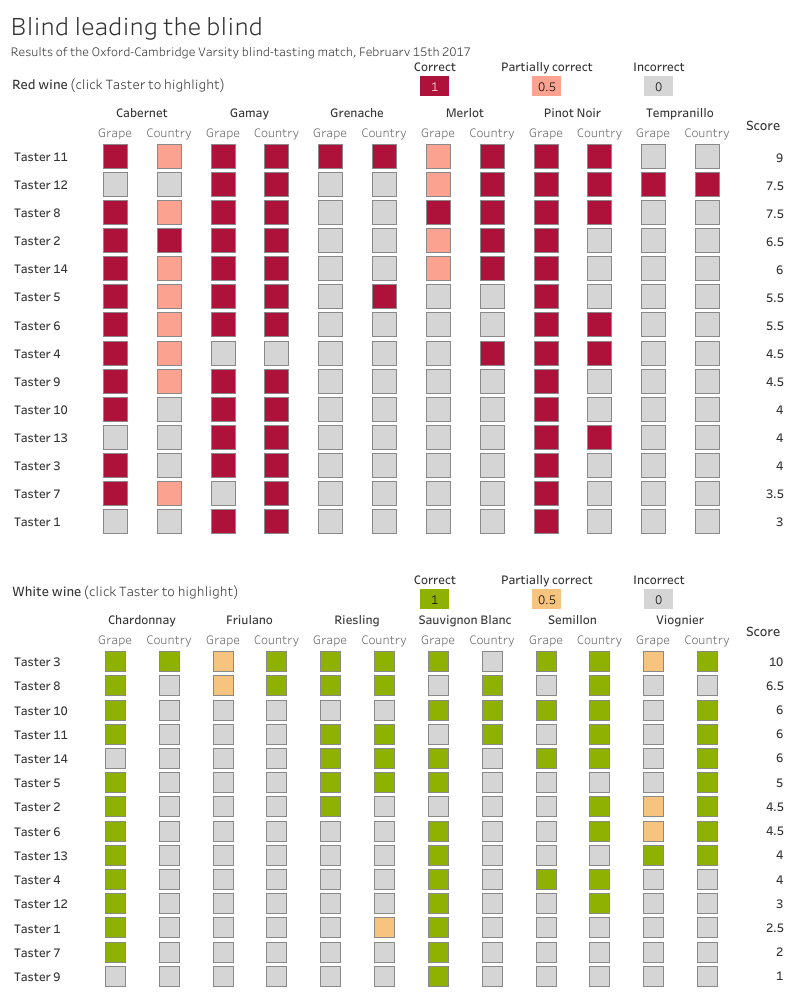
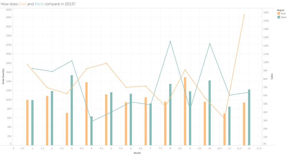
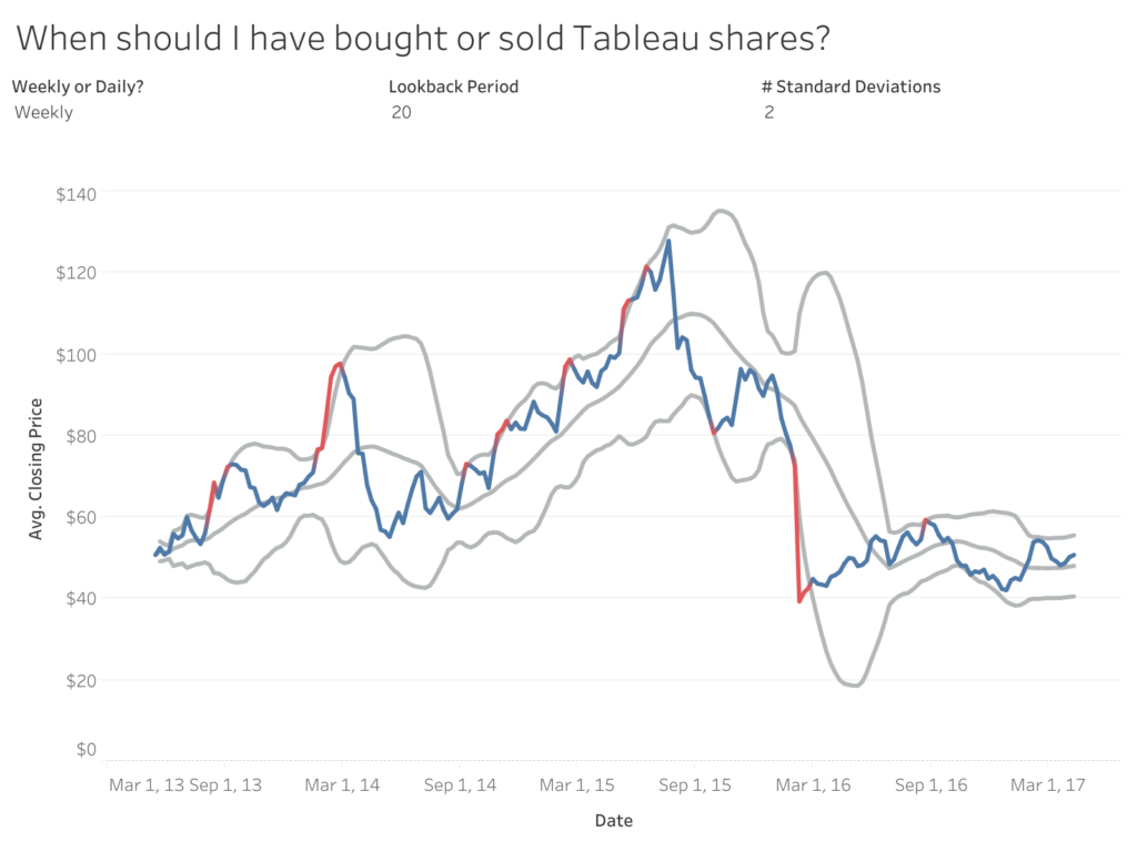
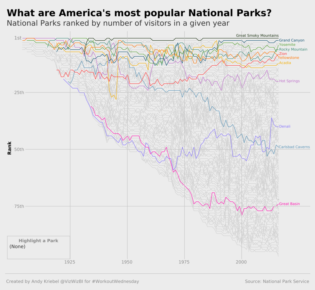
Sean Miller

#WOW2017 | 20 | Comparing Regions

Introduction EDITOR’S NOTE: This challenge was originally published on Emma Whyte’s Tableau blog which no longer exists. This challenge is republished here with the author’s permissions  This week’s challenge was given to me by Jeffrey Shaffer (Tableau Zen Master and co-author of the new Big Book of Dashboards). This was Jeffrey’s original challenge to me: I had a …

#WOW2017 | 20 | Comparing Regions Read More »

#WOW2017 | 12 | Can you highlight a treemap?

Introduction EDITOR’S NOTE: This challenge was originally published on Emma Whyte’s Tableau blog which no longer exists. This challenge is republished here with the author’s permissions   This week’s Workout Wednesday is inspired by Charlie who posted a question on how to achieve a highlighted treemap to The Information Lab Centre of Excellence: Challenge accepted! …

#WOW2017 | 12 | Can you highlight a treemap? Read More »

#WOW2017 | 08 | Marimekko Makeover

Introduction EDITOR’S NOTE: This challenge was originally published on Emma Whyte’s Tableau blog which no longer exists. This challenge is republished here with the author’s permissions This week I decided to re-create a makeover from Junk Charts in Tableau. This image originally appeared in The Wall Street Journal and shows the percentage of men and women employed …

#WOW2017 | 08 | Marimekko Makeover Read More »

#WOW2017 | 06 | UK Population Predictions

Introduction EDITOR’S NOTE: This challenge was originally published on Emma Whyte’s Tableau blog which no longer exists. This challenge is republished here with the author’s permissions   This week I’m looking at creating population ‘butterflies’ in Tableau. As an extra challenge I’ve also created them in a trellis chart format! I’m a big fan of …

#WOW2017 | 06 | UK Population Predictions Read More »

#WOW2017 | 04 | Common Baseline

Introduction EDITOR’S NOTE: This challenge was originally published on Emma Whyte’s Tableau blog which no longer exists. This challenge is republished here with the author’s permissions   This week I’m testing your knowledge of building common baseline charts in Tableau. These charts are really useful for aligning metrics that start at different time periods. I’m …

#WOW2017 | 04 | Common Baseline Read More »

#WOW2017 | 02 | How to show nothing when “All” is selected

Introduction EDITOR’S NOTE: This challenge was originally published on Emma Whyte’s Tableau blog which no longer exists. The challenge is republished here with the author’s permissions For week 2, I challenge you to recreate the dashboard below. The visualisations themselves are fairly simple. It’s the kick-ass text titles and logo switching that are the real challenge. …

#WOW2017 | 02 | How to show nothing when “All” is selected Read More »