Introduction
EDITOR’S NOTE: This challenge was originally published on Emma Whyte’s Tableau blog which no longer exists. This challenge is republished here with the author’s permissions
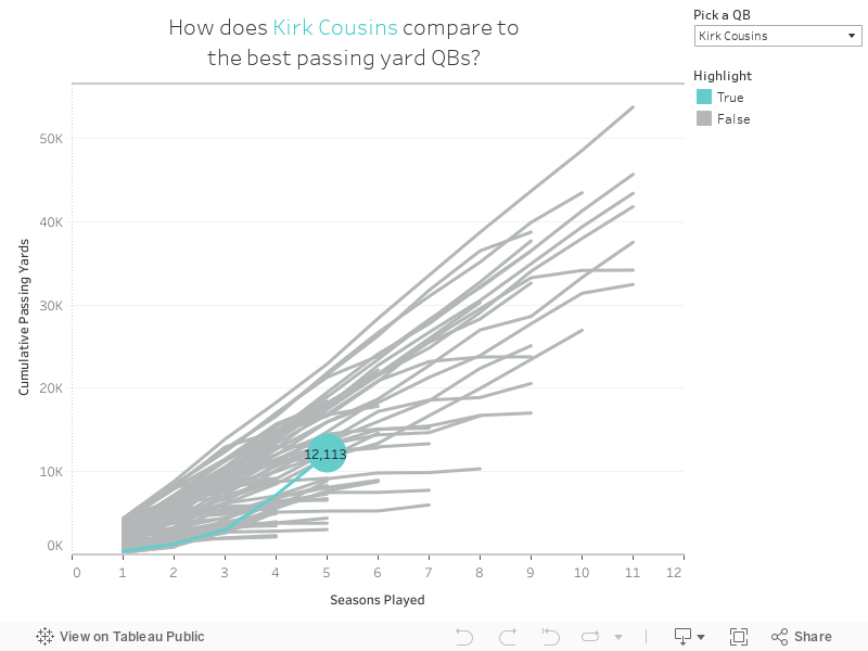
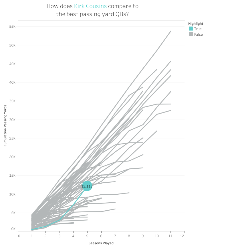
This week I’m testing your knowledge of building common baseline charts in Tableau. These charts are really useful for aligning metrics that start at different time periods. I’m using some data from one of my favourite sports – American Football. With the Super Bowl looming I wanted to compare Quarterback passing yards over all the seasons they’ve played. This chart is perfect for this because no matter which year the player started, I can compare them all from a common baseline.
Your job is to re-create this viz like-for-like. You can download the data here
Requirements
- You will have to use a Union in Tableau to get the data in to 1 table
- I pivoted the data to get it in to an easier to use format
- I filtered the quarterbacks to those that have played at least 3 season and those that have passed for at least 2000 yards in total
- You should be able to pick the QB that you want to highlight – this should be only the list of QBs after the filter
- The highlighted QB should be shown in the light blue colour and should have a circle at the end of the line displaying their total passing yards
- Make the formatting of the chart the same as mine
Dataset
This week uses a custom dataset. You can find it here on Emma’s Drive
Attribute
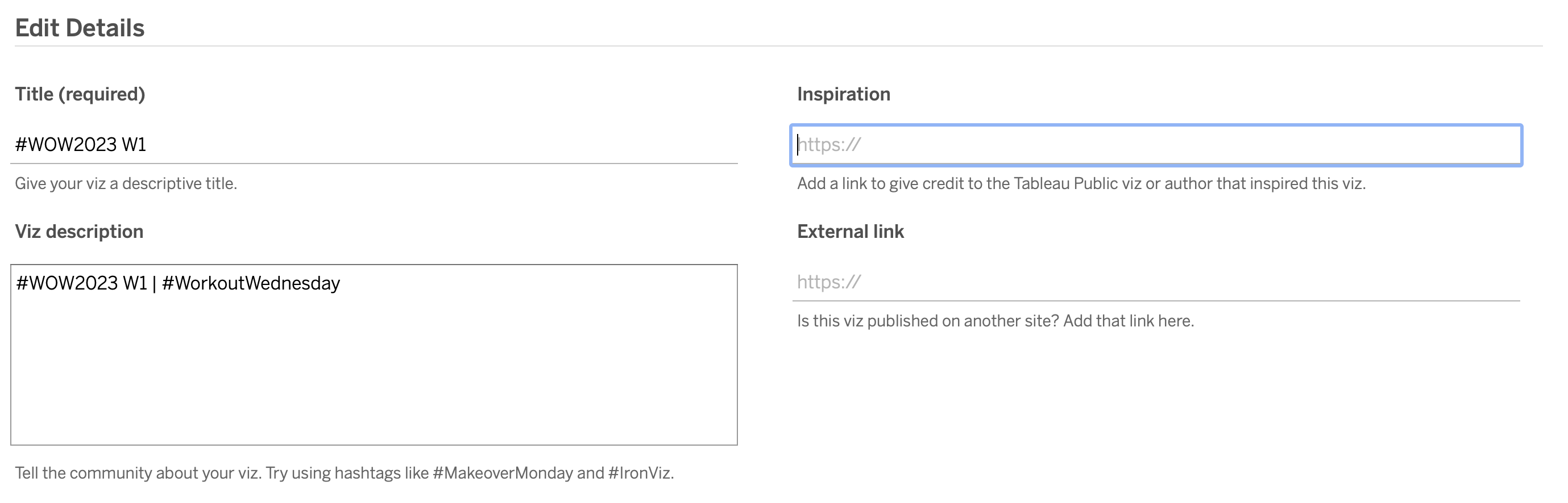
When you publish your solution on Tableau Public make sure to take the time and include a link to the original inspiration. Also include the hashtag #WOW2023 in your description to make it searchable!
Share
After you finish your workout, share on Twitter and/or LinkedIn using the hashtag #WOW2023 @Tableau and tag @WorkoutWednsday @EmmaWhyte & @vizwizbi
Solution
Interactive