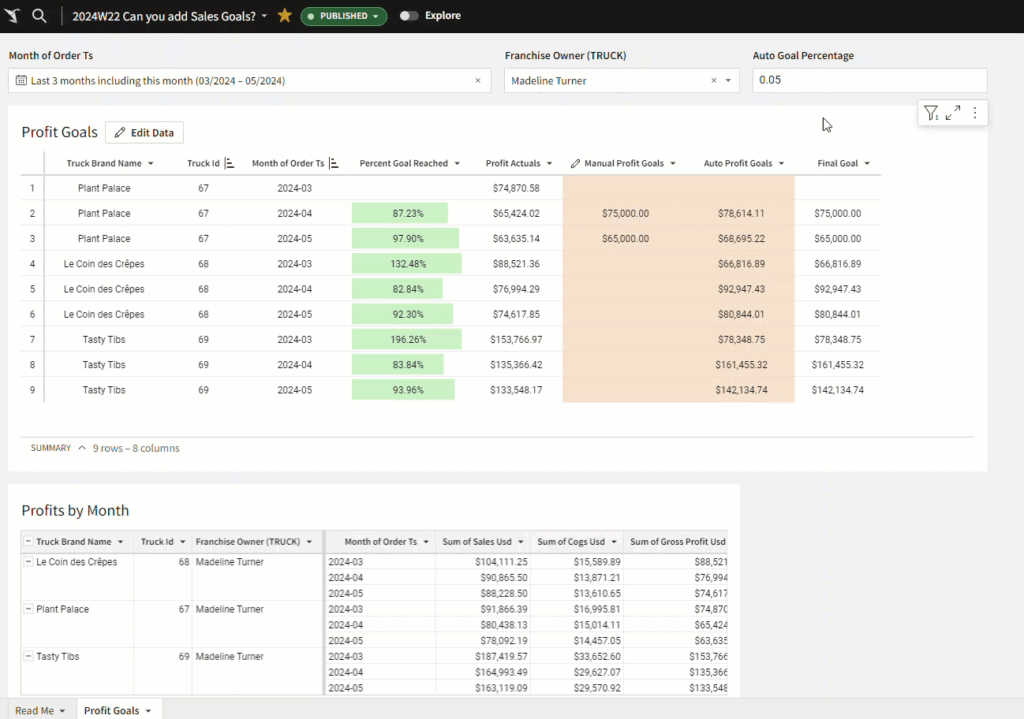
2024 Week 18 | Power BI: Visualize Mammal Lifespan with a Scatterplot and Background Image

Introduction Continuing on last week’s infographic theme, we are recreating an infographic from Visual Capitalist this week, this time showing average lifespan for different mammals.  We will be using a scatterplot visual of your choice this week. I made two demo versions, one using the Deneb custom visual and one using the Enhanced Scatterplot custom …

2024 Week 18 | Power BI: Visualize Mammal Lifespan with a Scatterplot and Background Image Read More »

2024 Week 17 | Sigma: Can you Cohort These Customers?

Introduction Welcome to Week Seventeen! This week, you’re going to perform a Cohort Analysis of food truck customers based on when they placed their first order.  Conditional formatting will help highlight which cohorts have a greater percentage of customers in them. As a bonus, you will implement a dynamic page control input to let the …

2024 Week 17 | Sigma: Can you Cohort These Customers? Read More »

2024 Week 17 | Power BI: Design an Earth Day Infographic

Introduction Welcome back to Workout Wednesday! This week we’re celebrating Earth Day (April 22) with a design challenge. You can do whatever your designer heart desires with this challenge. I’ve provided a sample, but this is just to get your creative juices flowing. Whatever you do, ensure that your design is accessible and that you’re …

2024 Week 17 | Power BI: Design an Earth Day Infographic Read More »

#WOW2024 | Week 17 | How far would total steps from TC23 respondents take you?

Introduction For the final week of Community Month, it is my pleasure to introduce you to a new Guest Coach on the Workout Wednesday team, Deborah Simmonds. For a number of years, Deb has been one of the most dedicated #WOW participants, so I was delighted to invite her to create her own challenge for you. …

#WOW2024 | Week 17 | How far would total steps from TC23 respondents take you? Read More »

Star Trek timeline data plotted on a sine wave

2024 Week 16 | Power BI: Timeline on a Sine Wave with Core Visuals

Introduction In this week’s challenge, we are creating a timeline visual on a sine wave. You can use your creativity to break out the timelines into series, through conditional formatting, offsetting separate shapes, or create different shapes using different trigonomic functions. Alternatively, with small multiples. Requirements Obtain the data from Kaggle and/or Wikipedia Create a …

2024 Week 16 | Power BI: Timeline on a Sine Wave with Core Visuals Read More »