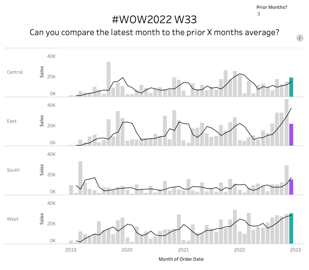
2022 Week 33 | Power BI: Compare two series of values
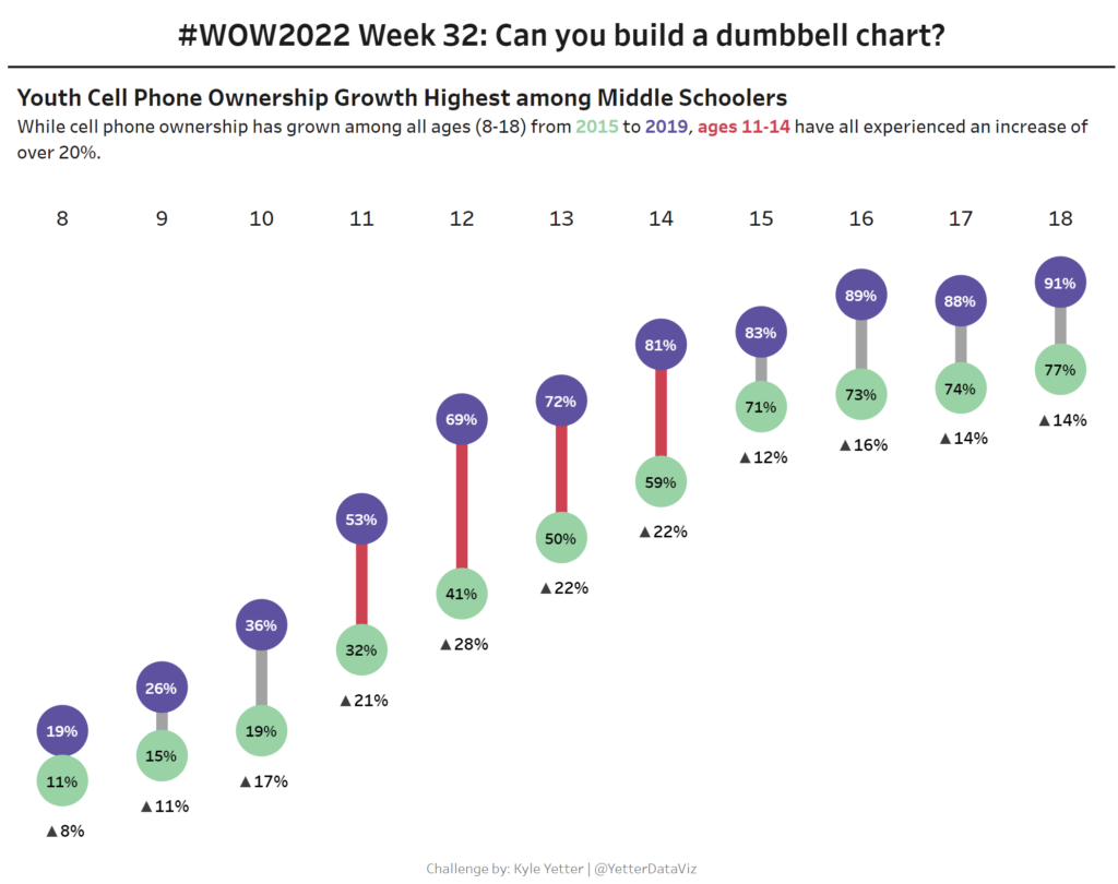
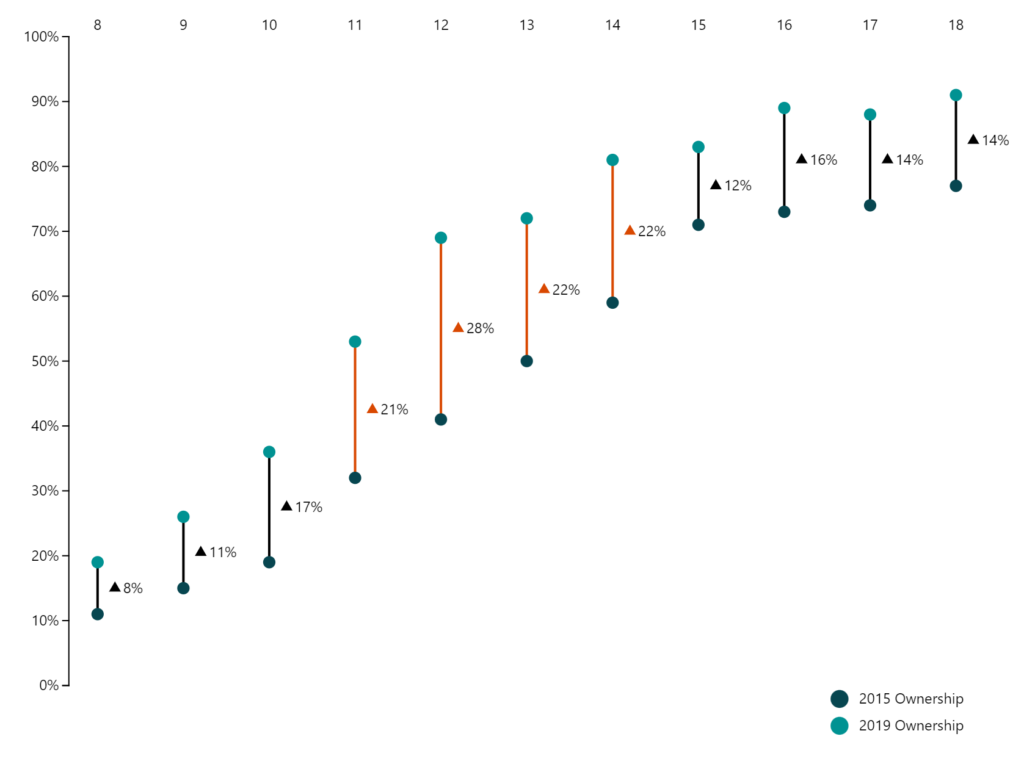
Introduction Welcome back to Workout Wednesday! This week we’re visualizing two series of values in a take on last week’s Tableau challenge! This week’s challenge uses youth cellphone data and gives you the opportunity to either build a dumbbell chart using Charticulator or to build a lipstick column chart using a custom visual. Complete one or both …
2022 Week 33 | Power BI: Compare two series of values Read More