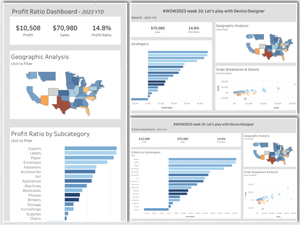
Tableau

#WOW2023 | Week 6 | Can you create a normalized jitterplot?

Introduction As Donna mentioned last week, this month we’re focusing on alternative chart types. This jitterplot is a fun one inspired by one of Steve Wexler‘s charts in The Big Book of Dashboards. I like jitterplots because they allow you to easily see how an individual compares to the rest of the group via distribution, […]

#WOW2023 | Week 6 | Can you create a normalized jitterplot? Read More »

Tableau, Workout Wednesday

#WOW2023 | Week 5 | Can you build a funnel chart?

Introduction Hi everybody. It’s now my turn to set my first challenge as part of the official #WOW crew – eeek!. For those of you who don’t know me, I’ve been completing these challenges since the program was launched in 2017, and I blog solution guides on my personal blog at https://donnacoles.home.blog/. I’ve been approached

#WOW2023 | Week 5 | Can you build a funnel chart? Read More »

Tableau, Workout Wednesday

#WOW2023 Week 1: Can you use Image Role & Dynamic Zone Visibility?

Introduction Can you believe it’s 2023 already? No me neither, but we have a cracking line up for this year that makes me excited to still be apart of the Workout Wednesday Team. If this is your first time here, Welcome to #WOW2023. The aim of this community initiative is to rebuild the visualisation using a

#WOW2023 Week 1: Can you use Image Role & Dynamic Zone Visibility? Read More »

Tableau, Workout Wednesday

#WOW2022 Week 51: Let’s show quarterly sales with end-user flexibility

Introduction I recently had this type of request at work – stop me if you’ve heard this before. We need to show the trend of [single or multiple measures] and we want to see it by these specific dimensions. Oh! And we also need to be able to filter by the same dimensions as well…

#WOW2022 Week 51: Let’s show quarterly sales with end-user flexibility Read More »

Tableau, Workout Wednesday

#WOW2022 | Week 50 | Interactive Proportional Brushing

Introduction This is my last challenge of the year and what better way to round things off than with everyone’s favourite chart – the bar chart – but let’s make it “sexy”. Bar charts may be simple but when you combine them with some interactive highlighting and sorting you can create something quite dynamic which

#WOW2022 | Week 50 | Interactive Proportional Brushing Read More »

community, Tableau