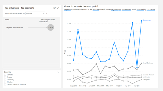
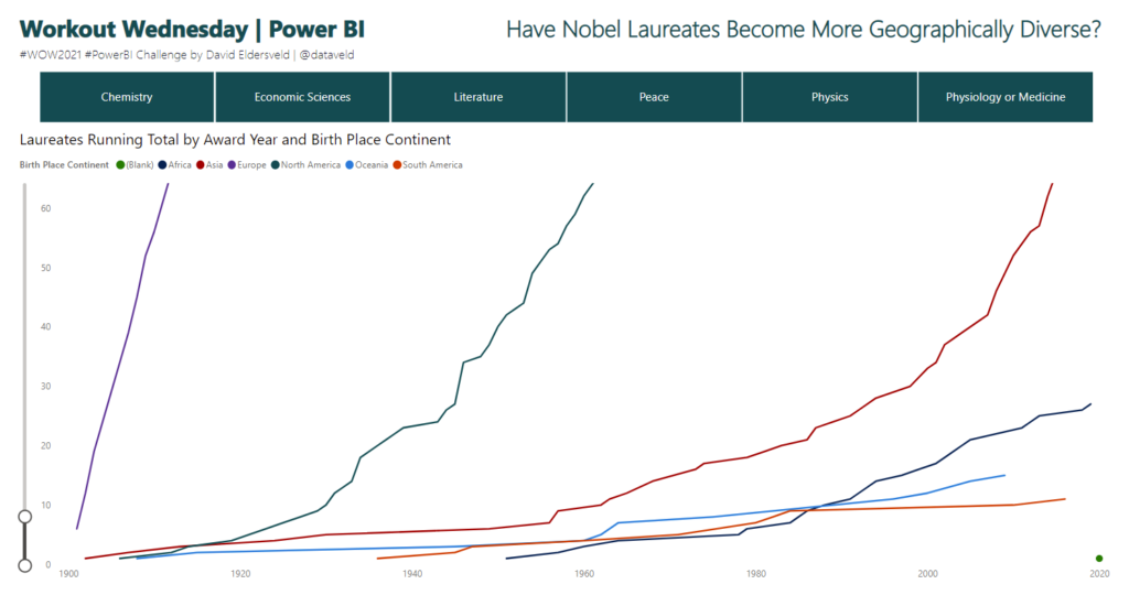
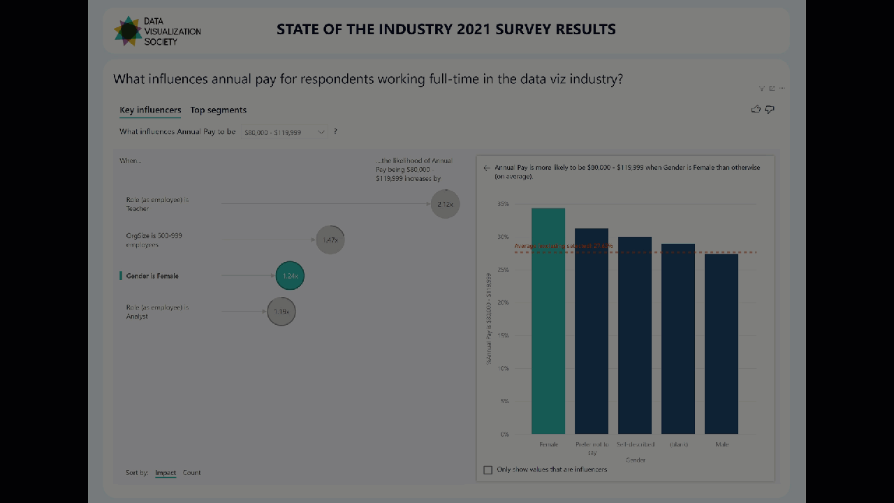
Beginner

2021 Week 47 | Power BI: Custom Line Chart Formatting

Introduction This week we are continuing our design theme by working through a custom formatting hack for line charts. Conditional formatting in Power BI can be tricky at times, especially when trying to format different chart types.  If you are familiar with conditionally formatting a line chart, you’ll know that in the Data Colors section …

2021 Week 47 | Power BI: Custom Line Chart Formatting Read More »

Deneb visual for Power BI

2021 Week 31 | Power BI: Declarative Visualization with Deneb

Introduction Over the course of Power BI’s Workout Wednesday challenges, you’ve had a chance to try several “custom” visuals. These are typically developed by third parties and may or may not appear on Microsoft’s AppSource marketplace. Generally, you don’t have much control over the visualization apart from whatever format options the developer creates. This week, …

2021 Week 31 | Power BI: Declarative Visualization with Deneb Read More »

Workout Wednesday Power BI Week 23 2021 Nobel Prize

2021 Week 23 | Power BI: Can You Build a Cumulative Line Chart?

Introduction Continuing with the Nobel Prize data that Meagan began exploring last week, this week extends to consider aspects of individual Nobel laureates. The main visual is a cumulative line chart, but you’ll also provide detail on laureates with a report page tooltip. While additional JSON expansion and transformation was required from the original dataset, …

2021 Week 23 | Power BI: Can You Build a Cumulative Line Chart? Read More »