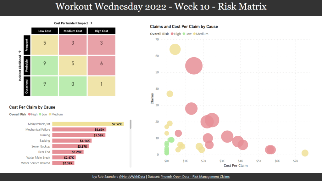
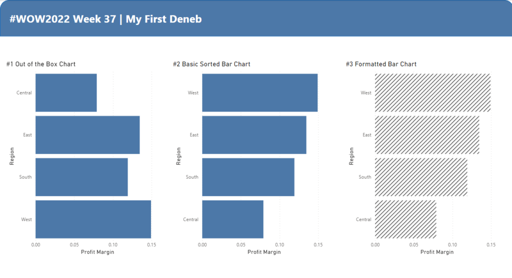
Custom Visual

2022 Week 36 | Power BI: Split Violin Plot and HTML

Introduction Another PlotlyJS visual this week – creating a split violin plot. We’ll be comparing male and female dating preferences collected from speed dating events between 2002-2004. EXTRA CREDIT – For those with a little more time on their hands, an extended workout challenge is included; conduct your own data analysis and create a data …

2022 Week 36 | Power BI: Split Violin Plot and HTML Read More

2022 Week 31 | Power BI: Connected Scatter with PlotlyJS

Introduction This week for Workout Wednesday we are getting familiar with the PlotlyJS visual by creating traces and annotations for a connected scatterplot.   Connected scatterplots are a cross between a scatterplot and a lineplot whereby two numeric variables are connected by a third ordered variable (often time).   The below graph created with the …

2022 Week 31 | Power BI: Connected Scatter with PlotlyJS Read More

2022 Week 26 | Power BI: Polar Plots with Charticulator

Introduction June is Music Month and this week we are getting arty with Charticulator. In our previous Charticulator challenges, we designed with cartesian plots, spiral plots and tried our hand at nested charts. For this challenge we use a Polar Scaffold to visualise songs segments by time/duration.   This challenge presumes some Power Query experience. …

2022 Week 26 | Power BI: Polar Plots with Charticulator Read More

2022 Week 20 | Power BI: Pie Matrix Tableau Redo

Introduction May is Tableau Redo month and this week we will be recreating Tableau #WoW2019 Week 45 by Luke Stanke.   Requirements Filter the data up until November 6th, 2021. Create a matrix showing region and last 7 days (up to November 6th, 2021). Create SVG Measures to build a doughnut chart that shows the …

2022 Week 20 | Power BI: Pie Matrix Tableau Redo Read More

Screenshot from Power BI Workout Wednesday 2022 Week 18

2022 Week 18 | Power BI: Remake this Tableau budget burndown chart

Introduction For the month of May, we are remaking Tableau visualizations with Power BI. Although the visuals made by the two tools may be similar, the calculations and formatting options are a bit different. This makes some things easier in one tool compared to the other. If you use both Power BI and Tableau, feel …

2022 Week 18 | Power BI: Remake this Tableau budget burndown chart Read More

2022 W16 | Power BI : Quadrant Plot with Jitter

Introduction Your challenge this week is to create a Quadrant Plot. It should include different colors in each quadrant and the points should be jittered to try and reduce data overlap. Please note, that it is not expected to create the quadrants, quadrant lines, and color change by selecting any individual data point (if someone figures out how …

2022 W16 | Power BI : Quadrant Plot with Jitter Read More

Power BI Report containing Demeb bullet charts

2022 Week 13 | Power BI: Build a Bullet Chart with Deneb

Introduction For this last week of March, we are continuing our project management theme.  The challenge this week is to use Deneb to build bullet charts using the provided data. Bullet charts were created by Stephen Few to offer an alternative to clunky gauges. Bullet charts are used to compare a featured measure to one or …

2022 Week 13 | Power BI: Build a Bullet Chart with Deneb Read More

2022 Week 10 | Power BI: Risk Matrix

Introduction Your challenge this week is to create a Risk Matrix with some supporting visuals.  We decided to keep the project management theme going this week.  If you did not do last week’s challenge, I highly recommend you checkout Kerry’s Gantt Chart challenge, here.   For this challenge, I looked at a lot of possible ways to create a …

2022 Week 10 | Power BI: Risk Matrix Read More

2022 Week 08 | Power BI: Can you make a Gantt Chart?

Introduction This week we are creating Gantt Charts in Power BI. It is not required to do all 4 variations, choose one of the options that interests you the most. Each option increases in time and/or experience level. Requirements QUICK MODE Import data Import the Microsoft Gantt Chart from AppSource Place Project Category in the …

2022 Week 08 | Power BI: Can you make a Gantt Chart? Read More

Scroll to Top