2022 Week 47 | Power BI: WoW on Twitter
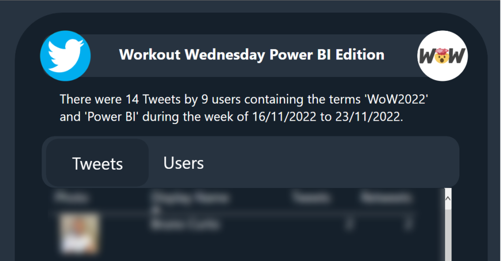
Introduction Welcome back to Workout Wednesday! This week we’re going to visualize Twitter data using Twitter’s API to retrieve tweets that have been made about Workout Wednesday! You have complete creative license to visualize the data in any way that you see fit. If you have a Power BI premium license, I encourage you to […]
2022 Week 47 | Power BI: WoW on Twitter Read More »
Power BI, Workout Wednesday