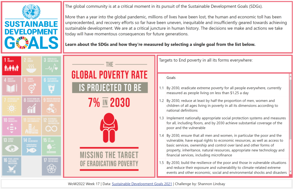
2022 Week 17 | Power BI : Create a Custom Theme
Introduction Welcome back to color month! It’s our 4th color-focused challenge and in stark contrast to Kerry’s week 14 challenge, we’re using loads of bright colors! This week we’re creating a custom theme using the color palette of the United Nations Sustainable Development Goals. This challenge was inspired by a Makeover Monday challenge – take a look …