Month: June 2022

#WOW2022 | 26 | Let’s make a dynamic relative filter

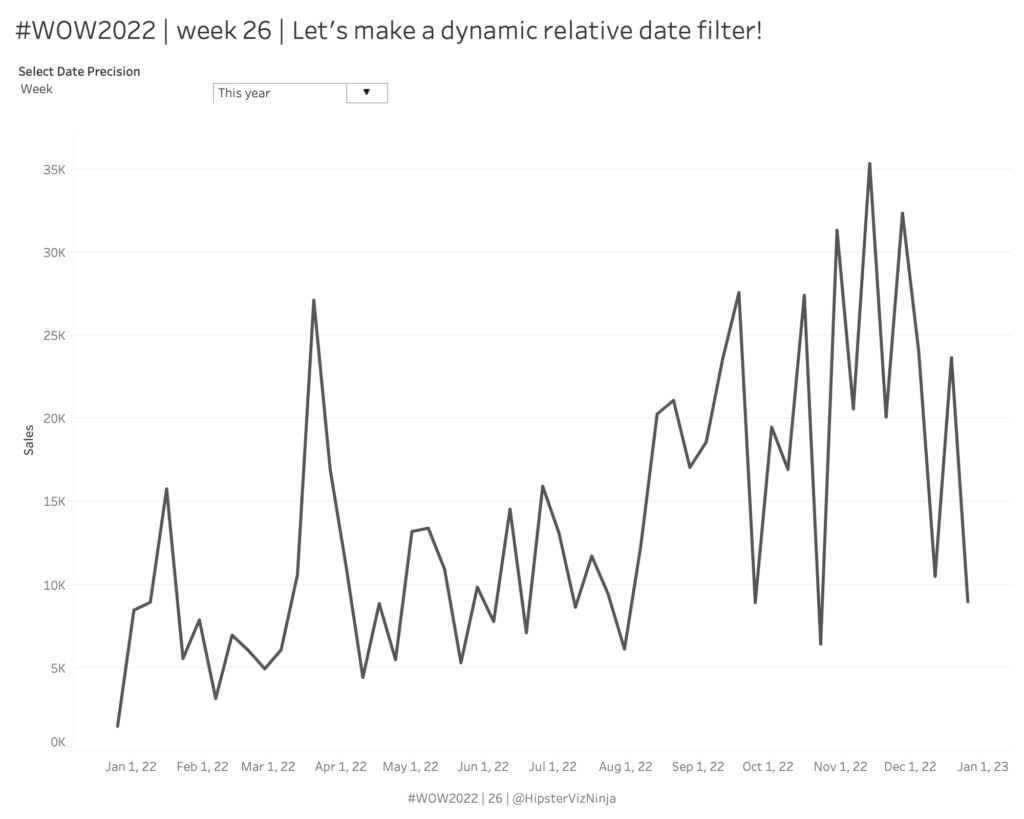
Introduction Welcome to week 26 – the halfway mark of 2022! This week is pretty straightforward; how simple it will be is up to you 😀 I’ve always really liked using the relative date filter in Tableau but one thing that’s always irked me is that the anchor date is not dynamic – neither end-user …

#WOW2022 | 26 | Let’s make a dynamic relative filter Read More

2022 Week 26 | Power BI: Polar Plots with Charticulator

Introduction June is Music Month and this week we are getting arty with Charticulator. In our previous Charticulator challenges, we designed with cartesian plots, spiral plots and tried our hand at nested charts. For this challenge we use a Polar Scaffold to visualise songs segments by time/duration.   This challenge presumes some Power Query experience. …

2022 Week 26 | Power BI: Polar Plots with Charticulator Read More

#WOW2022 | Week 25 | Double drill-down with Set Actions

Introduction My second favourite challenge in Tableau, after Table Calculations, is anything with Set Actions. Some of you may have already used these in previous challenges this year, but this week I am dedicating it to this wonderful (and sometimes tricky) Tableau functionality. Warning: this is not a beginner-friendly challenge! The problem I wanted to …

#WOW2022 | Week 25 | Double drill-down with Set Actions Read More

2022 Week 25 | Power BI: Visualizing Music

Introduction June is still music month, so for this week’s challenge we’re going to visualize music. Sometimes the simple visualizations tell the best stories. That is definitely the case for the “warming stripes” visualization which was used to show the change of global temperature over time. Using this as motivation, what if we created a …

2022 Week 25 | Power BI: Visualizing Music Read More

2022 Week 24 | Scatterplot with custom marker

Introduction For this workout, we are visualizing data in a scatterplot in a bit of a non-traditional manner. This week marks 26 years since Ella Fitzgerald, the “Queen of Jazz”, passed away. So we are visualizing melodies to a few of her songs. My approach is a bit abstract – not quite sheet music but …

2022 Week 24 | Scatterplot with custom marker Read More

2022 – WEEK 24: How is the arctic ice extent trending?

Introduction This week you are invited to build a horizon chart of the arctic ice extent–the amount of ice on the arctic ice cap. Data comes from the National Snow and Ice Data Center. In case you are not familiar with the horizon chart, a nice definition can be found here on Nathan Yao’s Flowing …

2022 – WEEK 24: How is the arctic ice extent trending? Read More

2022 Week 23 | Collab with Preppin Data – Salesforce Opportunities

Introduction Welcome back to Workout Wednesday! This week is our annual collaboration with Preppin’ Data and the Tableau team! This week we’re visualizing Salesforce data – looking at current open opportunities, and trying to distinguish the dollar amount of opportunities due to close this month. This week’s challenge can be done in both Power BI and Tableau, and …

2022 Week 23 | Collab with Preppin Data – Salesforce Opportunities Read More

Scroll to Top