Month: September 2022

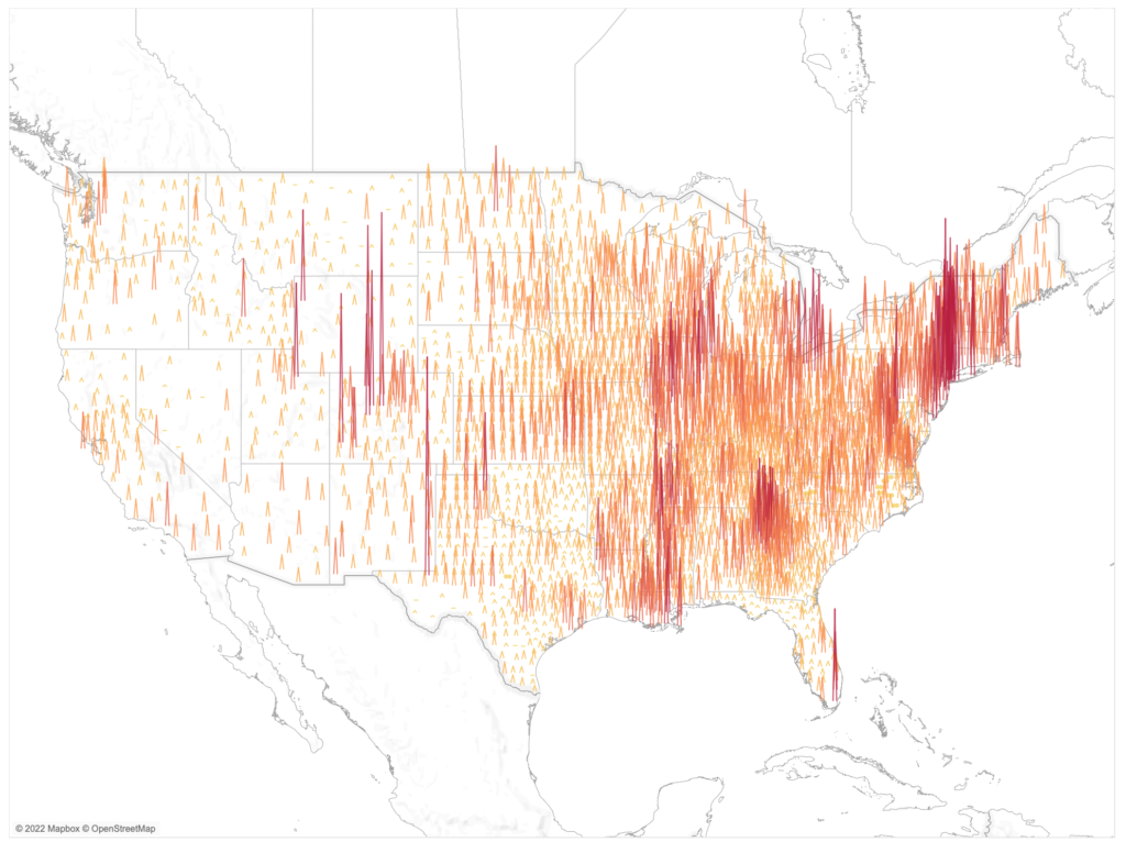
2022 – Week 39: Where were COVID-19 Cases most active on December 30th, 2021?

Introduction This week we’ll look back at COVID-19 cases in the continental United States on December 30th, 2021. In this challenge you will use data from covidactnow.org to show where cases were most prevalent in terms of cases per 100,000. The data for this challenge are already pre-loaded in a workbook. They include the COVID-19 …

2022 – Week 39: Where were COVID-19 Cases most active on December 30th, 2021? Read More

Error Bars showing standard deviation from the average

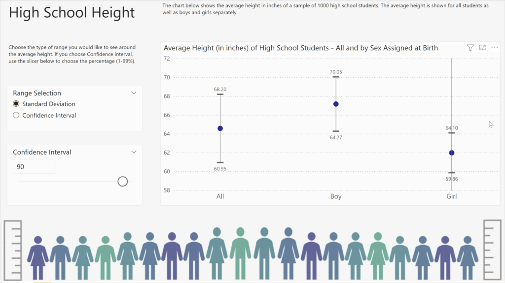
2022 Week 39 | Power BI: Use error bars to show statistical ranges

Introduction We first looked at error bars in week 28. But error bars have several formatting features and can be used in several types of visuals. This week, we are going to use error bars to show a dynamically populated range around an average.  Requirements Calculate the average height and standard deviation for the heights. …

2022 Week 39 | Power BI: Use error bars to show statistical ranges Read More

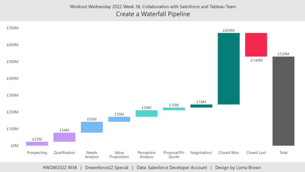
2022 Week 38 | Power BI: Create a Waterfall Pipeline

Introduction Welcome back to Workout Wednesday! This week we’re collaborating with the Tableau team to create a waterfall pipeline using Salesforce data. Lorna Brown, the creator of the challenge is attending Saleforce’s Dreamforce conference, hence the nature of the challenge. We’re building a waterfall chart using the Simple Waterfall custom visual by Datanomy Limited. This week’s workout can be done in …

2022 Week 38 | Power BI: Create a Waterfall Pipeline Read More

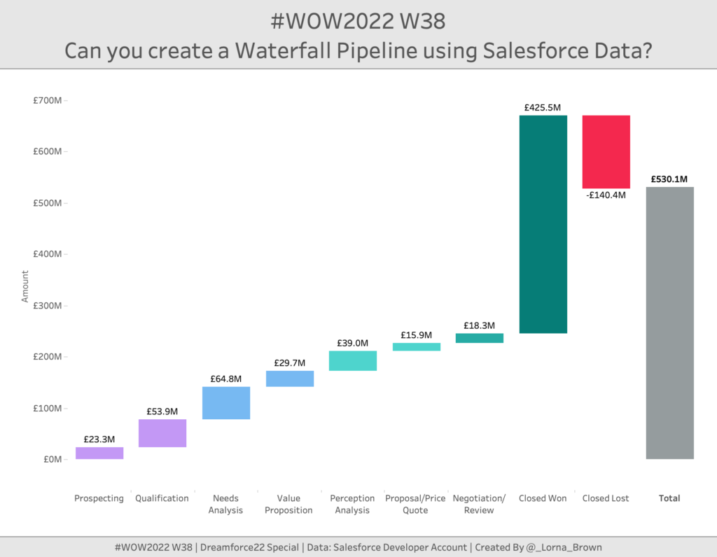
#WOW2022 W38: Can you create a Waterfall Pipeline using Salesforce Data?

Introduction This week is Dreamforce; Salesforce’s conference. So I thought I would stay on theme and use Salesforce Data. When I first started to see Salesforce pre-built dashboards they included several elements, but the one we are going to focus on today is the Waterfall chart. This allows us to see how much value is …

#WOW2022 W38: Can you create a Waterfall Pipeline using Salesforce Data? Read More

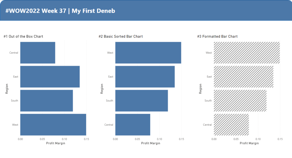
2022 Week 37 | Power BI: My First Deneb

Introduction I sit back every week and watch the other amazing members of the #WorkoutWednesday Power BI team go through Deneb challenges like it’s nothing. The visuals are fantastic, the customizations are intriguing, but the truth is – I’ve never done a Deneb visual! Until this week that is.    If you’re like me and …

2022 Week 37 | Power BI: My First Deneb Read More

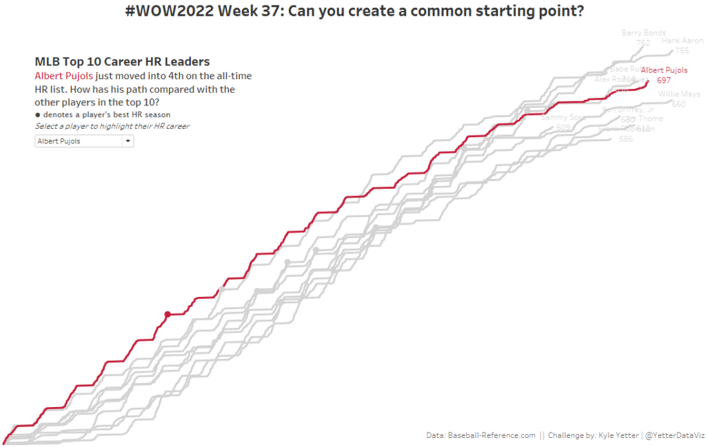
#WOW2022 Week 37: Can you create a common starting point?

Introduction This week’s challenge is focused on Level of Detail (LOD) calculations. We could probably build this chart using Table Calculations, but we’re not going to. Deliberate practice with some basic LODs. This also can be the basis for some cohort analysis, aligning various groups from different time periods on the same starting point. And …

#WOW2022 Week 37: Can you create a common starting point? Read More

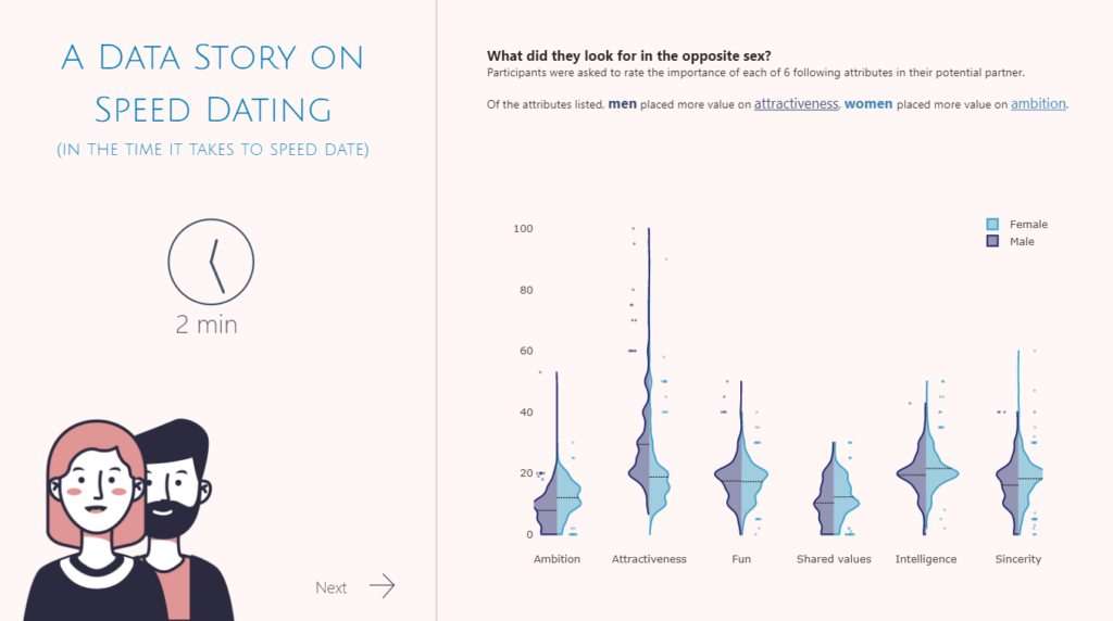
2022 Week 36 | Power BI: Split Violin Plot and HTML

Introduction Another PlotlyJS visual this week – creating a split violin plot. We’ll be comparing male and female dating preferences collected from speed dating events between 2002-2004. EXTRA CREDIT – For those with a little more time on their hands, an extended workout challenge is included; conduct your own data analysis and create a data …

2022 Week 36 | Power BI: Split Violin Plot and HTML Read More

Scroll to Top