Year: 2024

2024 Week 17 | Power BI: Design an Earth Day Infographic

Introduction Welcome back to Workout Wednesday! This week we’re celebrating Earth Day (April 22) with a design challenge. You can do whatever your designer heart desires with this challenge. I’ve provided a sample, but this is just to get your creative juices flowing. Whatever you do, ensure that your design is accessible and that you’re …

2024 Week 17 | Power BI: Design an Earth Day Infographic Read More

#WOW2024 | Week 17 | How far would total steps from TC23 respondents take you?

Introduction For the final week of Community Month, it is my pleasure to introduce you to a new Guest Coach on the Workout Wednesday team, Deborah Simmonds. For a number of years, Deb has been one of the most dedicated #WOW participants, so I was delighted to invite her to create her own challenge for you. …

#WOW2024 | Week 17 | How far would total steps from TC23 respondents take you? Read More

Star Trek timeline data plotted on a sine wave

2024 Week 16 | Power BI: Timeline on a Sine Wave with Core Visuals

Introduction In this week’s challenge, we are creating a timeline visual on a sine wave. You can use your creativity to break out the timelines into series, through conditional formatting, offsetting separate shapes, or create different shapes using different trigonomic functions. Alternatively, with small multiples. Requirements Obtain the data from Kaggle and/or Wikipedia Create a …

2024 Week 16 | Power BI: Timeline on a Sine Wave with Core Visuals Read More

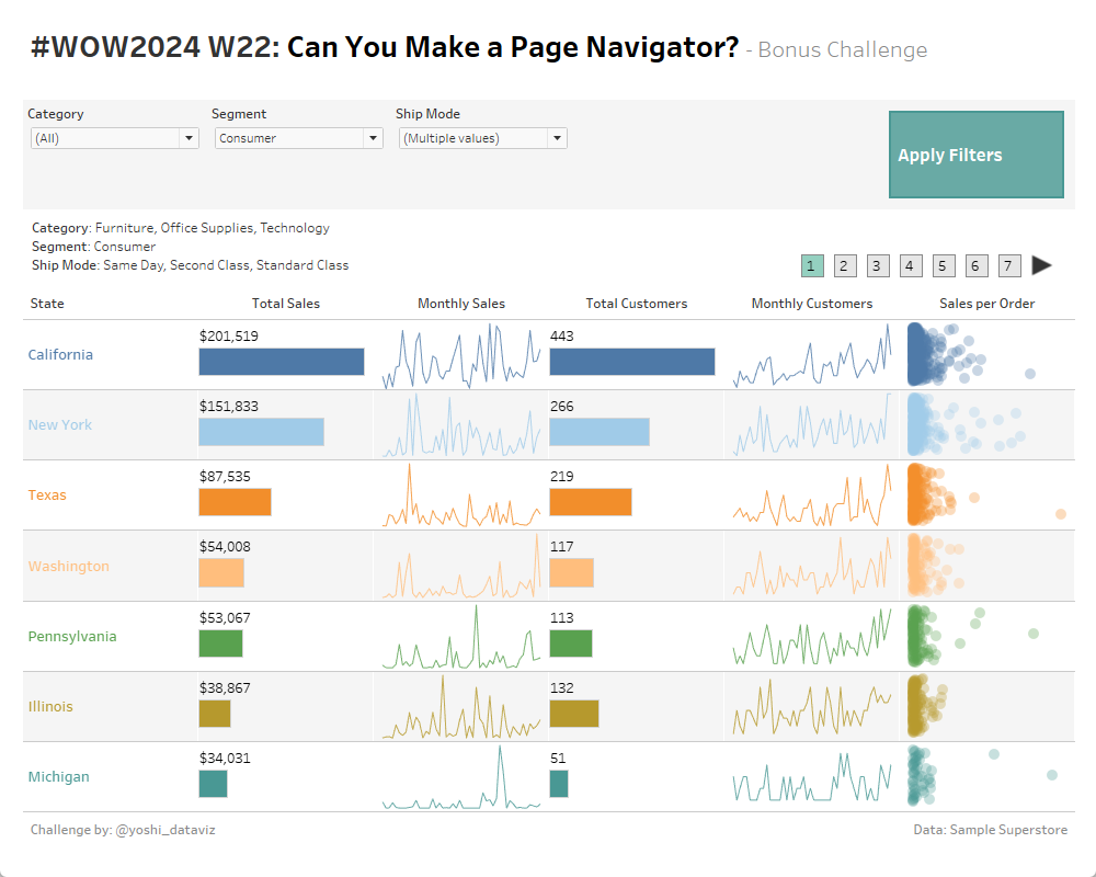
#WOW2024 | Week 16 | Can you create a sales dashboard by effectively utilizing headers?

Introduction This week’s challenge comes from Chasoso (Hideaki Yamamoto), who is an active participant in WorkoutWednesday and was the runner-up in last year’s Viz contest at the Japan Tableau User Group (JTUG) annual meeting. # Introduction(EN)I’m very happy to join Workout Wednesday as a guest coach.Because I’ve been encountering interesting vizzes every week, I admire …

#WOW2024 | Week 16 | Can you create a sales dashboard by effectively utilizing headers? Read More

2024 Week 15 | Power BI: Visualize sunrise times with a line chart

Introduction Since I watched the solar eclipse from Texas this week, we have a solar theme. We are visualizing the sunrise time each day in 2024 to date. I’m keeping it simple with the line chart core visual, but you can use whatever visual you would like.  Requirements 1. Retrieve the data from Data.World.  2. …

2024 Week 15 | Power BI: Visualize sunrise times with a line chart Read More

#WOW2024 Week 15: Can you create a (super) dynamic trellis chart?

Introduction Continuing with our community month, I decided to invite the OG himself back for a challenge, Andy Kriebel. All I’m going to say about this challenge is, I’m sorry if it’s super hard and don’t be afraid to sneak a peak into the actual workbook to get insight into how Andy’s mind works! Click …

#WOW2024 Week 15: Can you create a (super) dynamic trellis chart? Read More

2024 Week 15 | Sigma: Can you identify the top, average, and bottom profitable customers? 

Introduction This week, we’re building a staple in my bar chart library: Top, Bottom, and Other Values. I often use this bar chart to easily show the breadth of the outliers while not losing sight of the typical. This challenge is also a great example of the flexibility of modeling at different levels of granularity …

2024 Week 15 | Sigma: Can you identify the top, average, and bottom profitable customers?  Read More

Scroll to Top