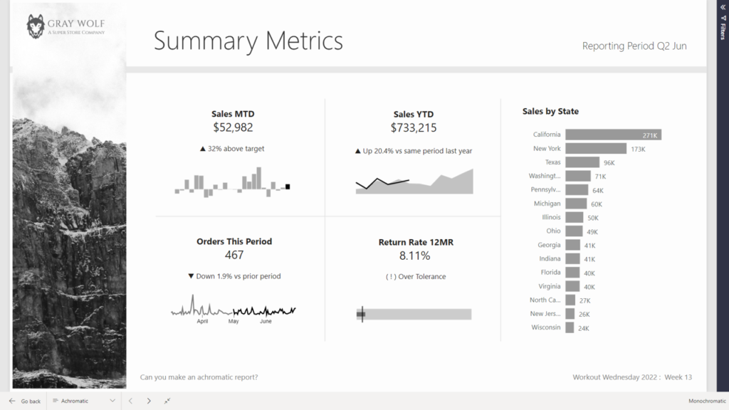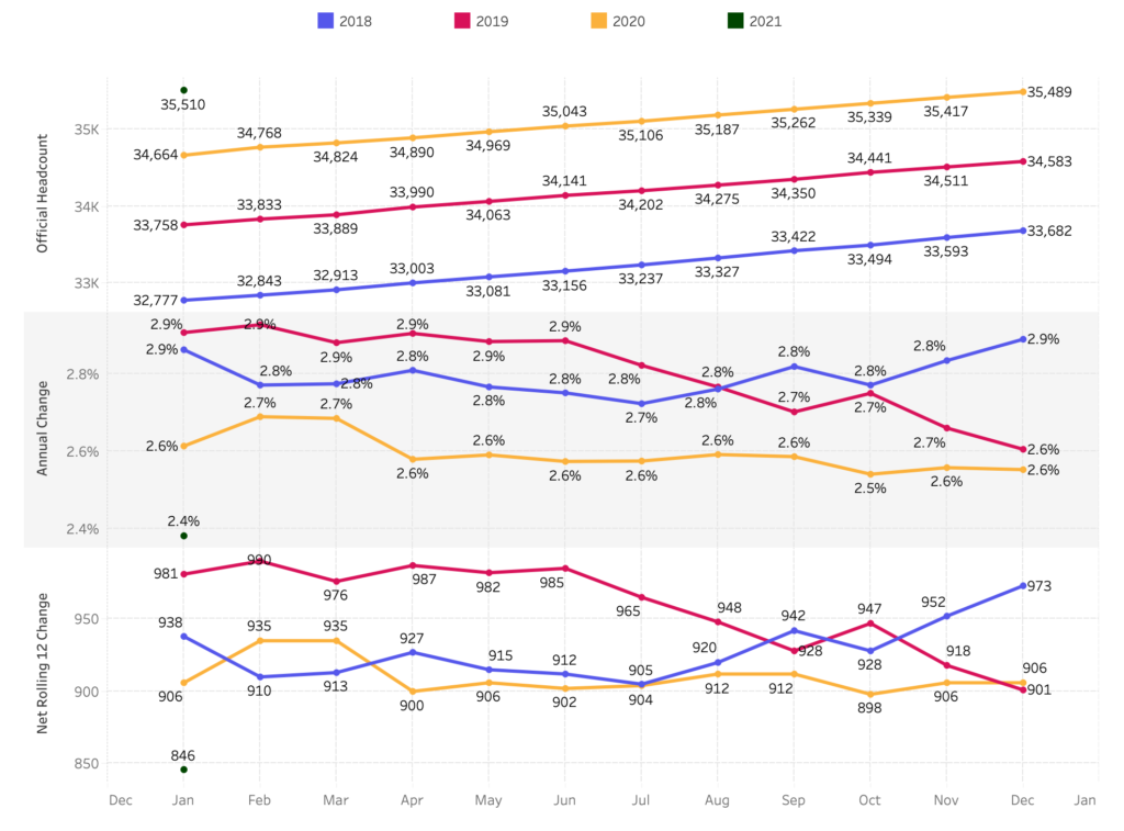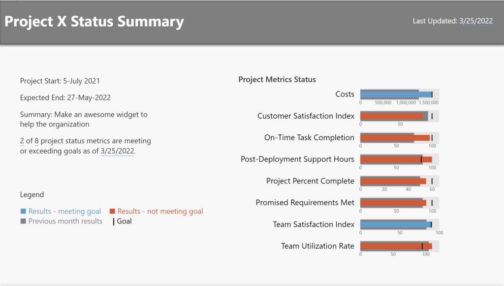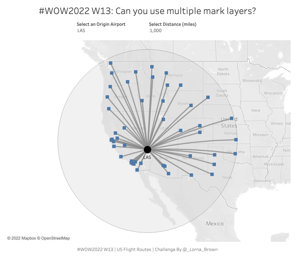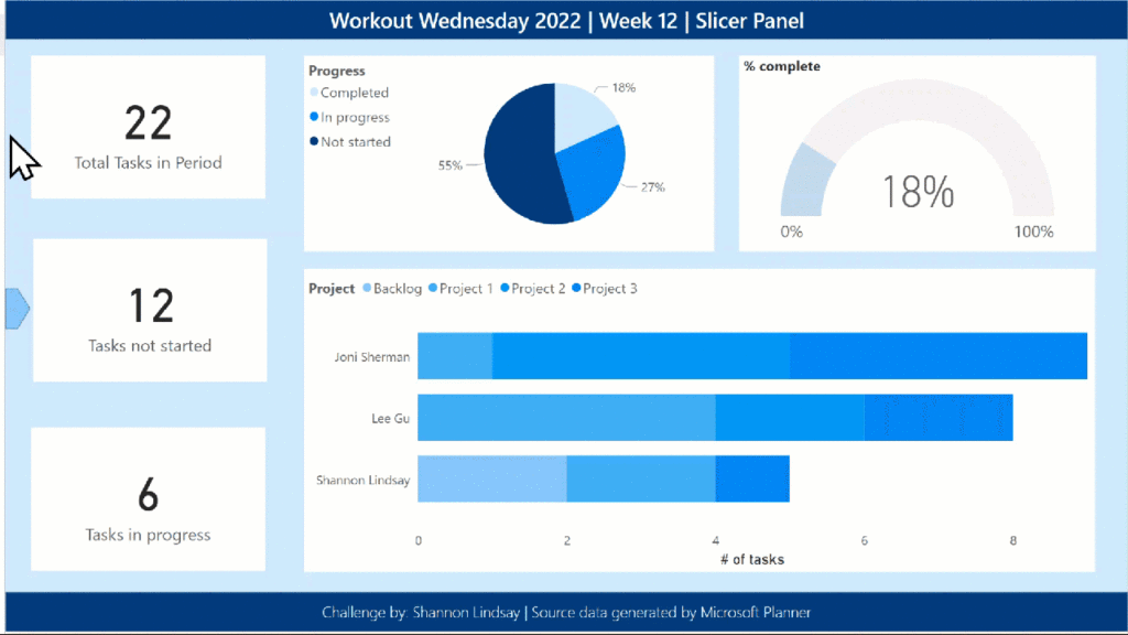
#WOW2022 | Week 15 | Filter Challenge
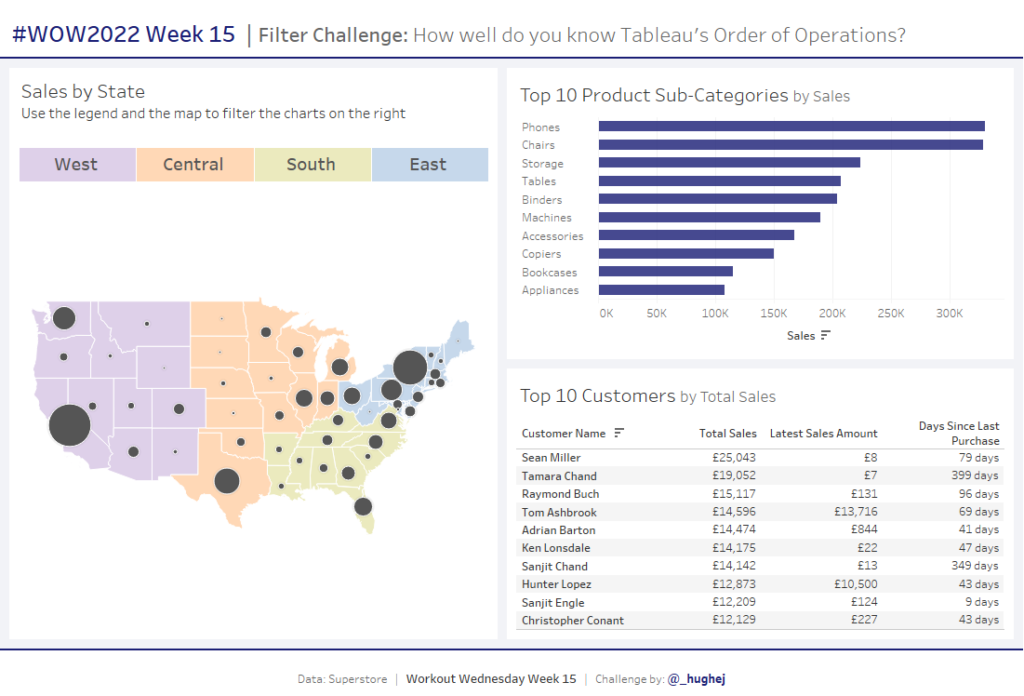
Introduction I’ve heard last week’s challenge was a tough one, but it was great to see so many people participating and learning from it! My challenge this week was inspired by a colleague at work. Without revealing too much, it has been designed to test your understanding of how filters work in Tableau, based on …