Power BI

Power Bi report with a line chart and map

2021 Week 40 | Power BI: Geocoding and Maps

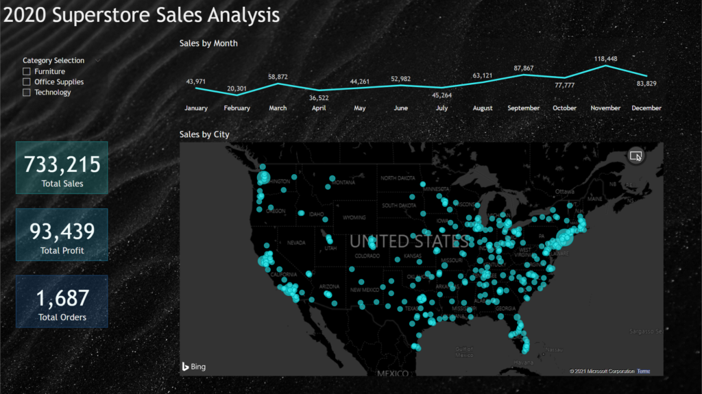
Introduction We have declared October to be mapping month! This month, we will focus on maps and geospatial data. There are several different maps available in Power BI as default and custom (AppSource) visuals. This week we are going to start off simple and use the Map visual to make a bubble map.  When visualizing …

2021 Week 40 | Power BI: Geocoding and Maps Read More

Workout Wednesday Week 39

2021 Week 39 | Power BI: Assist Your Data Exploration with AI

Introduction It can be challenging getting a new dataset and quickly finding something to focus on and tell a story about. Power BI has built in tools that help you quickly identify data points of interest, and provides visuals that can help tell the story. Have Power BI help you tell the story with your …

2021 Week 39 | Power BI: Assist Your Data Exploration with AI Read More

2021 Week 37 | Power BI: What-If Parameters

Introduction This week’s Workout Wednesday we will be using “What-If” Parameters to show Top N values based on user selection. What-If Parameters can allow your audience to have more self-service interaction with the dashboard. For this challenge, we will be visualizing the Top N Movies based on Worldwide sales, as well as leveraging conditional formatting to …

2021 Week 37 | Power BI: What-If Parameters Read More

Workout Wednesday Power BI Week 34 2021

2021 Week 34 | Power BI: Building a Network Diagram

Introduction This week’s Workout Wednesday we will be creating a network diagram in Power BI.  Network diagrams are useful to explore relational datasets and are often used to visualize such things as project interdependencies, and social networks.  For this challenge we will be visualizing the interconnections of actors/characters of the Love Actually movie by number …

2021 Week 34 | Power BI: Building a Network Diagram Read More

Power BI Magic Tables

2021 Week 33 | Power BI: Create Magic Tables

Introduction Tables, tables, tables…Love them, or hate them, we, Power BI developers, can’t live without them. Our users too. However, who says that we must provide our users with “normal”, old-fashioned tables? This week, with little creativity and magic, we will push table visual experience to a whole new level! The report below shows data about …

2021 Week 33 | Power BI: Create Magic Tables Read More

2021 Week 32 | Power BI: Toggling Views with Bookmarks

Introduction This week we are going to be exploring how to use Bookmarks to toggle between different views in a report. There are a number of things you can do with Bookmarks, but in this week’s example we are going to use them to toggle between chart views and then as a Reset Filters button. …

2021 Week 32 | Power BI: Toggling Views with Bookmarks Read More

Deneb visual for Power BI

2021 Week 31 | Power BI: Declarative Visualization with Deneb

Introduction Over the course of Power BI’s Workout Wednesday challenges, you’ve had a chance to try several “custom” visuals. These are typically developed by third parties and may or may not appear on Microsoft’s AppSource marketplace. Generally, you don’t have much control over the visualization apart from whatever format options the developer creates. This week, …

2021 Week 31 | Power BI: Declarative Visualization with Deneb Read More

Wow 2021 PBI Week 30 Power BI report

2021 Week 30 | Power BI: Remove Punctuation and Count Words With Power Query

Introduction To celebrate our fourth week of Power Query month, we are going to use Power Query to analyze text data. Inspired by Chris Webb’s blog post, we are going to analyze word usage in Mary Wollstonecraft Shelley’s Frankenstein; Or, The Modern Prometheus. The Power Query techniques used in this week’s challenge are a bit …

2021 Week 30 | Power BI: Remove Punctuation and Count Words With Power Query Read More

2021 Week 29 | Power BI: Let’s Watch the Olympics!

Introduction This week we are collaborating with Preppin’ Data to get a close look at the schedule for the 2020 Olympic Games! We’re also collaborating with the Tableau team and we invite you to take a look at both challenges! With the opening ceremony 2 days away, we thought we’d visualize the schedule in our own time zone. We encourage you …

2021 Week 29 | Power BI: Let’s Watch the Olympics! Read More

Scroll to Top