2022 Week 20 | Power BI: Pie Matrix Tableau Redo
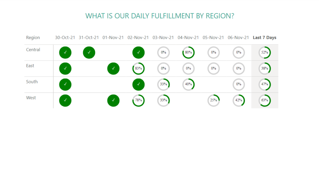
Introduction May is Tableau Redo month and this week we will be recreating Tableau #WoW2019 Week 45 by Luke Stanke. Requirements Filter the data up until November 6th, 2021. Create a matrix showing region and last 7 days (up to November 6th, 2021). Create SVG Measures to build a doughnut chart that shows the …