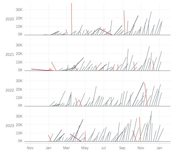
#WOW2022 | week 11 | Can you navigate a hierarchy?
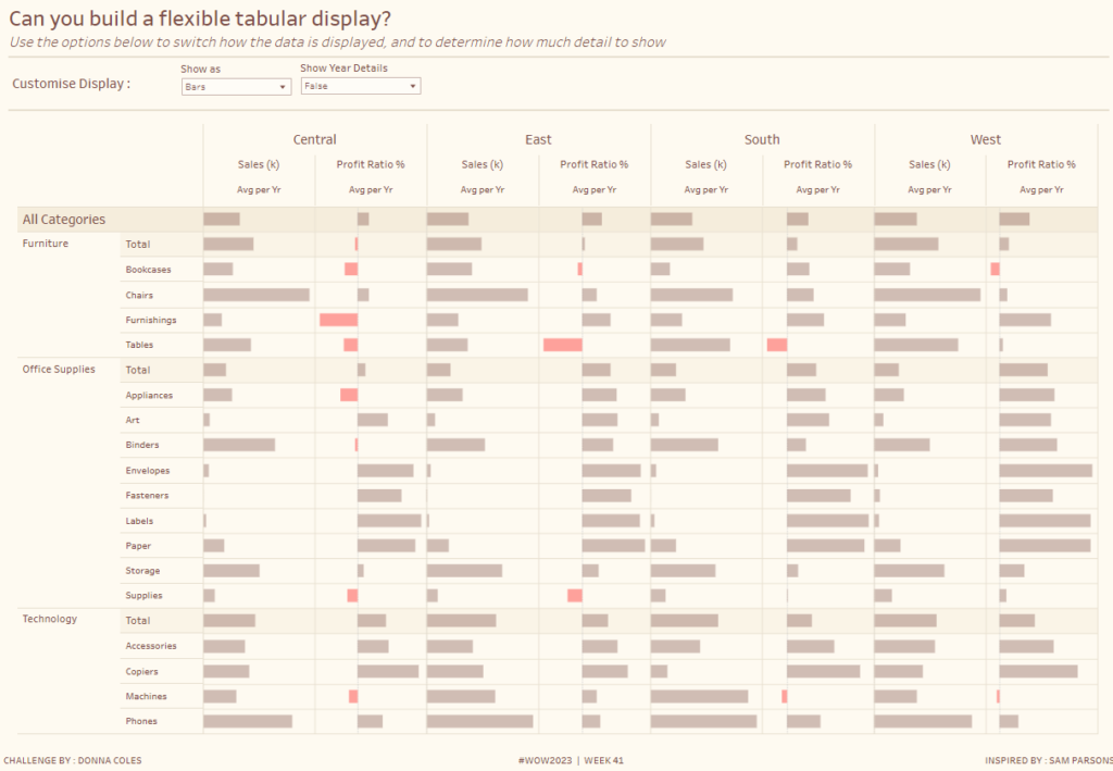
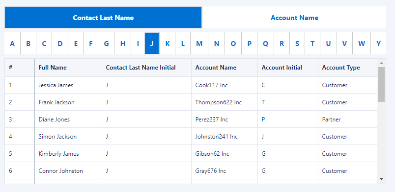
When analyzing data in a dashboard, sometimes it is important to understand all levels of a hierarchy. Can you build an interactive hierarchy navigation solution in Tableau?
Introduction Your challenge this week is to create a Risk Matrix with some supporting visuals. We decided to keep the project management theme going this week. If you did not do last week’s challenge, I highly recommend you checkout Kerry’s Gantt Chart challenge, here. For this challenge, I looked at a lot of possible ways to create a …
Introduction This week we are creating Gantt Charts in Power BI. It is not required to do all 4 variations, choose one of the options that interests you the most. Each option increases in time and/or experience level. Requirements QUICK MODE Import data Import the Microsoft Gantt Chart from AppSource Place Project Category in the …
2022 Week 08 | Power BI: Can you make a Gantt Chart? Read More
Introduction This week we are going to look at hospital admission rates. This data source comes from The Medical Stays dashboard on the Tableau Exchange. This particular challenge is more focused on working with time than it is working with medical data. In this challenge you need to group time into 15 minute increments throughout …
2022 Week 9: How many patients were admitted every 15 minutes? Read More
Introduction There has been an overwhelming response from the last couple of weeks series so I thought, let’s continue. How many times have you gone into a meeting with a finished dashboard and someone’s asked “Can you just…”. Well here is my “Can you just…”!! I want you to be able to switch what measures …
Introduction Welcome to week 7 of Workout Wednesday for Power BI 2022. We are again using the Data Visualization Society‘s annual State of the Industry survey results. This week we are looking at how we can visualize parallel sets. Although this may not be a visual that we use often, it can be very useful for multivariate analysis. …
Introduction This week is our third installment of this month’s “dashboard series” so we’ll be building upon Erica’s challenge from Week 5 and Sean’s challenge from Week 6. If you’ve done Week 6, you can start from that, or you can check out those challenges linked above and come back to this when you’re done…or …
Introduction Welcome back to Power BI #WorkoutWednesday – we’re now in week 6! If you’re joining us for the first time, welcome! There are no dependencies on previous weeks – you’re welcome to jump right in with this week’s challenge, where we’ll use AI in Power BI to get an understanding of key influencers of …
Introduction Here we go! This is the second installment of our new “dashboard series” that Erica started last week. My challenge will build upon what she built. If you participated last you can start from that there, if you haven’t started yet, you can check out her challenge here and then come back when you’re …