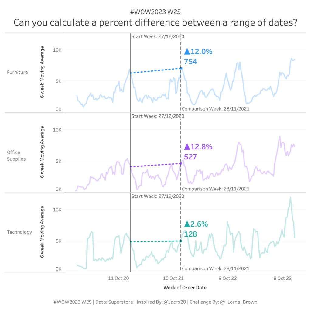
#WOW2023 Week 25: Can you calculate a percent difference between a range of dates?
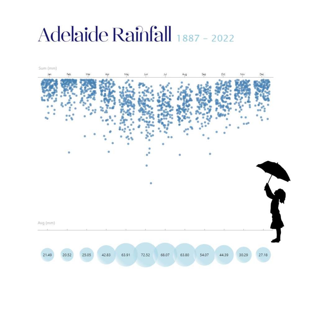
Introduction I saw this visualisation floating around my twitter and trending on Tableau Public and thought it would make a great challenge for Workout Wednesday. Big thanks to Jacob for letting me use his visualisation as inspiration today! In this weeks workout, I want you to look at the percent change between two dates, we […]
#WOW2023 Week 25: Can you calculate a percent difference between a range of dates? Read More »
Tableau, Workout Wednesday