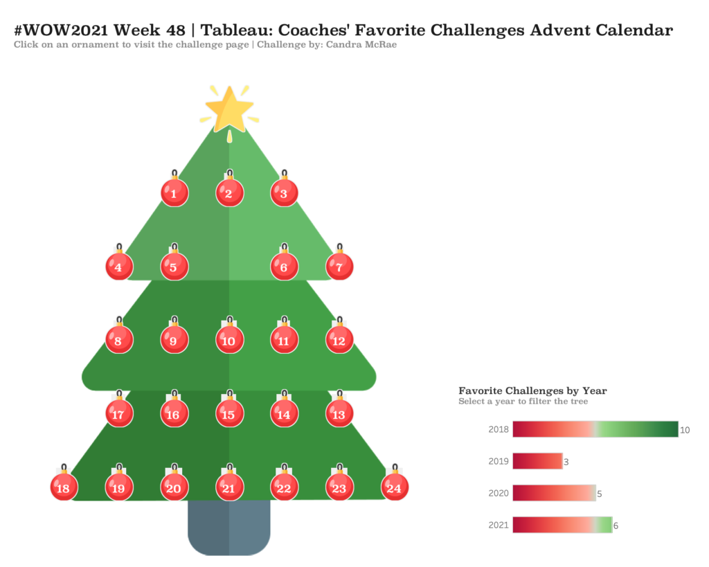
#WOW2021 Week 48 | Tableau | Coaches’ Favorite Challenges Advent Calendar
Introduction With the December right around the corner, holiday advent calendars will be everywhere. We didn’t want Workout Wednesday to miss out on that holiday tradition. So, we created an advent calendar featuring favorite challenges selected by our very own #WOW coaches. As my gift to you and a major development hint, I provided the …
#WOW2021 Week 48 | Tableau | Coaches’ Favorite Challenges Advent Calendar Read More