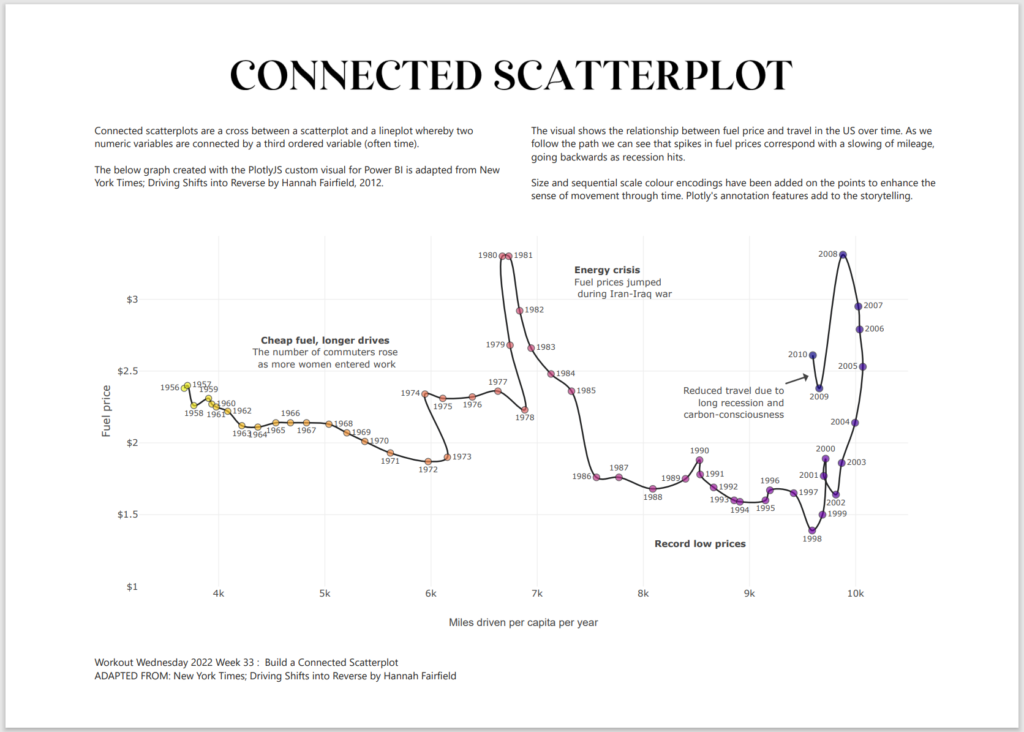
2022 Week 31 | Power BI: Connected Scatter with PlotlyJS
Introduction This week for Workout Wednesday we are getting familiar with the PlotlyJS visual by creating traces and annotations for a connected scatterplot. Connected scatterplots are a cross between a scatterplot and a lineplot whereby two numeric variables are connected by a third ordered variable (often time). The below graph created with the …
2022 Week 31 | Power BI: Connected Scatter with PlotlyJS Read More