Month: August 2022

#WOW2022 | Week 35 | Conditional Table Formatting with Dynamic Headers

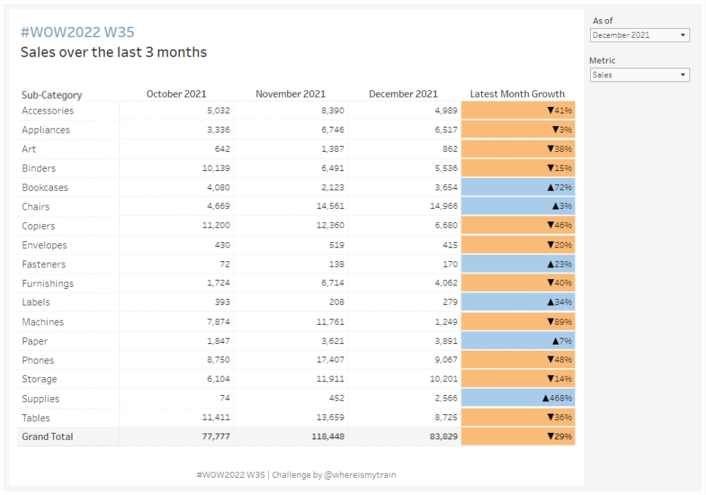
Introduction This week’s challenge is brought to you by a guest coach, my colleague Valerija Kirjackaja, who came across this problem at work and created a beautiful solution for it. How often do you get asked to re-create Excel tables in Tableau? On a scale from 1 to ‘I am never doing this again’ – …

#WOW2022 | Week 35 | Conditional Table Formatting with Dynamic Headers Read More

2022 Week 35 | Power BI: Make a Comet Chart

Introduction This week we are exploring another lesser used chart type: the comet chart. Comet charts show the evolution of one or two measures over time. They allow you to see change between two time periods across a category while emphasizing the direction of the change. You might use a comet chart instead of a dumbbell …

2022 Week 35 | Power BI: Make a Comet Chart Read More

2022 – Week 34: What is the average occupancy by weekday?

Introduction This week we return to another business-specific challenge. This team we will explore hospitality data. The goal of this challenge is to determine what the average occupancy is by day at three different properties. The challenge of this data is that you’ll only ever know when customers check-in or check-out. Not the actual total …

2022 – Week 34: What is the average occupancy by weekday? Read More

2022 Week 34 | Power BI: Calculation Groups

Introduction Calculation Groups in Power BI essentially allow you to apply logic or formatting to a variety of measures at the same time.  For example, let’s say you were looking to create a Month-To-Date, Quarter-To-Date, and Year-To-Date view across Revenue, Orders, and Units.  This would require you to create a calculation for each of the …

2022 Week 34 | Power BI: Calculation Groups Read More

2022 Week 33 | Power BI: Compare two series of values

Introduction Welcome back to Workout Wednesday! This week we’re visualizing two series of values in a take on last week’s Tableau challenge! This week’s challenge uses youth cellphone data and gives you the opportunity to either build a dumbbell chart using Charticulator or to build a lipstick column chart using a custom visual. Complete one or both …

2022 Week 33 | Power BI: Compare two series of values Read More

#WOW2022 W33: Can you compare the latest month to the prior X months average?

Introduction When looking through the challenge insights I realised we haven’t had many of the fundamental LOD style Workouts for a while. So this week we take a look at how does the latest month compare to the prior X months average? Click to open in Tableau Public Requirements Dashboard Size: 800 x 700px 2 …

#WOW2022 W33: Can you compare the latest month to the prior X months average? Read More

2022 Week 32 | Leverage Field Parameters in Measures

Introduction My name is Spencer Hamilton, Analytics Consultant with phData, and I’ll be guest hosting this week’s challenge! For the challenge, we’re going to look at one of Power BI’s newer features, Field Parameters, and create some calculations that dynamically change based on the selected parameter value. In this specific example we’re looking at Sample …

2022 Week 32 | Leverage Field Parameters in Measures Read More

#WOW2022 Week 31: Let’s build a KPI dashboard

Introduction Who doesn’t love a good KPI dashbaord? This one is fairly simple and straightforward. Let’s look at four simple metrics and see how each subcategory ranks within a selected metric. With this challenge – MIND THE NUMBER FORMATTING 🙂 Click to open in Tableau Public Requirements Dashboard Size: 700 x 350 2 sheets Display …

#WOW2022 Week 31: Let’s build a KPI dashboard Read More

Scroll to Top