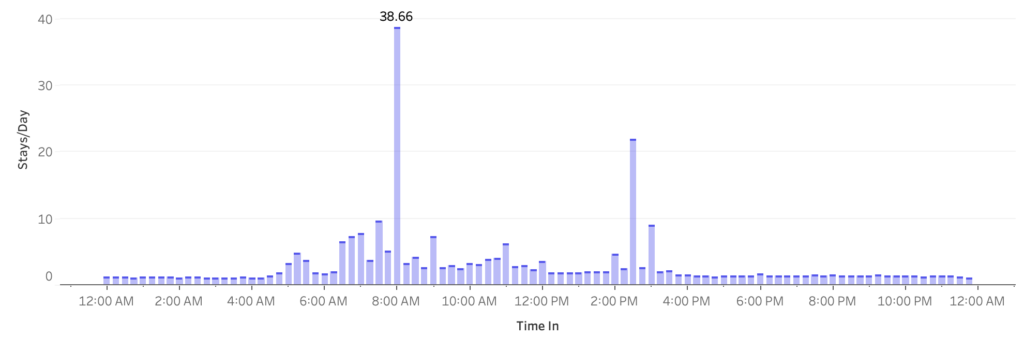
2022 Week 9: How many patients were admitted every 15 minutes?
Introduction This week we are going to look at hospital admission rates. This data source comes from The Medical Stays dashboard on the Tableau Exchange. This particular challenge is more focused on working with time than it is working with medical data. In this challenge you need to group time into 15 minute increments throughout […]
2022 Week 9: How many patients were admitted every 15 minutes? Read More »