Year: 2022

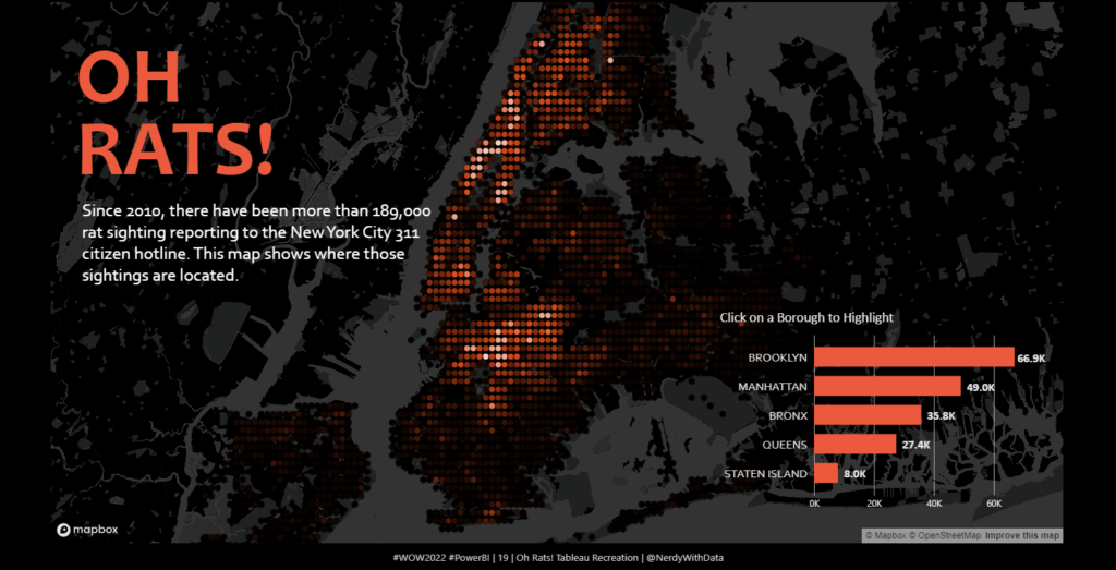
2022 Week 19 | Power BI: Oh Rats! Tableau Recreation

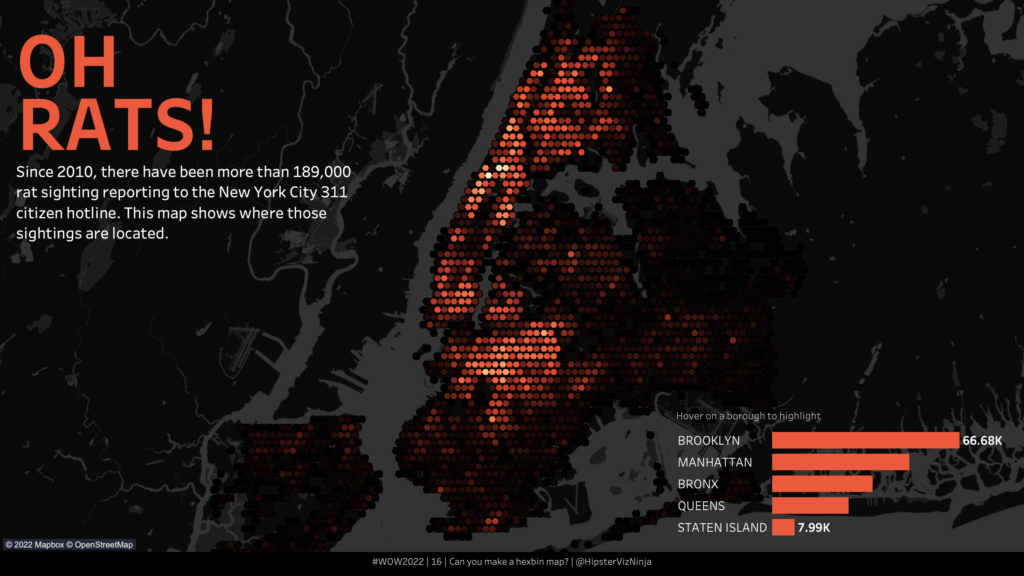
Introduction A few week’s ago, Sean Miller created an incredibly slick dashboard showing Rat Sightings in New York since 2010 for week 16 of Tableau’s Workout Wednesday (Challenge Link).  The challenge used Hexbins to combine multiple map points into shapes of the same size to show density more clearly within a map.  This week, we’re …

2022 Week 19 | Power BI: Oh Rats! Tableau Recreation Read More

Screenshot from Power BI Workout Wednesday 2022 Week 18

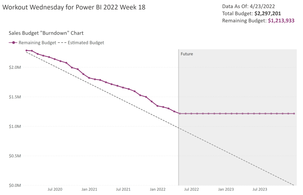
2022 Week 18 | Power BI: Remake this Tableau budget burndown chart

Introduction For the month of May, we are remaking Tableau visualizations with Power BI. Although the visuals made by the two tools may be similar, the calculations and formatting options are a bit different. This makes some things easier in one tool compared to the other. If you use both Power BI and Tableau, feel …

2022 Week 18 | Power BI: Remake this Tableau budget burndown chart Read More

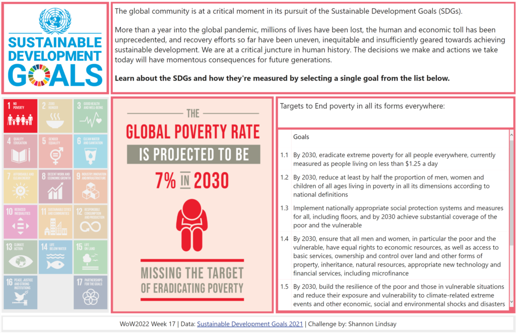
2022 Week 17 | Power BI : Create a Custom Theme

Introduction Welcome back to color month! It’s our 4th color-focused challenge and in stark contrast to Kerry’s week 14 challenge, we’re using loads of bright colors! This week we’re creating a custom theme using the color palette of the United Nations Sustainable Development Goals. This challenge was inspired by a Makeover Monday challenge – take a look …

2022 Week 17 | Power BI : Create a Custom Theme Read More

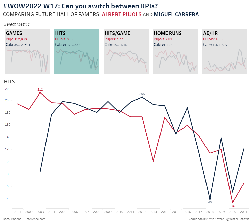
#WOW2022 | Week 17 | Can you switch between KPIs?

Introduction This week’s challenge is inspired by a Makeover Monday I did a couple years ago, which was inspired by Lindsey Poulter‘s Set Actions workbook. But rather than use the same soccer data, I’m continuing to celebrate the start of baseball season by comparing two Major League Baseball greats.  The overall challenge here is to …

#WOW2022 | Week 17 | Can you switch between KPIs? Read More

2022 W16 | Power BI : Quadrant Plot with Jitter

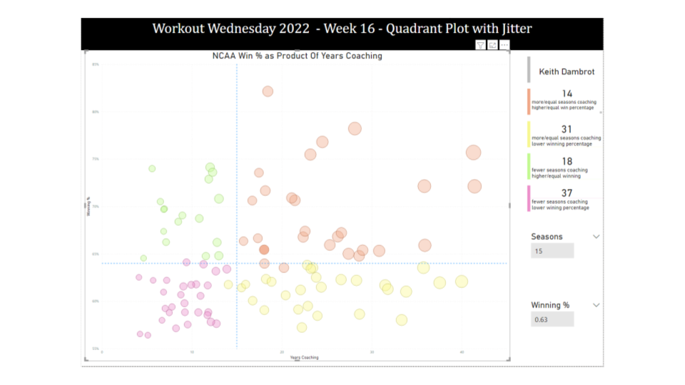
Introduction Your challenge this week is to create a Quadrant Plot. It should include different colors in each quadrant and the points should be jittered to try and reduce data overlap. Please note, that it is not expected to create the quadrants, quadrant lines, and color change by selecting any individual data point (if someone figures out how …

2022 W16 | Power BI : Quadrant Plot with Jitter Read More

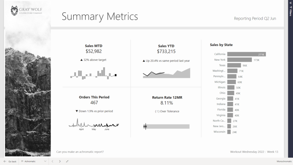
2022 Week 14 | Power BI: Create an achromatic report

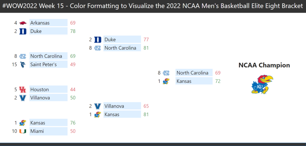
Introduction April is colour month for Power BI Workout Wednesday 2022. First up we are going to try our hand at creating reports WITHOUT hue. Using a file from a previous challenge, can you create an achromatic report that uses contrast and lightness effectively? There will be some creative freedom involved in this challenge, no …

2022 Week 14 | Power BI: Create an achromatic report Read More

Scroll to Top