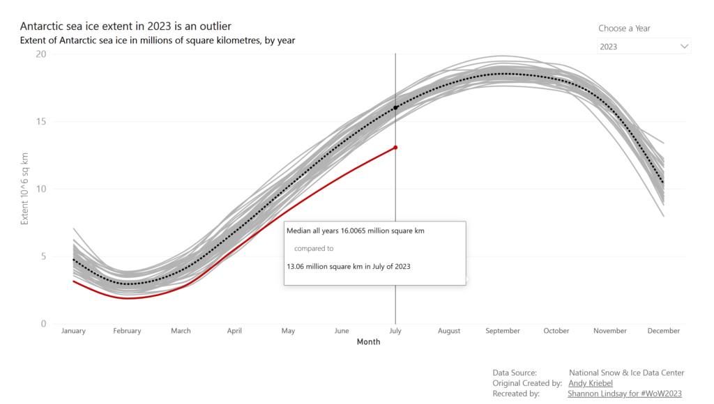
2023 Week 30 | Power BI: Build a smooth line chart
Introduction Welcome back to Workout Wednesday! This week we’re building a line chart using the new smoothing feature that was released this month! This week’s challenge was inspired by Andy Kreibel’s Makeover Monday challenge. We’re exploring the disappearing sea ice in the Antarctic using a line chart, looking at the extent of sea ice in millions of …
2023 Week 30 | Power BI: Build a smooth line chart Read More