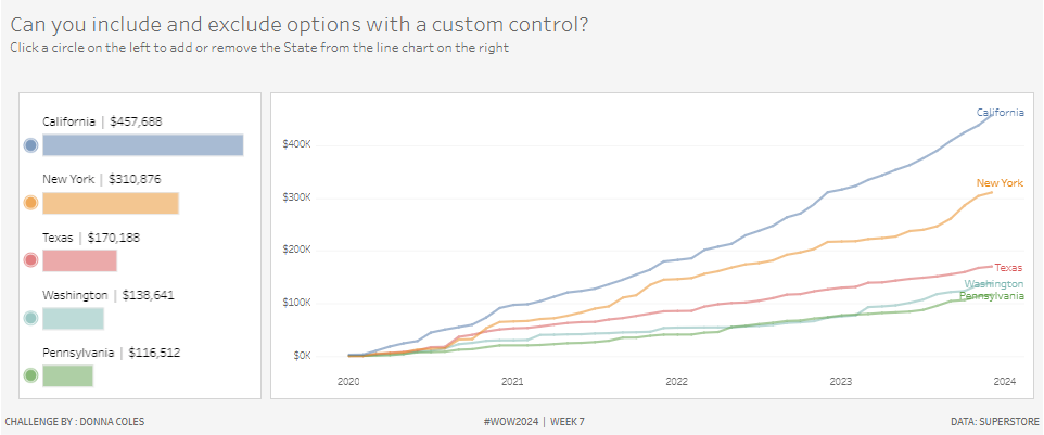
#WOW2024 | Week 7 | Can you include and exclude options with a custom control?
Introduction This week’s challenge is inspired by something I’d seen at work, and I thought it would be quite fun to see if I could reproduce in Tableau and if so, share as a challenge 🙂 I could, so here it is… can you include & exclude options with a custom control? Click to open …
#WOW2024 | Week 7 | Can you include and exclude options with a custom control? Read More