Year: 2024

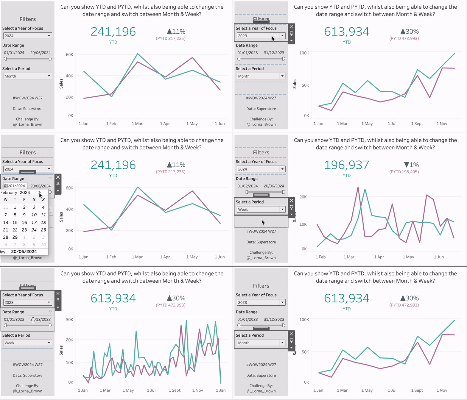
#WOW2024 | Week 27 | Can you show YTD and PYTD, whilst also being able to change the date range and switch between Month & Week?

Introduction One of the perks of my job is that I get to help colleagues solve puzzles that clients throw at them. This is where this came from. Well in fact – the original idea came from a Power BI report, and I wanted to prove it was doable in Tableau.  Click to open in …

#WOW2024 | Week 27 | Can you show YTD and PYTD, whilst also being able to change the date range and switch between Month & Week? Read More

2024 Week 26 | Sigma: Can you calculate RunRates?

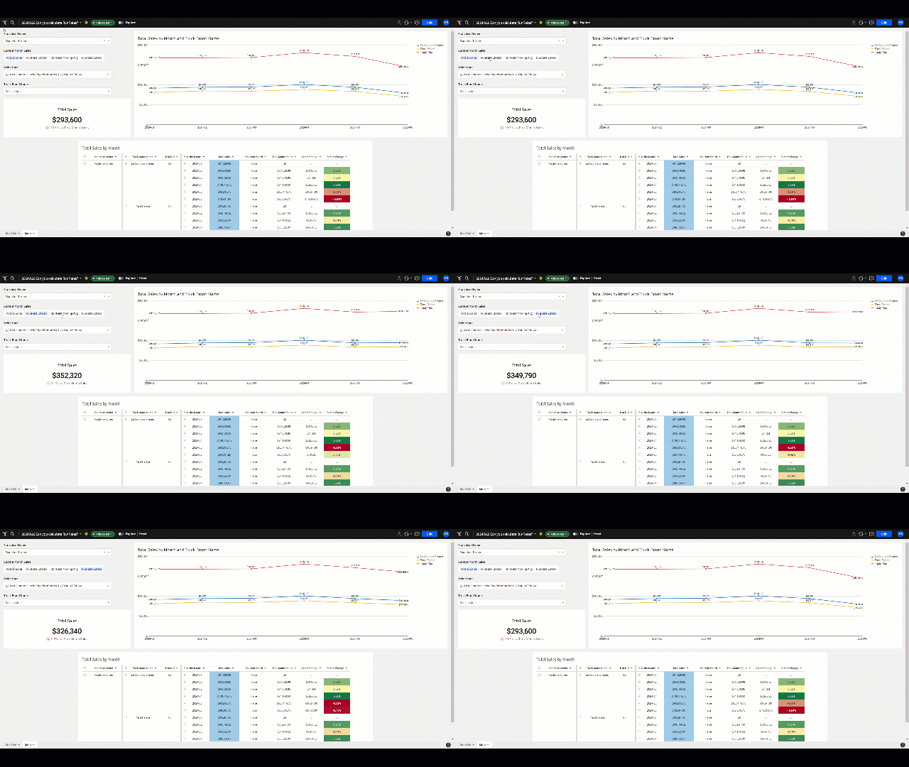
Introduction Welcome to Week 26! When we dive into monthly data, it’s often more helpful to predict the current month’s numbers rather than relying on incomplete data for an incomplete month. This week, we’re trying out three different ways to estimate sales projections for the ongoing month, also known as the run rate. Dealing with …

2024 Week 26 | Sigma: Can you calculate RunRates? Read More

2024 Week 26 | Power BI: Reference Theme Sentiment Colors in DAX

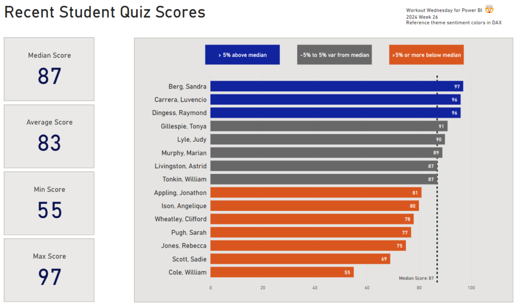
Introduction Power BI reports have a theme that specifies the default colors, fonts, and visual styles. In Power BI Desktop, you can choose to use a built-in theme, start with a built-in theme and customize it, or create your own theme.  In addition to the primary data colors, we can also define sentiment colors and divergent …

2024 Week 26 | Power BI: Reference Theme Sentiment Colors in DAX Read More

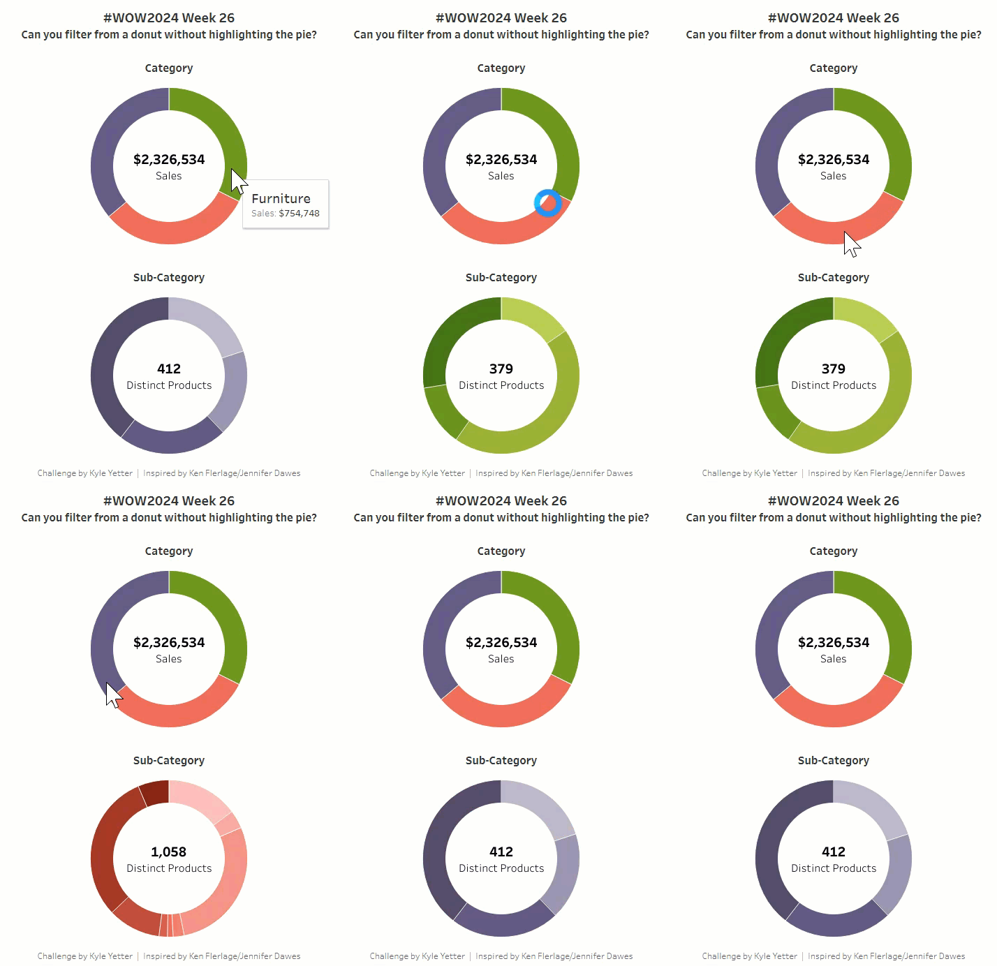
#WOW2024 | Week 26 | Can you filter from a donut without highlighting the pie?

Introduction I was recently catching up on the Flerlage Twins blog, and came across a post that I had somehow missed from the end of  last year about trying to solve a highlighting problem with donut charts when filtering. I read through it, and was surprised that my favorite technique from Yuri Fal didn’t work, …

#WOW2024 | Week 26 | Can you filter from a donut without highlighting the pie? Read More

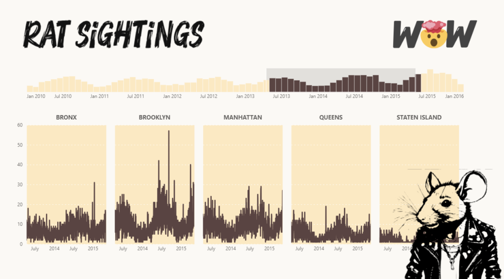
Timebrush slicer visual with Deneb depicting Rat Sightings in Manhattan

2024 Week 25 | Power BI: Time Brush Slicer

Introduction This week’s challenge looks to create a time brush slicer. The time brush slicer can be created with Deneb or another custom visual. Requirements Obtain the data from a previous challenge Model data Option A Import Timbrush Slicer and Small Multiple Custom Visual Create a time brush slicer Create a line chart with small …

2024 Week 25 | Power BI: Time Brush Slicer Read More

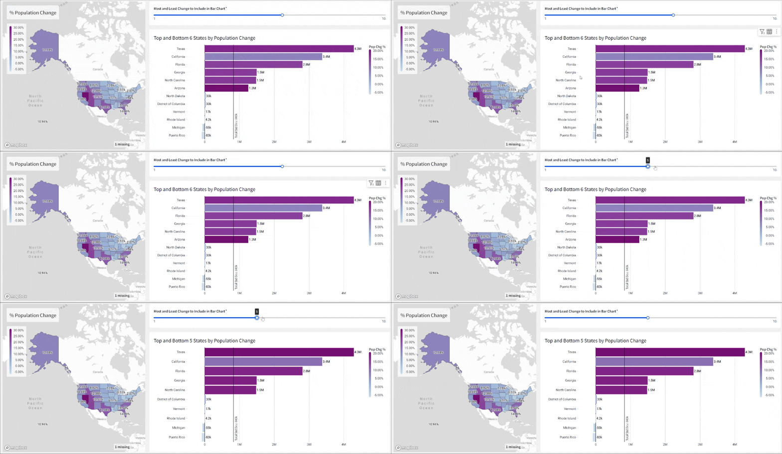
2024 Week 25 | Sigma: Can you compare these populations?

Introduction Welcome to Week Twenty-Five! This week, you’re going to compare US Census data from 2000 and 2010.  In this challenge, we’ll highlight a couple of new formatting additions to Sigma, as well as create a dynamic parameter.  Good Luck!-Ashley Need access to Sigma? Click Here to Sign Up Link to WOW Sigma Instance Youtube …

2024 Week 25 | Sigma: Can you compare these populations? Read More

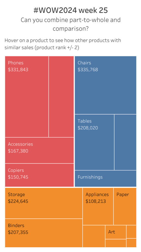
#WOW2024 | 25 | Can you combine part-to-whole and comparison?

Introduction What’s up everybody! Thank for checking and taking on the latest #WOW2024 challenge! I’ve got another real-life inspired challenge for you all this week. At times, it can important to show both part-to-whole relationships as well as rank or comparison to each other. We know that there are many ways to accomplish but what …

#WOW2024 | 25 | Can you combine part-to-whole and comparison? Read More

Sample P

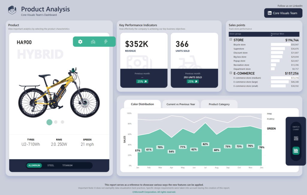
2024 Week 24 | Power BI: Get creative with the Power BI Core Visuals team

Introduction Welcome back to Workout Wednesday! This week’s challenge is purely dataviz – there is no data transformation involved. You have the pleasure of either recreating or making over the stunning sample report provided by the Power BI core visuals team. This report is beautiful to look at and was built to demonstrate some of the …

2024 Week 24 | Power BI: Get creative with the Power BI Core Visuals team Read More

#WOW2024 | Week 24 | Can you visualise headcount distribution in multiple ways on a single sheet?

Introduction For this week’s challenge I want to see if you can provide users with the flexibility to choose how they want to display a particular metric – in this case we’re looking at Headcount data, and how it is distributed across different employee attributes. Depending on the question being asked, a particular layout might …

#WOW2024 | Week 24 | Can you visualise headcount distribution in multiple ways on a single sheet? Read More

2024 Week 24 | Sigma: Can you add custom map layers?

Introduction A few weeks ago, the 19th Police District of Chicago emailed me with some interesting survey data. The visualizations were useful, but they were living inside of a Google Slides presentation, and I wanted to dig deeper into the results. Thankfully, I followed my nose to their community survey website and found that they …

2024 Week 24 | Sigma: Can you add custom map layers? Read More

Scroll to Top