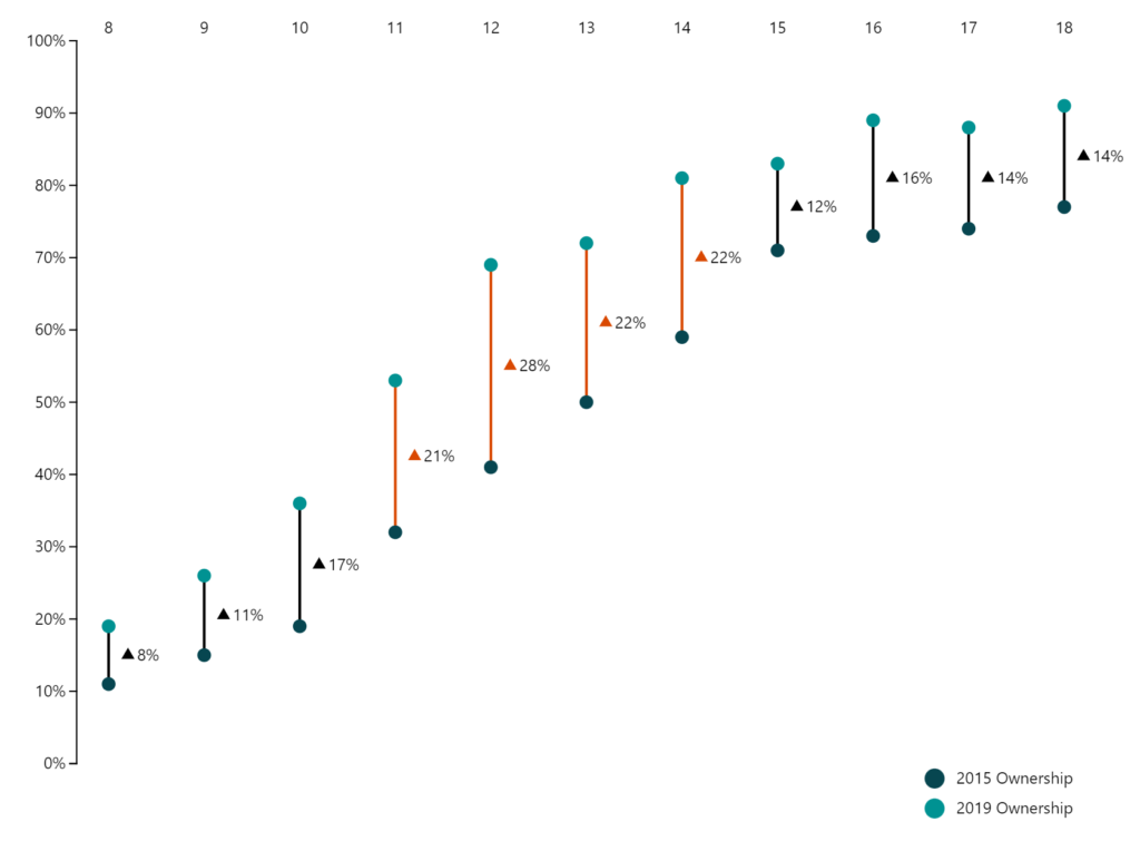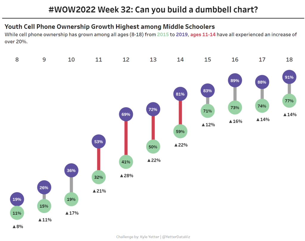
2022 Week 35 | Power BI: Make a Comet Chart
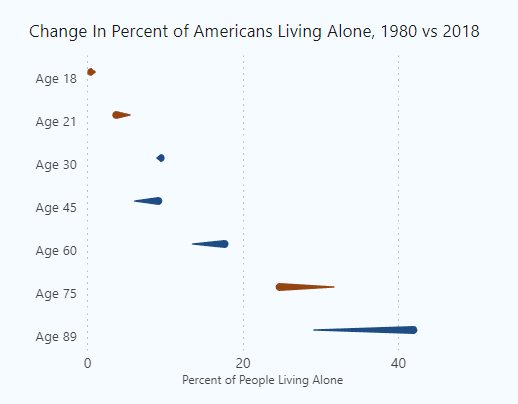
Introduction This week we are exploring another lesser used chart type: the comet chart. Comet charts show the evolution of one or two measures over time. They allow you to see change between two time periods across a category while emphasizing the direction of the change. You might use a comet chart instead of a dumbbell …